Saturday, December 16, 2017
Weekly Indicators for December 11 - 15 at XE.com
- by New Deal democrat
My Weekly Indicators post is up at XE.com.
A whirlpool of crosscurrents among the long leading indicators has developed.
Why Did 30 and 90 Day Commercial Paper Spreads Recently Blow-Out?


I watch a number of yields for signs of financial market stress. Above are the charts for the 30-day commercial paper/bill spread (top) and the 90-day commercial paper/treasury spread. Both recently blew out.
Why?
Friday, December 15, 2017
Industrial production for November 2017: Dear Doomers, you can shut up about "soft" vs. "hard" data now
- by New Deal democrat
For months and months this year, the mantra of the Doomers was that the "soft data" of the Fed regional surveys and ISM manufacturing wasn't being confirmed by the "hard data" like industrial production.
Meanwhile, those of us who actually know something about leading vs. coincident data placidly kept noting that the new orders data for both leading indicators (the Fed surveys and ISM manufacturing) portended strength -- just as in early 2016 they turned from negative to positive, accurately portending the end of the shallow industrial recession.
And here is Industrial Production (red), and its manufacturing (blue) and mining (green) components through November:

Yes, it doesn't move in a straight line. In particular there were several months of hurricane-related weakness. But the leading surveys have once again been proven correct, and those who listened to the Doomers wrong.
Real retail sales for November 2017 portend positivity for 2018
- by New Deal democrat
There have been any number of perfectly good and perfectly obvious write-ups of yesterday's retail sales report for November.
I like to think much of my "value-added" is telling you not about what the data indicates about now, or about the recent past, but what it portends in the near and further-term future, and real retail sales is one of my favorite metrics for thet.
So, here are two 2018 takeaways from real retail sales:
1. Real retail sales per capita adds to the evidence that, left to its own devices, the economy will not enter a recession in 2018.
This number has frequently turned one year or more before recessions, including the last two. The 0.8% retail sales vs. 0.4% inflation, with ~0.06% population growth means it made another new high yesterday:

2. The job market measured YoY should remain steady over the next 3 - 6 months.
This is a relationship I started graphing in the middle of the "Great Recession" in early 2009. Divide real retail sales by 2, and the smoothed trend gives you a good idea where YoY payroll growth is going to trend in the near future:

With the exception of the outsized moves in retail sales just after the recession, the correlation is pretty good, and the directional trend is a close match.
Bottom line: the recent improvement in retail sales, including the big numbers from October and November, at very least suggest that the employment situation will not soften significantly in the next few months.
P.S.: I'd be inclined to treat the jump in the past several months as a hurricane-related rebound, but no such jump occurred after either Katrina in 2005 or Sandy in 2012.
Thursday, December 14, 2017
Real wages stagnate YoY, decline significantly since July
- by New Deal democrat
So lackluster has wage growth been that even the modest uptick in consumer inflation to 2.2% YoY in November means that non-managerial workers have seen virtually no real growth in their paychecks over the last 12 months.
With yesterday's +0.4% increase in consumer prices, here's what YoY real wages look like for non-managers (blue) and all employees including managers (red):

All wages are up +0.3% YoY, but nonsupervisory workers have seen only a +0.1% increase.
Here is the same data for the last 2 years, set to a value of 100 as of January 1, 2017:

Real wages rose by over 2% through July, but have actually declined since then, up to nearly -1% for all employees.
To look at the economy as a whole vs. individual workers, here is a look at real aggregate payrolls for all employees:

Aggregate payrolls adjusted for inflation rose 2.3% this year through July, and have made zero progress since.
This doesn't mean that we're DOOOMED, but on the other hand since workers have already dipped into their savings in the past year (the savings rate has declined by over 1%), consumers are ill prepared should anything like a spike in gas prices occur soon.
The Long-End of the Curve Isn't Predicting Booming Growth

The chart above plots 10 years of the 10-year CMT (left scale) and the Y/Y percentage change in GPD (right scale). Notice the following general trends:
1.) The 10-year has moved lower since the recession. In the second quarter of 2009, the 10-year came close to 4%. It is currently in the 2.3-2.4 range.
2.) In absolute terms, the 10-year yield increased more than 100 basis points between the summer and fall of 2017, rising from 1.37% to 2.6%. Traders called this the "Trump trade." They believed that Trump would increase fiscal spending (largely on infrastructure) and lower taxes. The combination would increase growth and inflation, hence the sell-off in the long-end of the bond market. Since the election, yields have trended lower, incating the "Trump trade" is losing steam.
3.) The Y/Y percentage change in GDP has mostly printed between 2%-3% since 2010. Weaker GDP growth is a function of slowing population growth, lower productivity, and the "debt-deflation" growth dynamic that characterized this expansion.
4.) Yields are fluctuating between ~2% and ~2.6% -- hardly a level indicating booming growth. This means bond traders are thinking, "more of the same is coming."
Wednesday, December 13, 2017
The Phantom Menace: Fed rate hikes and non-existent inflation
- by New Deal democrat
This isn't the first time the Fed has engaged in a rate hiking campaign in the face of somnolent inflation. There were are least three prior episodes.
I take a look at the reaction of the bond market and the economy over at XE.com.
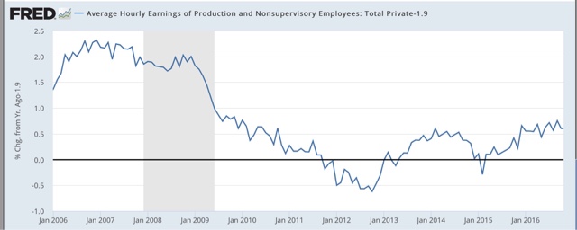
The Ugly Picture of US Wage Growth

The chart above shows the Y/Y percentage change in the average hourly earnings of nonsupervisory employees. We can break this data down into two sections. Due to higher inflation and stronger unions, the pace of growth was far stronger before the 1980s.
We see a different dynamic at work during the first three post-1982 expansions. Wages decline coming out of the recesssion, falling to ~2% Y/Y percentage growth rate. They then climb during the second half of the expansion, peaking ~4% Y/Y percentage growth rate. This probably explains why the Fed remains thoroughly convinced that the Phillip's Curve is still in play: they're assuing the past is prologue, and with good reason.
However, this expansion we see a different growth dynamic at work. As before, the Y/Y percentage change dropped to 2% a little before the expansion was halfway over. But the pace of growth in the second half of the recovery is far weaker. Hence, we have weaker wage growth.
Here's a graph of the average and median growth rate of wages for each of the expansions:

The pace is clearly declining.
Tuesday, December 12, 2017
October JOLTS report: a good post-hurricane rebound
- by New Deal democrat
The August and September hurricanes continue to make their impacts felt in the economic data. Yesterday's JOLTS report for October, like the October and November jobs reports, shows a rebound from those impacts. The best way to look at the data is to average the last two months (and this will be true for the next JOLTS report as well, which will be best viewed by averaging all three months).
Let's start as usual by updating the disconnect between the "soft data" of openings in this survey and the "hard data" of actual hires and discharges. As I have pointed out many times, openings can be just chumming the water for resumes, or even laying the groundwork to hire foreign workers. The disconnect betrays an unwillingness to pay new hires more, or to engage in on the job training.
In October. openings continued to run about 10% higher than actual hires:

Hires have been basically flat for the last 2 years -- specifically since December 2015 -- while openings have continued to increase, although they too have been flattish for the last 5 months (especially if we average the last two months):


Further, in the previous cycle, hires stagnated, and shortly thereafter involuntary separations began to rise, even as quits continued to rise for a short period of time as well:

[Note: above graphs show quarterly data to smooth out noise]
Here are hires vs. separations on a monthly basis for the last several years (again, mentally aveerage the last two months). At this point both hires and separations are tracing a similar trend over the last 24 months:

While quits remain at expansionary high levels, involuntary separations bottomed a year ago, and have risen on a quarterly basis ever since. Here's the monthly view of the last several years. The good news is that involuntary separations have fallen in the last several months, even if we average the last two. At the same time, they remain above thei bottom they established a year ago:

Finally, while the JOLTS data is not broken up by states, so it is impossible to know the precise impact of the hurricanes, because the data is broken down by Census Region, we can exclude the Southern Region and see what was going on in the rest of the country, which was not affected. I've prepared that for openings, hires, quits, and layoffs and discharges below (and helpfully marked the expansion highs (low for layoffs) with an "H" (and "L") symbol):
| Month | Openings | Hires | Quits | Layoffs/ discharges |
|---|---|---|---|---|
| 9/16 | 3595 | 3158 | 2042 H | 975 |
| 5/17 | 3640 | 3350 | 1895 | 922 L |
| 6/17 | 3882 | 3224 | 1849 | 1078 |
| 7/17 | 3897 | 3416 | 1822 | 1113 |
| 8/17 | 3965 | 3253 | 1888 | 1127 |
| 9/17 | 3935 | 3174 | 1903 | 1070 |
| 10/17 | 4099 H | 3529 H | 1875 | 1066 |
This is pretty impressive. It shows that outside of the South, both openings and hires are at new highs, and involuntary separations have receded. The only sore spot is quits, which peaked over a year ago, although they have improved compared with earlier this year.
The report yesterday was a good one, but on the other hand, it is very consistent with being late in the cycle.
Monday, December 11, 2017
The wage - debt deflation dynamic and the next recession
- by New Deal democrat
One of the important dynamics why recessions end is that inflation decelerates more than wage growth. Thus, for the 90% or so of people who still have jobs, there are some compelling bargains, enough to jumpstart more spending.
That all gets short-circuited if wages actually decline. Then, the fact that debt payments, unlike prices, do not decline, overwhelms the possibility of spending growth. That was one of the most ruinous aspects of the 1929-33 great contraction.
This is why I keep harping every month on the poor wage growth shown in the jobs reports. Here we are, over eight years into the economic expansion, and wage growth is actually declining a little, now at just 2.3% YoY:

This is the smallest wage growth of any expansion since the reports began over half a century ago. Simply put, we are more at risk of another wage deflationary "event" during the next recession, whenever it hits, than at any time since the 1930s.
Let me try to show this in detail.
As already noted, during recessions wage growth declines. What I've done below is to show that for each recession for the last half century, with one alteration: I've recalculated the starting number for peak wage growth during the previous expansion to 2.3%, to match its current rate:


Starting from +2.3%, 4 of the last 7 recession produce a period of wage deflation. The three worst recessions: 1974, 1981, and 2008, produce wage deflations of about a year or more.
But that is just on a YoY basis. When we take a look on a month over month basis, episodes of wage deflation continue off and on all through our current expansion:

And even following shallower recessions like 1991 and 2001, brief episodes of wage deflation occur for several years:


Of course, these charts are strictly hypothetical. The point is that, if actual wage deflation were to occur, because debt payments do not deflate, the dynamic can take on a life of its own, creating a vicious downward spiral, as it did in 1929-32.
Imagine such a deflationary event were to begin to occur in, say, late 2019. Imagine that the makeup of Congress then is similar to what it is now. Now imagine how such a Congress would approach such a deft deflation dynamic.
That is the stuff nightmares are made of.
Monday Morning Bond Market Round-Up
The Corporate Curve is Also Compressing


The top chart shows the 1-3 year corporate market, which is now near it's highest level for the year. The 3-5 year sector (second from the top) is also rising but is below its yearly high. The 15+ year sector of the market (second from the bottom) is declining. As a result, the corporate yield curve is also compressing (bottom chart).
Treasury Market ETFs Show the Treasury Curve Compression


Charts of the treasury market ETFs show why the yield curve is compressing. The short end of the market is selling off (top chart) the belly of the curve is flat (middle chart) and the long-end of the curve is rallying (bottom chart). As a result:

The yield curve flattens.
Job Growth is Strong Enough to Support Another Hike

The 3, 6, and 12-month averages of payroll job growth area all above 170,000/month, which is strong enough to support another hike from the Fed.
Keep An Eye On Oil

The weekly oil sector chart is right at the 200-week EMA with a rising MACD. So far this expansion, we've been very lucky when it comes to oil prices. However, should they continue rising, we may have a problem.
Sunday, December 10, 2017
Subscribe to:
Posts (Atom)