Saturday, November 14, 2015
Weekly Indicators for November 9 - 13 at XE.com
- by New Deal democrat
My Weekly Indicators piece is up at XE.com . The deflationary pulse intensified further this week.
Friday, November 13, 2015
As the global deflationary pulse intensifies, the SS US Eonomy takes on more water
- by New Deal democrat
I have a new post up at XE.com. There has been a renewed deflationary pulse in the global economy, and as a result, the US economy has taken on more drag.
Thursday, November 12, 2015
JOLTS Hires and Quits turn negative YOY; Labor Market Conditions Index uninspiring
- by New Deal democrat
When it comes to the monthly JOLTS reports, most commentators in my opinion are missing the big story, focusing only on the job openings number without paying attention to the pattern of this series during the 2002-07 expansion. And when it comes to that pattern, we have had an important change of trend.
Here are openings (blue), actual hires (red), and quits (green) since the inception of the JOLTS series:
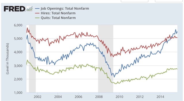
Keep in mind that, while this series looks extremely useful, because there is only 15 years of history, there is only one complete business cycle with which to compare. During that cycle, both hiring and quits peaked well before job openings. As shown above, the peaks in hiring and the trough in voluntary quits, was the first signal that the expansion was decelerating.
Keep in mind that, while this series looks extremely useful, because there is only 15 years of history, there is only one complete business cycle with which to compare. During that cycle, both hiring and quits peaked well before job openings. As shown above, the peaks in hiring and the trough in voluntary quits, was the first signal that the expansion was decelerating.
Now let's zoom in on the YoY% change in last 3 years:

While job openings have skyrocketed, both actual hires and quits stalled, and this month both turned negative YoY for the first time since the 1-month 2012 pause.
While job openings have skyrocketed, both actual hires and quits stalled, and this month both turned negative YoY for the first time since the 1-month 2012 pause.
This is an important indication that we are past mid-cycle.
Further, there is a labor market disconnect, as employers are not filling a record number of openings. As to why those openings are going unfilled, I have seen a fair amount of survey information where employers are complaining of not being able to find appropriately skilled candidates. Just yesterday we got the National Federation of Independent Business's report, in which the respondents labeled the inability to find qualified applicants as their number 2 concern (behind the perennial #1 taxes), ahead of the amount of sales:

Here's a similar graph from Deutsche Bank that is making the rounds:

I suspect that there are one or both of two clauses missing in the reasoning cited by small business owners and HR managers, as in: "We are not able to find skilled candidates [for the wage we want to pay and/or because we refuse to pay for any on-the-job training]." From the aforementioned NFIB report, note that the percentage of employers who have *planned* higher wages has generally stagnated for the last year:
Further, there is a labor market disconnect, as employers are not filling a record number of openings. As to why those openings are going unfilled, I have seen a fair amount of survey information where employers are complaining of not being able to find appropriately skilled candidates. Just yesterday we got the National Federation of Independent Business's report, in which the respondents labeled the inability to find qualified applicants as their number 2 concern (behind the perennial #1 taxes), ahead of the amount of sales:
Here's a similar graph from Deutsche Bank that is making the rounds:
I suspect that there are one or both of two clauses missing in the reasoning cited by small business owners and HR managers, as in: "We are not able to find skilled candidates [for the wage we want to pay and/or because we refuse to pay for any on-the-job training]." From the aforementioned NFIB report, note that the percentage of employers who have *planned* higher wages has generally stagnated for the last year:

There has been an uptick in the last couple of months -- but note there is still a lower percentage of employers planning to raise wages than during most of the last 3 expansions!
Finally, I have also recently started paying more attention to the Fed's Labor Market Conditions Index (blue in the graph below), which appears to be a good leading indicator for YoY payroll growth (red):

While there were some huzzahs! that there were upward revisions to the last 6 months in this index, the above graph shows that, in context, it is not pointing to strong payrolls growth in the months ahead. Rather, I expect each such report to be lower than the conquerable report one year ago. This simply reinforeces the argument that we are past mid-cycle (as the YoY% growth in jobs generally peak near mid-cycle).
In short, I continue to be underwhelmned by JOLTS reports where job openings don't translate into actual hires. Hopefully the October jobs report, along with the NFIB report on planned wage hikes, indicates that the dam is finally beginning to break, and increased wages will translate into increased actual hiring.
Wednesday, November 11, 2015
5 graphs for 2015: October update
- by New Deal democrat
At the end of last year, I highlighted 5 graphs to watch in 2015. We are now 10 months through the year, so let's take another look.
#5. Mortgage refinancing
After a mini-surge at the end of January (light brown in the graph below) due to low mortgage rates, refinancing applications fell back to their post-recession lows during spring. With a decrease in rates in summer and autumn, there was a small increase, but we are still nowhere near the level of refinancing we saw in 2010 and 2012. Mortgage News Daily has the graph:

Over the last 35 years, refinancing debt at lower rates has been an important middle/working class strategy. There is little room left for that strategy.
#4 Gas prices
Here is a graph of average hourly wages divided by gas prices (blue) since the bottom in gas prices in 1999:

How long must a worker labor in order to buy a gallon of gas? After skyrocketing in the lead-up to the Great Recession, gas prices collapsed, helping the consumer start to spend again on other things at the bottom of that recession. The steep drop in gas prices late last year took us almost all the way back to that bottom. Just as in 1986 and 2006, at first consumers saved the money, but once they loosened their pursestrings, the economy responded.
#3 Part time employment for economic reasons
Next is a graph of part time workers for economic reasons expressed as a percentage of the labor force. This is one of the big positive stories of the year. Over the last 10 months, this has fallen by about 0.8% or 1,300,000:

In the longer view, this is still 1.5% (about 2.25 million) above the boom level of 1999 and about 1.0% (1.5 million) above the level of 2007, but is at least finally close to its 1994 - 2007 range:

#2 Not in Labor force but want a job now:
This moved generally sideways during the first quarter, improved nicely for the next few months, but slid back in the last 2 months:

It is now only 300,000 above its post-recession low of November 2013 (just prior to Congress's cutoff of extended unemployment benefits) and about 1.6 million, or 1.1% of the workforce, above its 1999 and 2007 lows.
#1 Nominal wage growth
After 3 poor readings last August, December, and February, YoY growth in nominal wages for nonsupervisory personnel fell back close to their post-recession lows before rebounding this spring. In October YoY growth finally cracked 2% to the upside. In the below graph, I have s ubtracted 1.9% fromYoY nominal wage growth, and 10.3% fromcthe U6 unemployment rate, to set both to zero at their current levels:

In the 1990s and 2000s, nominal wage growth started to accelerate when the broad U6 unemployment rate fell to 9.9% and 9.7% respectively. The increase in YoY growth in wages last month coincided exactly with U6 falling from 10% to 9.8%.
In summary, 10 months into the year we finally have improvement in 4 of the 5 metrics, some more than others:
- Involuntary part time employment has declined substantially.
- Low oil prices have continued to benefit consumers.
- Wage growth, driven in part by the decline in the broad unemployment rate, has finally started to improve.
- Although the decline has stalled in the last several months, over the year there has been a decrease in the number of people not even in the labor force, but who want a job now.
- Refinancing is still at low ebb. For the economic expansion to continue for a substantial time, we must either see a new low in rates (very unlikely), or real wages must continue to grow (at the moment looking likely).
Still, if current trends continue, we won't achieve real, full employment like 1999 or even 2007 for about another 2 years!
Tuesday, November 10, 2015
Expect the boom in apartment construction - and rents - to continue
- by New Deal democrat
I have a new post up at XE.com .
Between stagnant wages and increasing demand from the large Millennial generation, multi-unit housing construction has continued to boom. Rent increases don't look like they are set to abate either.
Monday, November 9, 2015
Forecasting the 2016 election economy: in which I respond to Nate Silver
-by New Deal democrat
As you all know, I have been writing a series about "Forecasting the 2016 election economy." In general, good economic conditions at election time usually mean the return of the incumbent party to the White House, while a recession is almost always fatal.
My goal in this experiment is to be able to make a reasonable forecast of those conditions, hopefully no later than the publication of December and 4th quarter data in January.
Based on 160 years of NBER data, and 50 years of data on the "long leading indicators,"a week ago I made a preliminary forecast that Q3 2016 GDP will be positive, a boon to the Democratic nominee.
Several days later, in what reads like a direct reply, Nate Silver poured cold water over the entire enterprise, writing that "We know almost nothing about the election day economy."
While I have the utmost respect for Nate's statistical skills, I believe in this case his argument is misdirected. In particular, I believe he has failed to distinguish between the fabled unreliability of the general economic punditry and the more rigorous and objectively verifiable record of indexes of leading indicators.
The gist of Nate's argument, as I read it, is that while the state of the economy is very important to election outcomes (I agree), non-economic events can have important political consequences (I agree with that as well. If the economy were the sole determinant of presidential outcomes, Humphrey in 1968 and Gore in 2000 would have won in landslides). Beyond that, he says, economic forecasting has almost no value one year out, the forecast of an economic pundit having a margin of error of +/-4.6%! Specifically with regard to 2007, while (he says, I disagree as spelled out below) there were a few warning signs, the punditry and even the Fed was remarkably complacent, seeing only a 1/3 chance of a recession in 2008! Nate also cites his book, The Signal and the Noise, which devotes a 23 page chapter to issues with economic forecasting, mainly developing in great detail the horrible record of pundits in general.
But, dear reader, notice that in his article this week, and in the links in that article, Nate nowhere discusses the record of indexes of leading indicators in general, or long leading indicators in particular.
Indeed, in the 23 page chapter about economic forecasting in his book, Nate devotes only 3 pages to the issue of leading indicators, one of which is devoted to skewering ECRI's blown 2011 recession call (a call I also skewered as well at the time). In fact, the Index of Leading Indicators, developed over decades by the BEA under Prof. Geoffrey Moore, and since refined by the Conference Board, gets exactly one paragraph. He writes on p. 187 that it "has typically declined a couple of months in advance of recession," but has also had "many false alarms." He then cites to a single study which claimed that the real-time unrevised data was much less helpful. That's it. That's the entire discussion.
I have dutifully searched for a single reference by Nate to Prof. Moore, or a single reference to "long leading indicators." As far as I have been able to find, he has never devoted a single pixel to either.
Here are the problems I see with Nate's argument insofar as it simply waves off the utility of leading indicators:
1. To begin with, that economic pundits are notoriously poor forecasters is not evidence that the Long Leading Indicators are in any way deficient.
2. He called ECRI "charlatans" because they won't disclose the inputs to the WLI. In fact we know exactly what those are, and exactly their weights. I worked with Jeff Miller, Georg Vrba, and Recession Alert on the issue. We found that 10-15 years ago the components were published publicly each week in Business Week. Then RecessionAlert tested the weightings, and ran a two month trial to make sure the series matched in real time. It did. Nate can run a statistical check, because we made the components and weightings public.
3. In any event, the Index of Leading Indicators, and ECRI's WLI, are designed to forecast 6 to 8 months out, not one year
4. The only indicators designed to see 1 year or more out are the long leading indicators. Professor Moore published them in 1989, although he didn't disclose the weightings. ECRI used to publish the graph, without giving away the components or weightings, until 2011.
5. Right now, as I understand them, all of the long leading indicators but one are positive.
Now let's dsicuss each of these in order:
1. that economic pundits are notoriously poor forecasters is not evidence that the Long Leading Indicators are in any way deficient.
Silver's primary claim is that surveys of economic pundits show that their opinions are frequently very wide of the mark. That's true. That's because most pundits are trend followers. While the original source article unfortunately is a dead link, Prof. Mark Thoma's extensive discussion of it is very much alive, and still timely even though it is now 10 years old:
Forecasters Rely on Today to Predict Tomorrow, Caroline Baum, Bloomberg: ...The sentiment shift, based on high-frequency data, is even harder to understand in light of the economy's steady performance. ... Weak numbers yield a weak outlook. Strong numbers mean good times ahead. Where's the forecasting?
The Index of Leading Economic Indicators, which isn't a bunch of randomly selected components, is signaling slower, not faster, growth ahead. [Note this was written in 2005. The LEI were, ahem, correct!] The 10 components of the LEI were all chosen because of a demonstrated ability to predict future economic activity. ... As long as the weekly and monthly numbers come in strong, economists will be guided by mostly contemporaneous indicators released with a lag. How come no one follows the leaders?
Prof. Thoma continued:
The paper by Stock and Watson linked above and the work that followed in the next 15 years or so look at these issues in considerable detail and answer the questions raised in the column. For those interested, the question of the optimality of the LEI and other indicators for use in economic forecasting has been examined extensively with Stock and Watson leading voices in this area. A very, very quick search of "Stock Watson Forecasting GDP" in Google Scholar turns up the following papers on this topic (some of the abstracts are below for quick reference). One more note. The comments about forecasters being swayed by high frequency data is why repeated warnings have been issued on this very topic.
So Nate Silver's discussion of how wrong pundits are in my opinion has absolutely zero relevance to a discussion of actual leading indicators, particularly where the issue is whether GDP 4 quarters hence will be positive or negative, not the actual percentage of its growth.
2. He called ECRI "charlatans" because they won't disclose the inputs to the WLI.
I feel for ECRI. They are a proprieatry service (somewhere i heard they charge $64,000 to customers) and so aren't about to give away their secrets. But as to the Weekly Leading INdex (WLI) we know exactly what those are, and exactly their weights. I worked with Jeff Miller, Georg Vrba, Recession Alert and others on the issue. We found that 10-15 years ago the components were published publicly each week in Business Week. Here's are the components of the WLI:
- Initial Jobless Claims
- Business Failures
- Real Estate Loans
- Journal of Commerce-ECRI Industrial Materials Price Index
- S&P 500 Stock Price Index
- Corporate Bond Yield Aaa
- Risk Spread Between
Then Recession Alert tested the weightings and ran a two month trial to make sure the series matched in real time. It did.
Nate can run a statistical check, because we made the components and weightings public. Doug Short shows how to calculate the WLI growth rate weekly which I am helpfully quoting below:
"Note: How to Calculate the Growth series from the Weekly Leading Index
ECRI's weekly Excel spreadsheet includes the WLI and the Growth series, but the latter is a series of values without the underlying calculations. After a collaborative effort by Franz Lischka, Georg Vrba, Dwaine van Vuuren and Kishor Bhatia to model the calculation, Georg discovered the actual formula in a 1999 article published by Anirvan Banerji, the Chief Research Officer at ECRI: " The three Ps: simple tools for monitoring economic cycles - pronounced, pervasive and persistent economic indicators."
Here is the formula:"MA1" = 4 week moving average of the WLI "MA2" = moving average of MA1 over the preceding 52 weeks "n"= 52/26.5 "m"= 100 WLIg = [m*(MA1/MA2)^n] - m"
3. In any event, the Index of Leading Indicators, and ECRI's WLI, are designed to forecast 6 to 8 months out, not one year
As noted in the article by Professor Thoma discussed above:
the LEI [ ] "has an average eight to nine months lead time at peaks and troughs -- shorter at troughs
Similarly, ECRI's Lakshman Achuthan told Bloomberg TV that the WLI leads economic reality by 6-9 months.
So why should we expect the LEI, or ECRI"s WLI, to forecast the economy one year ahead?
Further, Prof. Geoffrey Moore himself, the originator of the WLI, wrote in "Leading Indicators for the 1990's" where he laid out in considerable detail his lifelong research into both Long and Short leading indicators, wrote that the high-frequency Weekly Leading Index is a slightly less reliable adjunct to the LLI and Short Leading Index, but had the advantage of being updated in a more timely and frequent fashion. For refernce, here is my post from 2011 discussing Prof. Moore's work, including the differences between the Long Leading Indicators, the Short Leading Indicators, and the Weekly Leading Indicators.
4. The only indicators designed to see 1 year or more out are the long leading indicators. Professor Moore published them in 1989, although he didn't disclose the weightings. ECRI used to publish the graph, without giving away the components or weightings, until 2011.
In the same 2011 article I link to above, I listed Professor Moore's 4 Long Leading Indicators:
:
Real M2
Dow Jones Bond Average
Housing Permits
The relationship between price and unit labor costs in manufacturing
These typically turn negative more than 12 months before the onset of a recession, and on average 14 months before.
ECRI has not published a graph of these indicators since 2011. Here is their history up until then:

One advantage of the LLI is that most of the components will never be revised: the yield curve, M1, M2, and bond yields for October 2015 should read the same 50 years from now as they do today. Housing permits do get revised in the subsequent month, but to my knowledge little if at all thereafter. Of Professor Moore's original 4 LLI components, only corporate profits are subject to significant and ongoing revision.
And, contrary to the claim made in Nate's book about 2007, 3 of the 4 components of the LLI had turned down by the end of 2006 (all 4 if one uses real M1 in lieu of real M2), giving a clear early warning of weakness, whic was confirmed by short leading indicators like the increase in jobless claims, decrease in car sales, and peaking of the stock market during 2007 before the onset of the Great Recession.
And, contrary to the claim made in Nate's book about 2007, 3 of the 4 components of the LLI had turned down by the end of 2006 (all 4 if one uses real M1 in lieu of real M2), giving a clear early warning of weakness, whic was confirmed by short leading indicators like the increase in jobless claims, decrease in car sales, and peaking of the stock market during 2007 before the onset of the Great Recession.
5. Right now all of the long leading indicators but one are positive.
The Long Leading Indicators are certainly not perfect. In particular, none of them gave much warning of the 1981-82 "double dip" recession, which was engineered by Volcker's aggressive tightening at the Fed. They aren't designed to be infallible, but rather "necessary but not sufficient." Prof. Moore's approach was to use the LLI as an "early warning" which then needed to be confirmed by the Short Leading Indicators (things like the stock market indexes and initial jobless claims). They also have one problem common to all indicators: they become less reliable the moment they significantly affect human behavior. Fortunately, I am a small blogger out in the Oort cloud of the econoblogosphere, so I am not worried about that.
But, as I wrote earlier, there are others including "Recession Alert," who have been engaged in similar work, and whose forecasts are marked to market at least monthly if not weekly. While their system in proprietary, I know that their own version of the LLI is similar to Prof. Moore's and incorporates almost all of the long leading indicators I cited in making my preliminary 2016 forecast. Dwaine Van Vuuren of Recession Alert has given me permission to post his most recent graphs, first of his LLI:

and here are his recession probablitiies one year out:

Like me, barring aggressive contractionary Fed action, his model sees almost no chance of a recession before the end of Q3 2016.
But, as I wrote earlier, there are others including "Recession Alert," who have been engaged in similar work, and whose forecasts are marked to market at least monthly if not weekly. While their system in proprietary, I know that their own version of the LLI is similar to Prof. Moore's and incorporates almost all of the long leading indicators I cited in making my preliminary 2016 forecast. Dwaine Van Vuuren of Recession Alert has given me permission to post his most recent graphs, first of his LLI:
and here are his recession probablitiies one year out:
Like me, barring aggressive contractionary Fed action, his model sees almost no chance of a recession before the end of Q3 2016.
IN conclusion, while no model can be perfect, I believe using the indexes of leading indicators to forecast the 2016 election economy is a worthwhile enterprize.
In "The Signal and the Noise," Nate wrote:
The temptation that some economists succumb to is to put all this data into a blender and claim that the resulting gruel is haute cuisine.
thus trashing the entire career of Prof. Moore and others who worked for the Bureau of Economic Statistics and developed the LEI. Respectfully, they deserved more than a one paragraph note with two citations in Nate's book, and an airy brush-off last week.
Specifically, if Nate can show that the LLI are too unreliable 1 year out, more power to him. the decades of research by Stock and Watson mentioned by Prof. Thoma one decade ago might make a good start. I believe it is fair to say that his article this past week did not do that.
So I challenge him to apply his top-notch statistical methods to the LLI, and test whether they performed significantly better than chance in determining, one year out, whether GDP for a particular quarter would turn negative.
==========
UPDATE: In addition to Recession Alert, another similar - and totally transparent - system, Georg Vrba's Business Cycle Index, also forecasts no recession within the next 12 months:

Another statistician who helped decode ECRI's WLI, Franz Lischka, wrote of the 2016 election last week:
What will determine who will finally win? As Hillary should know best, “It’s the economy, stupid!”, the famous phrase from her husband’s 1992 campaign.To be more exactly, the single best predictor is the change in the unemployment rate over the election year. (From the December data, which is released at the start of the year to the October data, which is published right before the election.)There seems to be a very strong pattern here: If the unemployment rate rises, stays flat or just inches lower by the smallest possible margin of -0.1% (all marked in red), the candidate from the opposition wins (also marked in red). If the unemployment falls at least -0.2%, the candidate of the incumbent party wins.

....
And at least for now the economy is in Clinton’s favor. Initial claims, which are the best predictor of the future direction of the unemployment rate, are still on the way down.
I understand that Bob Dieli's most recent long term forecast is also for no recession. If I receive his permission to include his report, I will do so.
Sunday, November 8, 2015
Subscribe to:
Posts (Atom)