This is over at XE.com
http://community.xe.com/forum/xe-market-analysis/international-week-review-solid-us-employment-report-edition
Saturday, July 5, 2014
Weekly Indicators for June 30 - July 4 at XE.com
- by New Deal democrat
Independence Day didn't feature the only fireworks of the week. The second quarter went out with a bang, too.
Friday, July 4, 2014
Happy Fourth of July
- by New Deal democrat
Enjoy Independence Day! Regular economic blogging will resume tomorrow.
The American Revolution is a reminder that, just because a county is a representative democracy, it can't behave like a total d*ck towards a minority subject to its jurisdiction.
What separates representative democracies from tyrannies is not that they won't do horrible things, or that things won't go horribly wrong, but that at least as to their citizens who have the right to vote, when they do a nonviolent remedy is built into the foundation law. That's why tyrannies are internally popular during good times, but fail during hard times, while republics can endure. Had the Parliament of the UK granted full voting rights and representation to its American colonies, we might all be British! Or maybe Canadians. ;-)
238 years ago, the Founders decided to see if a modern Republic, grounded on the principles of the Enlightenment, could successfully overcome the flaws that had brought down its ancient predecessors. The experiment is still in progress.
Thursday, July 3, 2014
The REAL "real unemployment rate" for June 2014: 9.6%
-by New Deal democrat
Before we leave today's employment report, here is one more item of interest, which I overlooked this morning.
The unemployment rate declined for the right reason: fewer people were unemployed, even though more people entered the labor force. This is very good. Additionally, the people not counted in the unemployment rate because they were so discouraged they didn't look at all - but would like a job now - also decreased. the total decrease of over 600,000 in a labor force of 150 million or so, means that the "real" unemployment rate dropped by -0.4% to 9.6%, as shown below:

Comparing apples to apples, this is only 0.1% higher than 1995, and 0.5% higher than 2003. Not "good," but definitely moving in the right direction.
This is the right way to account for discouraged workers. Any other calculation you read that extrapolates estimates from a decade ago, or assumes no Baby Boom, is a waste of math.
The best measure yet of labor utilization?
- by New Deal democrat
I think I have found a better measure of labor utilization than Paul Krugman's employment to population ratio of people aged 25-54. It is also a measure which fully responds to the one notable weak point in today's employment repart.
ZH and a few Doomer dead-enders have touted the increase in involuntary part time jobs and the decline in full time jobs in the more volatile Household Survey. There is an easy rejoinder to this, and that is to take a more granular look by examining the aggregate hours worked in the economy, which I've indexed to 100 at its December 2007 maximum in this graph:

More hours were worked in the economy in June vs. May. As usual, in the real world DOOM has failed to appear.
Now let's take out demographics (mainly Boomer retirements). Here's the number of persons in the age group 15-64, normally thought to be the ages of employment:

Now, we divide the aggregate hours in the economy by the working age demographic group:

This tells us the number of working hours available in the economy to those in what is usually thought of as the working age demographic. It clearly shows that the economy was at its best ever in the 1960s, and had its biggest boom in the last 40 years during the tech boom of the late 1990's. It also shows that the worst times for labor were in the 1973-74, 1981-82, 1990, and the 2008-09 tecessions.
Interestingly, this shows just how significant an impact on the employment population there has been by Boomers working past age 65, shown in this graph:

(h/t Doug Short)
The number and percentage of people over 65 staying in the labor force force past age 65 has been increasing for 20 years, showing the effects of increasing healthy longevity. This even affects Krugman's preferred metric of the employment to population ratio of those ages 25-54, because the longer Boomers stay in the work force, the fewer job openings there are for members of Gen X and the Millennials.
In short, since 1973, only the top of the tech boom, and 2007, were the only times in which the work available to the prime working age labor was higher than it is now. If more Boomers can be enticed to really retire, the lot of the prime age working population will improve substantially.
June 2014 jobs report: excellent headline, meh internals, and still not good enough
- by New Deal democrat
HEADLINES:
- Not in Labor Force, but Want a Job Now: down 323,000 to 6.115 million
- Employment/population ratio ages 25-54: up from 76.4% to 76.7% equalling its recent high
- Average Weekly Earnings for Production and Nonsupervisory Personnel: up +0.2% or $.04 to $20.58, Up 2.0% YoY
The headlines numbers were very good. But since we knew the general range of job growth and unemployment, I want to focus on the 3 above headline numbers as to "real" unemployment and wages. Two of these three numbers for June have basically gone sideways since the beginning of the year, indicating that little headway has been made as to the chronic problem of stagnant wages. The relative bright spot is that we have a significant rebound in the employment population ratio in the prime working age group.
Those who want a job now, but weren't even counted in the workforce were 4.3 million at the height of the tech boom, and were at 7.0 million a couple of years ago. This month declinled, but was still above February's and last November's number. This is almost certainly due to the cutoff in extended unemployment benefits by Congress at the end of last year.
After inflation, real hourly wages for nonsupervisory employees were probably essentially flat from May to June, The YoY change in average hourly earnings is +2.0%.
The more leading numbers in the report tell us about where the economy is likely to be a few months from now. These were mixed.
- the average manufacturing workweek was unchanged at 41.1.This is one of the 10 components of the LEI.
- construction jobs increased by 6.000. YoY 192,000 construction jobs have been added.
- manufacturing jobs increased by 16,000, and are up 129,000 YoY.
- temporary jobs - a leading indicator for jobs overall - increased by 10,100.
- the number of people unemployed for 5 weeks or less - a better leading indicator than initial jobless claims - decreased by 149,000 to 2,410,000 compared with December's 2,255,000 low.
Other important coincident indicators help us paint a more complete picture of the present:
- The average workweek for all nonsupervisory workers was unchanged at 33.7 hours.
- Overtime hours were unchanged at 3.5 hours.
- the index of aggregate hours worked in the economy rose by 0.2 from 108.3 to 108.5.
- The broad U-6 unemployment rate, that includes discouraged workers decreased from 12.2% to 12.1%.
- The workforce increased by 81,000. Part time jobs for economic reasons increased by 275,000.
- the alternate jobs number contained in the more volatile household survey increased by 407,000 jobs. The household survey jobs numbers had been lagging the establishment survey numbers, but as expected this difference has now been almost entirely made up, with the household survey showing a 2,146,000 increase in jobs YoY.
- Government jobs increased by 26,000.
- the overall employment to population ratio for all ages 16 and above rose 0.1% from 58.9% to 60.0%, and has risen by +0.3% YoY. The labor force participation rate was unchanged at 62.8%, and has fallen by -0.7% YoY (but remember, this includes droves of retiring Boomers).
In summary, this report was yet another very good report, based on the standard of the last decade. as to the headline numbers and revisions. It is a still a mediocre report when measured against a longer timeframe. Further, many of the internals of this number were unchanged, although some of the forward looking numbers (workers in construction, manufacturing, and temp services) were positive.
We have made no headway since the beginning of this year in dealing with chronic underemployment as shown by discouraged workers, and very little headway on real wages. The relative bright spot is the significant headway on the percentage of prime working age people being employed, which has rebounded by over 1/3 from its recession low to its pre-recession peak.
We have made no headway since the beginning of this year in dealing with chronic underemployment as shown by discouraged workers, and very little headway on real wages. The relative bright spot is the significant headway on the percentage of prime working age people being employed, which has rebounded by over 1/3 from its recession low to its pre-recession peak.
Wednesday, July 2, 2014
Ebay, Part II: the Income and Cash Flow Statement
For the first part in this series on EBay's balance sheet, please go to this link.
When looking at a large, established company's earnings and cash flow statements, the main thing I want is predictability and consistency. While I don't expect the numbers to be completely uniform, lots of jumping around indicates the underlying economy is weak or that management may be having problems. With that in mind, let's start by looking at Ebay's Margins:

Over the last 5 years, the gross margin has declined from 71.58% in 2009 to 68.62% in 2013 -- a drop of about 4%. This isn't fatal; it does indicate the COGS has increased slightly over the last 5 years. At the same time, the operating margin has increased from 16.69% to 21.01%. The primary reason for this increase is SGA expenses as a percent of gross revenue have decreased from 37.86% in 2009 to 29.68% in 2013. The net margin has decreased from 27.37% in 2009 to 17.8% in 2013. But this drop is a bit of a misnomer; in 2009, the company recorded $1.4 billion in "other" income, in addition to income from continuing operations. In other words, a net margin in the high teens (17%-19%) is far more customary.
The decrease in the SGA expenses is encouraging, as it indicates costs are clearly under control. That's always a good sign. And the overall consistency in the revenue statement's margins also tells us management has a steady and disciplined hand.
Next, let's take a look at the company's overall revenue growth:
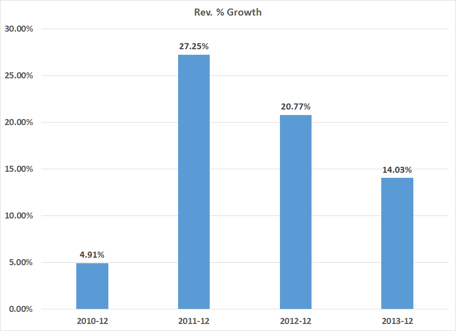
Coming out of the recession, growth was slow at a bit under 5%. 2011 and 2012 had some strong growth (perhaps pent-up demand kicking in) while 2013's figure was a bit more subdued. However, for a maturing company like Ebay, 14% is certainly nothing to sneeze at. Given Ebay is a mature company, top line revenue growth in the 14%-20% is far more likely.
Let's turn to the cash flow statement, starting with the relationship between operating earnings and investment activities. A mature company like Ebay should be able to derive investment funds from its operations, thereby freeing it on the financing side.
Here's a chart of the difference between operating cash flows and investment expenditures:

Ebay received a big cash infusing in 2009. In that year, they had $2.9 billion in operating income but only $1.1 billion in investments. Then they only had $567 million in PPE investments which was 19% of operating revenues. It's also highly probably management invested minimally as the economy was just emerging form the recession and growth was low. In 2010, there is still a net increase in cash, again with the most likely reason being conservatism on the part of management; their biggest investment expense was still PPE, but that total was only 26% of operating expenses. In 2011 and 2012, Ebay ramped up PPE investments, which totaled $963.5 million and $1.257 billion, respectively. The growth in their overall PPE expenditures is expressed in this chart:

In addition to strong increases in PPE, Ebay has been adding to their overall investment portfolio at a strong pace on an annual basis:

These investments have gone both to cash (in the form of short-term securities) and overall investments.
Finally, let's turn to the financing section of the cash flow statement. It shows two points.
1.) Over the last five years, Ebay has issued $4.4 billion in debt and repaid $1.5 billion, for a net change in debt outstanding of $2.8 billion.
2.) Ebay has repurchased a little over $4 billion in stock. Overall treasury stock has increased from $5.3 to $9.3 billion.
This leads to an interesting question: if and when Ebay will pay a dividend. Consider EBay's retained earnings:

Total retained earnings have increased from $8.3 billion in 2009 to $18 billion in 2013. The board is obviously paying shareholders now in the form of share buybacks. But, given that high level of retained earnings and EBay's ability to generate cash, a dividend might be in the future.
So, to conclude, EBay's management has costs under control as evidenced in the income statement. Margins have been constant and growth has been steady. I would expect a drop in annual growth rates to the high teens in the future. The cash flow statement indicates the company has the ability generate a large percentage of its investment needs through ongoing sales, freeing the company up when it comes to structuring their financing.
Simply put, EBay's a solid company.
When looking at a large, established company's earnings and cash flow statements, the main thing I want is predictability and consistency. While I don't expect the numbers to be completely uniform, lots of jumping around indicates the underlying economy is weak or that management may be having problems. With that in mind, let's start by looking at Ebay's Margins:
Over the last 5 years, the gross margin has declined from 71.58% in 2009 to 68.62% in 2013 -- a drop of about 4%. This isn't fatal; it does indicate the COGS has increased slightly over the last 5 years. At the same time, the operating margin has increased from 16.69% to 21.01%. The primary reason for this increase is SGA expenses as a percent of gross revenue have decreased from 37.86% in 2009 to 29.68% in 2013. The net margin has decreased from 27.37% in 2009 to 17.8% in 2013. But this drop is a bit of a misnomer; in 2009, the company recorded $1.4 billion in "other" income, in addition to income from continuing operations. In other words, a net margin in the high teens (17%-19%) is far more customary.
The decrease in the SGA expenses is encouraging, as it indicates costs are clearly under control. That's always a good sign. And the overall consistency in the revenue statement's margins also tells us management has a steady and disciplined hand.
Next, let's take a look at the company's overall revenue growth:
Coming out of the recession, growth was slow at a bit under 5%. 2011 and 2012 had some strong growth (perhaps pent-up demand kicking in) while 2013's figure was a bit more subdued. However, for a maturing company like Ebay, 14% is certainly nothing to sneeze at. Given Ebay is a mature company, top line revenue growth in the 14%-20% is far more likely.
Let's turn to the cash flow statement, starting with the relationship between operating earnings and investment activities. A mature company like Ebay should be able to derive investment funds from its operations, thereby freeing it on the financing side.
Here's a chart of the difference between operating cash flows and investment expenditures:
Ebay received a big cash infusing in 2009. In that year, they had $2.9 billion in operating income but only $1.1 billion in investments. Then they only had $567 million in PPE investments which was 19% of operating revenues. It's also highly probably management invested minimally as the economy was just emerging form the recession and growth was low. In 2010, there is still a net increase in cash, again with the most likely reason being conservatism on the part of management; their biggest investment expense was still PPE, but that total was only 26% of operating expenses. In 2011 and 2012, Ebay ramped up PPE investments, which totaled $963.5 million and $1.257 billion, respectively. The growth in their overall PPE expenditures is expressed in this chart:
In addition to strong increases in PPE, Ebay has been adding to their overall investment portfolio at a strong pace on an annual basis:
These investments have gone both to cash (in the form of short-term securities) and overall investments.
Finally, let's turn to the financing section of the cash flow statement. It shows two points.
1.) Over the last five years, Ebay has issued $4.4 billion in debt and repaid $1.5 billion, for a net change in debt outstanding of $2.8 billion.
2.) Ebay has repurchased a little over $4 billion in stock. Overall treasury stock has increased from $5.3 to $9.3 billion.
This leads to an interesting question: if and when Ebay will pay a dividend. Consider EBay's retained earnings:
Total retained earnings have increased from $8.3 billion in 2009 to $18 billion in 2013. The board is obviously paying shareholders now in the form of share buybacks. But, given that high level of retained earnings and EBay's ability to generate cash, a dividend might be in the future.
So, to conclude, EBay's management has costs under control as evidenced in the income statement. Margins have been constant and growth has been steady. I would expect a drop in annual growth rates to the high teens in the future. The cash flow statement indicates the company has the ability generate a large percentage of its investment needs through ongoing sales, freeing the company up when it comes to structuring their financing.
Simply put, EBay's a solid company.
Tuesday, July 1, 2014
What do the long leading indicators forecast for 2H 2014 and 1H 2015?
- by New Deal democrat
With the first half of 2014 in the books, I take a look at the long leading indicators, that usually turn a year or more before the economy turns, at XE.com. We now can begin to see the outlines of the first half of 2015.
Ebay, Part 1: The Balance Sheet
One of my favorite guilty pleasures is looking at guitars on EBAY. I've never purchased an instrument on line (and probably never would). But, this activity got me thinking about EBAY as a company and potential investment, which first led me to the stock's chart. Shifting to a weekly time frame, we get this picture:

Ebay was trading between the upper 40s and upper 50s for most of last year. Momentum has been declining and the CMF indicates volume is starting to flow out of the stock. This is not an encouraging picture from a technical perspective.
Then there is the relationship between EBAY and the SPYs:

The chart above shows EBAY/SPY. The declining nature of this relationship indicates the SPYs are outperforming EBAY. Clearly there is something about the company the market does not like, which led me to look at EBAYs' financials.
In the following analysis, I downloaded a spreadsheet of Ebay's balance sheet, income statement and cash flow from Morningstar.com.
Let's start by looking at the company's balance sheet starting with the liquidity position and beginning with the composition of its cash:

Over the last five years, Ebay has changed the composition of its cash holdings, slowing increasing the percentage of investments relative to cash. In 2009, the percentage of securities to cash was 19%. This percentage increased to 50% in 2013. The 10-K offers the following explanation of the firm's investment policy:
Short-term investments, which may include marketable equity securities, time deposits, certificates of deposit, government bonds and corporate debt securities with original maturities of greater than three months but less than one year when purchased, are classified as available-for-sale and are reported at fair value using the specific identification method. Unrealized gains and losses are excluded from earnings and reported as a component of other comprehensive income (loss), net of related estimated tax provisions or benefits.
Long-term investments may include marketable government bonds and corporate debt securities, time deposits, certificates of deposit and cost and equity method investments. Debt securities are classified as available-for-sale and are reported at fair value using the specific identification method. Unrealized gains and losses on our available-for-sale investments are excluded from earnings and reported as a component of other comprehensive income (loss), net of related estimated tax provisions or benefits.
Certain time deposits are classified as held to maturity and recorded at amortized cost. Our equity method investments are investments in privately held companies. Our consolidated results of operations include, as a component of interest and other, net, our share of the net income or loss of the equity method investments. Our share of investees' results of operations is not significant for any period presented. Our cost method investments consist of investments in privately held companies and are recorded at cost. Amounts received from our cost method investees were not material to any period presented.
We assess whether an other-than-temporary impairment loss on our investments has occurred due to declines in fair value or other market conditions. With respect to our debt securities, this assessment takes into account the severity and duration of the decline in value, our intent to sell the security, whether it is more likely than not that we will be required to sell the security before recovery of its amortized cost basis, and whether we expect to recover the entire amortized cost basis of the security (that is, whether a credit loss exists). We did not recognize an other-than-temporary impairment loss on our investments in 2013, 2012, or 2011.
The 10-k does not break down investment holdings, except to note they are short-term.
Next, let's turn to the company's liquidity ratios:

All of EBAYs' short term liquidity measures -- from the more liberal current ratio (assets/liabilities) to the more conservative cash ratio (cash/short term liabilities) -- are declining. What's important about this decline is it can't be attributed to a shifting of assets from cash to investments. If that were the case, we'd see a decline in the cash ratio but an increase in the quick ratio. Instead, all are moving lower.
However, this is not a fatal development. In fact, it's by design. The defensive interval ratio has never fallen below 1 in the last five years.

In addition, the company has a large credit facility. From their 10-K: We also have a $3.0 billion revolving credit facility, under which we maintain $2.0 billion of available borrowing capacity in order to repay commercial paper borrowings in the event we are unable to repay those borrowings from other sources when they come due. As of December 31, 2013, no borrowings or letters of credit were outstanding under this revolving credit facility and, accordingly, $1.0 billion of borrowing capacity was available for other purposes permitted by this credit facility.
The next issue to discuss is the growth of receivables, which is shown in this chart:

Receivables have increased as a percentage of assets from 37.69% in 2009 to 55.61% at the end of last year. As a result, we've seen a decrease in cash from 58.44% to 38.76%. Over the same period, Ebay has been increasing its payment business, which explains some of the increase. However, the increase doesn't explain the entire growth, seen on the chart below in comparison to the growth in receivables.

In two years, receivables and payments grew at similar rates. However, in 2011 and 2012 receivables growth far out-stripped the growth in payments.
Another way to look at the growth in receivables is receivables as a percentage of various assets:

It's obvious that Ebay is expanding its revenue streams and is developing payment systems for this purpose. However, Ebay's core competency is online auctions. In getting into the payments business, Ebay is become a de facto lender -- albeit to a large number of extremely small creditors. Peter Lynch called this type of activity "de-worsification," which implies the company is expanding its business into a market segment that it knows little about.
On the balance sheet, we also have the LTD/assets ratio, which is clearly under control:

And finally, there is book value. I use two methods of calculating this number: the straight assets-liabilities and a revised method in which I strip out all goodwill and assume receivables are sold at 75 cents on the dollar. Both of these values have been increasing a solid rates for the last five years:

Ebay's balance sheet is financially solid. Over the last five years they have shifted a larger percentage of their cash assets into securities with the hopes of increasing their short-term yield. Despite declining liquidity ratios, their defensive interval is still solid, indicating they have more than enough cash on hand. Book value has been growing at a good clip and the LTD debt/assets ratio's highest level over the last 5 years is 11%. The one area of concern is the growth in receivables, which could indicate the company is relaxing credit standards at the expense of prudent management. It could also be a sign the company is moving away from its core competency of online auctions.
Ebay was trading between the upper 40s and upper 50s for most of last year. Momentum has been declining and the CMF indicates volume is starting to flow out of the stock. This is not an encouraging picture from a technical perspective.
Then there is the relationship between EBAY and the SPYs:
The chart above shows EBAY/SPY. The declining nature of this relationship indicates the SPYs are outperforming EBAY. Clearly there is something about the company the market does not like, which led me to look at EBAYs' financials.
In the following analysis, I downloaded a spreadsheet of Ebay's balance sheet, income statement and cash flow from Morningstar.com.
Let's start by looking at the company's balance sheet starting with the liquidity position and beginning with the composition of its cash:
Over the last five years, Ebay has changed the composition of its cash holdings, slowing increasing the percentage of investments relative to cash. In 2009, the percentage of securities to cash was 19%. This percentage increased to 50% in 2013. The 10-K offers the following explanation of the firm's investment policy:
Short-term investments, which may include marketable equity securities, time deposits, certificates of deposit, government bonds and corporate debt securities with original maturities of greater than three months but less than one year when purchased, are classified as available-for-sale and are reported at fair value using the specific identification method. Unrealized gains and losses are excluded from earnings and reported as a component of other comprehensive income (loss), net of related estimated tax provisions or benefits.
Long-term investments may include marketable government bonds and corporate debt securities, time deposits, certificates of deposit and cost and equity method investments. Debt securities are classified as available-for-sale and are reported at fair value using the specific identification method. Unrealized gains and losses on our available-for-sale investments are excluded from earnings and reported as a component of other comprehensive income (loss), net of related estimated tax provisions or benefits.
Certain time deposits are classified as held to maturity and recorded at amortized cost. Our equity method investments are investments in privately held companies. Our consolidated results of operations include, as a component of interest and other, net, our share of the net income or loss of the equity method investments. Our share of investees' results of operations is not significant for any period presented. Our cost method investments consist of investments in privately held companies and are recorded at cost. Amounts received from our cost method investees were not material to any period presented.
We assess whether an other-than-temporary impairment loss on our investments has occurred due to declines in fair value or other market conditions. With respect to our debt securities, this assessment takes into account the severity and duration of the decline in value, our intent to sell the security, whether it is more likely than not that we will be required to sell the security before recovery of its amortized cost basis, and whether we expect to recover the entire amortized cost basis of the security (that is, whether a credit loss exists). We did not recognize an other-than-temporary impairment loss on our investments in 2013, 2012, or 2011.
The 10-k does not break down investment holdings, except to note they are short-term.
Next, let's turn to the company's liquidity ratios:
All of EBAYs' short term liquidity measures -- from the more liberal current ratio (assets/liabilities) to the more conservative cash ratio (cash/short term liabilities) -- are declining. What's important about this decline is it can't be attributed to a shifting of assets from cash to investments. If that were the case, we'd see a decline in the cash ratio but an increase in the quick ratio. Instead, all are moving lower.
However, this is not a fatal development. In fact, it's by design. The defensive interval ratio has never fallen below 1 in the last five years.
In addition, the company has a large credit facility. From their 10-K: We also have a $3.0 billion revolving credit facility, under which we maintain $2.0 billion of available borrowing capacity in order to repay commercial paper borrowings in the event we are unable to repay those borrowings from other sources when they come due. As of December 31, 2013, no borrowings or letters of credit were outstanding under this revolving credit facility and, accordingly, $1.0 billion of borrowing capacity was available for other purposes permitted by this credit facility.
The next issue to discuss is the growth of receivables, which is shown in this chart:
Receivables have increased as a percentage of assets from 37.69% in 2009 to 55.61% at the end of last year. As a result, we've seen a decrease in cash from 58.44% to 38.76%. Over the same period, Ebay has been increasing its payment business, which explains some of the increase. However, the increase doesn't explain the entire growth, seen on the chart below in comparison to the growth in receivables.
In two years, receivables and payments grew at similar rates. However, in 2011 and 2012 receivables growth far out-stripped the growth in payments.
Another way to look at the growth in receivables is receivables as a percentage of various assets:
It's obvious that Ebay is expanding its revenue streams and is developing payment systems for this purpose. However, Ebay's core competency is online auctions. In getting into the payments business, Ebay is become a de facto lender -- albeit to a large number of extremely small creditors. Peter Lynch called this type of activity "de-worsification," which implies the company is expanding its business into a market segment that it knows little about.
On the balance sheet, we also have the LTD/assets ratio, which is clearly under control:
And finally, there is book value. I use two methods of calculating this number: the straight assets-liabilities and a revised method in which I strip out all goodwill and assume receivables are sold at 75 cents on the dollar. Both of these values have been increasing a solid rates for the last five years:
Ebay's balance sheet is financially solid. Over the last five years they have shifted a larger percentage of their cash assets into securities with the hopes of increasing their short-term yield. Despite declining liquidity ratios, their defensive interval is still solid, indicating they have more than enough cash on hand. Book value has been growing at a good clip and the LTD debt/assets ratio's highest level over the last 5 years is 11%. The one area of concern is the growth in receivables, which could indicate the company is relaxing credit standards at the expense of prudent management. It could also be a sign the company is moving away from its core competency of online auctions.
Monday, June 30, 2014
Australian Interest Rate Decision Preview
This is up over at XE.com.
http://community.xe.com/forum/xe-market-analysis/australian-decision-preview-no-change-inflationary-pressures-are-contained
http://community.xe.com/forum/xe-market-analysis/australian-decision-preview-no-change-inflationary-pressures-are-contained
There really is only 1 issue in 2016
- by New Deal democrat
Who gets to make appointments to the Supreme Court from 2017 through 2020? There really is no other issue.
And no whining about stare decisis, if it is a Democrat. Once again today the revanchist 5 indicated that a long-time precedent, this time from 1977, should not longer be treated as valid. What goes around, comes around.
[regular economic blogging will resume shortly]
The state of the housing market, May 2014
- by New Deal democrat
As I wrote last week in discussing existing home sales at XE.com, the housing market tends to cycle in a regular order:
- 1st, interest rates turn
- 2nd, permits, starts, and sales turn
- 3rd, prices turn
- 4th, inventory turns
Now that we are half the way through 2014, let's look at where each of those points in the cycle stands.
Interest rates
First, here is a graph, covering the last 30 years, of the YoY% mortgage rates (inverted so that higher rates give a lower value, blue) vs. housing permits, YoY change in 100,000's (red):

Interest rates on mortgages went up about 1.4% between May and July of last year. On 16 of 19 occasions since the end of World War 2, that big a change led to a YoY decline of at least -100,000 in permits. In this case, housing permits have gone sideways, with small YoY% declines in several months, including May, since the beginning of this year.
In May mortgage rates equalled their lowest in almost a year. Since that appears to have had a big effect on housing activity in May, here is a close-up of the last five years of the YoY% change in permits (red, left scale) and rates for a 30 year mortgage (blue, right scale):

As you can see, these generally are mirror images of one another.
I suspect the situation this year is analogous to the late 1960's, when Boomers first reached adulthood and the existing aparment stock was nowhere near adequate to the task. Multi-unit starts skyrocketed, despite higher interest rates, while single family homes languished. It was an era of generally rising interest rates, and any temporary decline was met with heightened housing activity.
Interest rates
First, here is a graph, covering the last 30 years, of the YoY% mortgage rates (inverted so that higher rates give a lower value, blue) vs. housing permits, YoY change in 100,000's (red):
Interest rates on mortgages went up about 1.4% between May and July of last year. On 16 of 19 occasions since the end of World War 2, that big a change led to a YoY decline of at least -100,000 in permits. In this case, housing permits have gone sideways, with small YoY% declines in several months, including May, since the beginning of this year.
In May mortgage rates equalled their lowest in almost a year. Since that appears to have had a big effect on housing activity in May, here is a close-up of the last five years of the YoY% change in permits (red, left scale) and rates for a 30 year mortgage (blue, right scale):
As you can see, these generally are mirror images of one another.
I suspect the situation this year is analogous to the late 1960's, when Boomers first reached adulthood and the existing aparment stock was nowhere near adequate to the task. Multi-unit starts skyrocketed, despite higher interest rates, while single family homes languished. It was an era of generally rising interest rates, and any temporary decline was met with heightened housing activity.
Permits, starts, and sales
Second, here is a graph of the change, in thousands, YoY of starts (blue), permits (red), new home sales (green), and existing home sales (orange) (note that the St. Louis FRED does not track pending home sales):


Both of these graphs show the clear deceleration in the housing market through 2013 and through March 2014. Whether the spike in starts and new home sales in April and May means the trend has bottomed, or whether these are payback for particularly bad winter season reports, remains to be seen.
This morning we got the final report, pending home sales, which surged by +6.1% in May compared with April, but was still down -5.2% YoY.

More specifically, through May 2014:
- Permits are down -7% from their October 2013 high
- Starts are down -9% from their November 2013 high
- New home sales just blew past their previous June 2013 high
- Existing home sales are down -5% from their July 2013 high
- Pending home sales are down -7% from their June 2013 high
As I wrote last week, May new home sales were as big an outlier to the upside as March was originally reported to the downside. March was subsequently revised about 10% higher. So we should be mindful of revisions, and I think the best way to look at the number is to average March through May, which combined are only about 1% higher YoY.
Today's pending home sales report also adds unusually useful information. In the late 1960s and 1970s, the era of rising interest rates, buyers would pick and choose when to buy, and would pounce whenever there was a meaningful, if short term, did in rates. In May of this year, mortgage rates got as low as 4.12%, the lowest since June 2013 but for one week in October. Since pending sales are based on contract signings, it is likely that buyers jumped in response to these low rates.
Further, just as in the late 1960's, when Boomers first entered the market, now it is Millennials. Now as then, it is only multi-unit (apartment) construction that is carrying the recovery in housing this year. Single family home starts and sales have completely stalled. Here is a graph of single family permits (blue) compared with 5 unit or higher permits (red) since January 2013:

It is easy to see that it is multiunit construction, especially beginning in the second half of 2013, that is entirely responsible for any continuing increase in residential construction. Single family home construction and sales have gone essentially nowhere since the beginning of 2013.
Prices
Prices continue to increase, but YoY the price gains are decelerating, and in the case of existing home sales the non-seasonally adjusted data shows May 2014 prices below June and July 2013 prices. So let's start by showing the YoY% change in median prices in the Case Shiller 20 city index:

The YoY% change in median prices for new homes (red) and existing homes (blue): shows the same deceleration:

Finally, it is worth noting that the same deceleration is also showing up in the data at Depatment of Numbers Housing Tracker. I used this database of asking prices, which is updated weekly, to call in real time both the top of the housing boom in 2006, and the bottom of the housing bust in 2012. What is particularly noteworthy is that in 2006, it was the asking prices for houses in the 75th percentile (more expensive homes) which turned first. Now prices for those same more expensive houses are showing the most deceleration of all, as shown in this table, which shows the YoY% change for each percentile of houses for sale nationwide:
Inventory
With housing prices still increasing, albeit at a reduced rate, we would expect to find more inventory entering the market, as potential sellers hope to take advantage of the improved pricing situation. And that's exactly what we find. Below is the graph of combined new and existing home inventories:
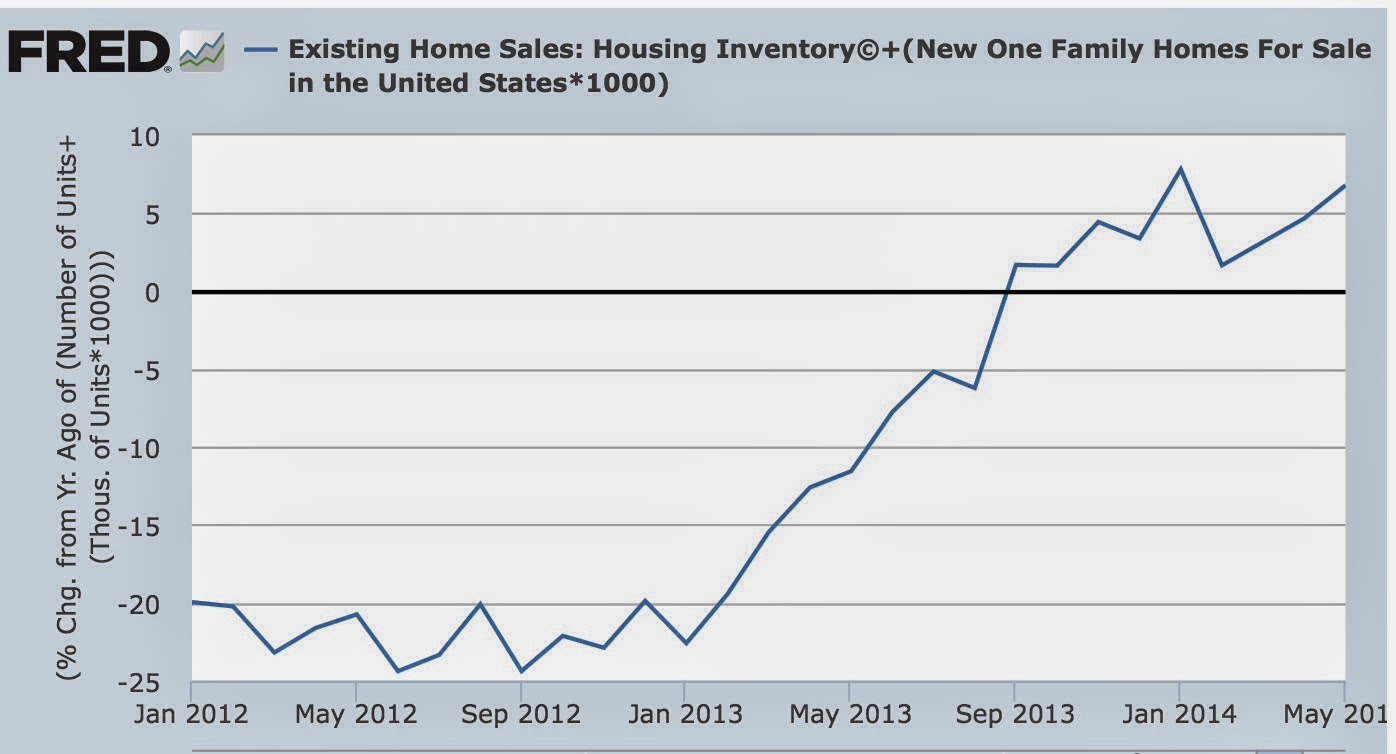
The inventory of houses for sale is not just increasing, but it is increasing at an accelerating rate YoY.
In summary, examining interest rates, sales, prices, and inventory in order:
Today's pending home sales report also adds unusually useful information. In the late 1960s and 1970s, the era of rising interest rates, buyers would pick and choose when to buy, and would pounce whenever there was a meaningful, if short term, did in rates. In May of this year, mortgage rates got as low as 4.12%, the lowest since June 2013 but for one week in October. Since pending sales are based on contract signings, it is likely that buyers jumped in response to these low rates.
Further, just as in the late 1960's, when Boomers first entered the market, now it is Millennials. Now as then, it is only multi-unit (apartment) construction that is carrying the recovery in housing this year. Single family home starts and sales have completely stalled. Here is a graph of single family permits (blue) compared with 5 unit or higher permits (red) since January 2013:
Prices
Prices continue to increase, but YoY the price gains are decelerating, and in the case of existing home sales the non-seasonally adjusted data shows May 2014 prices below June and July 2013 prices. So let's start by showing the YoY% change in median prices in the Case Shiller 20 city index:
The YoY% change in median prices for new homes (red) and existing homes (blue): shows the same deceleration:
Finally, it is worth noting that the same deceleration is also showing up in the data at Depatment of Numbers Housing Tracker. I used this database of asking prices, which is updated weekly, to call in real time both the top of the housing boom in 2006, and the bottom of the housing bust in 2012. What is particularly noteworthy is that in 2006, it was the asking prices for houses in the 75th percentile (more expensive homes) which turned first. Now prices for those same more expensive houses are showing the most deceleration of all, as shown in this table, which shows the YoY% change for each percentile of houses for sale nationwide:
Month
|
25th
percentile
|
50th
percentile
|
75th
percentile
|
|---|---|---|---|
Jun 2013
|
6.3
|
7.4
|
7.5
|
Sep 2013
|
12.0
|
10.9
|
7.9
|
Dec 2013
|
13.3
|
11.2
|
7.8
|
Mar 2014
|
13.8
|
10.7
|
6.3
|
Jun 2014
|
14.3
|
10.9
|
5.9
|
Inventory
With housing prices still increasing, albeit at a reduced rate, we would expect to find more inventory entering the market, as potential sellers hope to take advantage of the improved pricing situation. And that's exactly what we find. Below is the graph of combined new and existing home inventories:
The inventory of houses for sale is not just increasing, but it is increasing at an accelerating rate YoY.
In summary, examining interest rates, sales, prices, and inventory in order:
- With interest rates turning slightly lower YoY, there will probably be renewed vigor in housing permits, starts, and sales by the end of this year. We have either already seen the interim bottom in permits, starts, and sales, or will shortly.
- Decelerating and/or YoY declining sales have existed long enough for prices gains to decelerate, although they haven't turned negative. The median price for existing home sales, however, may turn negative in the next 2 months.
- Although prices are decelerating, they are still higher YoY and thus inventory is continuing to pour onto the market. This will probably continue, but will begin to decelerate between now and the end of this year.
Interest rates have turned, sales are bottoming, prices are increasing at a quickly decelerating rate, and inventory is still increasing smartly. As per the normal order.
Sunday, June 29, 2014
A thought for Sunday: towards a leading index for wage growth
- by New Deal democrat
A nerd's work is never done. I owe XE.com a column on margin debt from 3 months ago. I owe Angry Bear a column on 401(k)'s that is still in its first draft stage. I haven't finished comparing low vs. high wage job historical recoveries to see if this expansion has been different in quality, or just severity, in terms of the distribution of jobs creatted. As I've mentioned before, if you knew how little time I really have after regular obligations, you'd be surprised I am able to post at all. Despite that, I am going to add on a new challenge.
The two most important economic issues to average Americans are jobs and wages.
A lot of work has been done as to leading indicators for jobs. For example, the Conference Board has an Employment Trends Index which it calculates from public data sources, and leads the jobs report by about 6 months (It's still rising, by the way). Back in 2009, I wrote extensively about other economic indicators which telegraphed subsequent jobs growth (in particular real retail sales and the ISM manufacturing index), and used them to predict that jobs would hit bottom at the end of that year. Depending on which data revision is current, I was either spot on or off by two months. Since job are one of the four big coincident indicators, the Index of Leading Indicators itself is a decent first approximation of what will happen with job growth in the near future.
But almost no publicly available research appears to have been done to determine reliable leading indicators for nominal or real wage growth. Most of the discussions about wages tend to be negative, as in, "when will wage growth require the Fed to raise interest rates?" Even the one allegedly leading index I found, the "Bllomberg BNA wage trend indicator" (blue in the graph below), actually lags wage growth (red):

Secularly wages have been stagnant for almost 15 years. In fact, wages now are below wages in the 1970s in real terms. Cyclically real wages actually rose during the Great Recession due to the temporary collapse in gas prices. With the rise in gas prices, real wages fell into 2012, and with the general sideways movement in gas prices since, real wages have very slowly risen.
It would be valuable to be able to confidently forecast the direction of real wages over the next 6 to 12 months. Along with jobs, it is the big concern of most average Americans. I've done some preliminary work, and found a few surprising correlations, enough to be able to at least make a back of the envelope forecast. As time permits, I hope to lay this all out for you in the next month or so, and do a lot more research during the rest of this year to refine an approach towards establishing a leading index for wage growth.
Subscribe to:
Posts (Atom)