This is up over at XE.com
http://community.xe.com/forum/xe-market-analysis/international-week-review-creeping-deflation-and-secular-stagnation-edition
Saturday, April 19, 2014
Weekly Indicators for April 14 - 18 at XE.com
- by New Deal democrat
My Weekly Indicator post is up at XE.com. There was a stark difference in hiring permanent employees vs. hiring temporary employees and firing this past week.
Friday, April 18, 2014
No, the ratio of "employer-to-employer flows" does *NOT* prove the job market isn't improving
- by New Deal democrat
Mike Konczal of the Next New Deal has a post up claiming to show that even the currently employed are struggling to find jobs, and therefore there has been no jobs recovery. Like many Doomish arguments, it suffers from "proving too much." The author finds some metric either flatlining or going down since 2009, therefore conditions are not improving. The author never thinks through the implications of the same data showing the exact same thing for previous economic expansions. That's Konscal's problem here.
Konczal says:
Even those who have been unemployed zero weeks are having trouble finding jobs in this economy. And this is important evidence against the idea that the labor market is doing better than people realize if you just ignore the long-term unemployed.
.... If the economy is heating up significantly and the long-term unemployed aren’t capable of taking jobs, then the EE transition rate should be increasing. So how is it doing?
.... If the economy was heating up and the unemployed or those out of the labor force couldn't take jobs, we would expect this to increaseHere's the graph Konczal uses to support his conclusion:
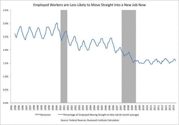
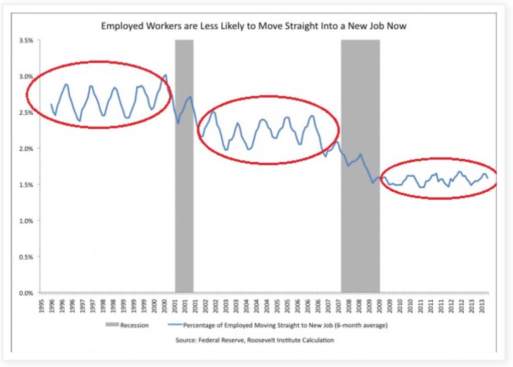
Except here's the problem: the graph just isn't flatlining since 2009 to the present. It also flatlines from 2003 to 2008, and even more tellingly, from 1994 to 1999 - during the biggest economic boom since the 1960s (highlighted below):
Is Konczal seriously contending that "the labor market wasn't improving" during the biggest boom in the last half century?
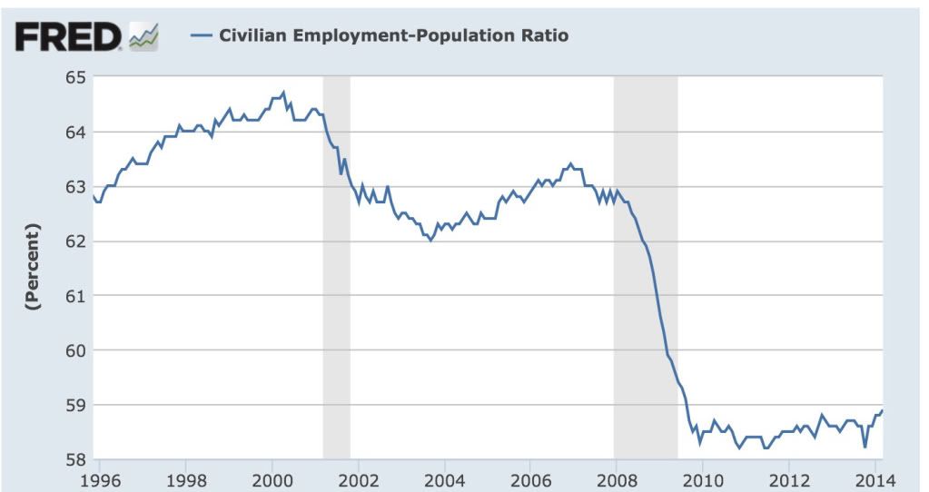
The "stair-step down" trend in Konczal's graph reminded me of another, namely, the employment to population ratio. Here is that graph for the same period of time:
As it turns out, that isn't a coincidence. The Census Bureau also took a detailed look at this data in 2006 (pdf). Here's their graph showing the data up until that point:
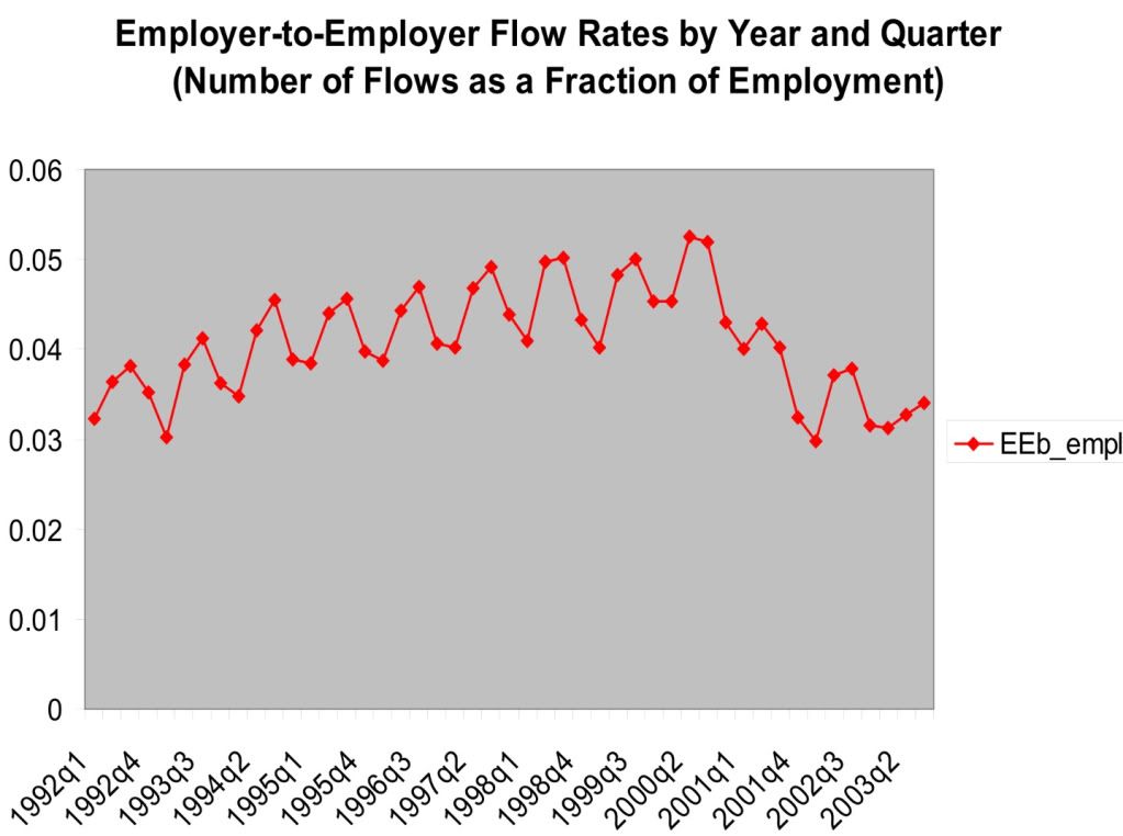
Notice how closely the data tracks the employment to population ratio. Unlike Konczal's graph, the Census Bureau's graph does slightly increase during the mid-1990s. This is likely due to the fact that the two graphs are measuring slightly different things: Konczal's graph measures the "percentage of employed moving straight to a new job" on a 6 month basis, while the Census Bureau's graph measures "number of flows as a fraction of employment" on a quarterly basis.
Konczal's problem is that he entirely fails to take into account the effect of demographics. Here's the Census Bureau's graph showing how employer to employer flows skew by age:
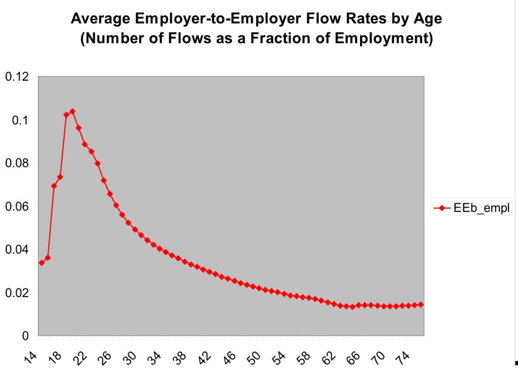
A huge percentage of employer to employer flows comes from people in their 20's. The percentage declines sharply as we move into the 30's and continues to gradually decline thereafter until about age 60.
So what Konczal has failed to account for is the huge distortion in the demographics of the work force caused by young people staying in college longer, and by the Boomer generation skewing the median employment age much higher into the age group that wants nothing more than to hang on to their current job until retirement age.
In other words, Konczal's graph appears to be another manifestation of the employment to population ratio, and not say anything about the relative strength of this job recovery. (My position remains, there has been a jobs recovery, it just hasn't been strong enough.) His data is sound, but his conclusion is faulty because it proves too much.
Thursday, April 17, 2014
A note about the strong rebound in March economic data
- by New Deal democrat
I have a post up at XE.com about the recent run of excellent March economic data.
Thoughts On Inflation In Light of Yellen's Comments Yesterday
This is up over at XE.com
http://community.xe.com/forum/xe-market-analysis/thoughts-us-inflation-light-yellens-comments
http://community.xe.com/forum/xe-market-analysis/thoughts-us-inflation-light-yellens-comments
Coke and Pepsi Now Tied Over the Last 10 Years

When I was a kid, I assumed that coke was the stronger brand. In retrospect, that impression was probably created by the "Pepsi challenge" marketing plan when I was kid (this was the 1970s).
But flash forward to the last 10 years and you wind up with a tie game between the performance of both stocks. Pepsi was the winner during the previous expansion. The two had similar performance in '08, Coke eventually outperformed Pepsi from 11-13, but now the two are more or less tied.
Wednesday, April 16, 2014
Tuesday, April 15, 2014
Real retail sales set new high: real wages decline
- by New Deal democrat
Based on the March reports, I can now update two of my frequent metrics: real retail sales, and real wages.
March inflation was only +0.2%, which still caused a small increase in the YoY measure. This is almost all due to the price of gas, which had already hit its 2013 high in early March, whereas gas is still increasing seasonally this year.
Real retail sales hit a new high in March:
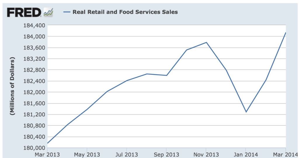
so the expansion is intact.
Since real retail sales per capita tend to hit their peak a year or more before any recession, let's look at that measure as well:
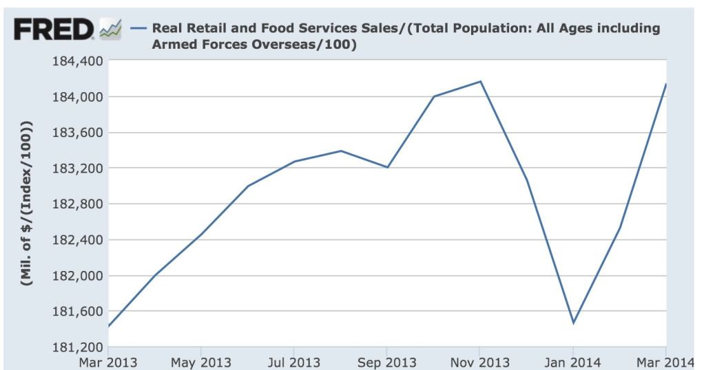
Here we haven't quite made a new high. Note that we had a similar decline in 2012 before sales per capita hit their stride again.
Finally, with the -$.02 decline in average hourly earnings in March, real wages took a significant hit:
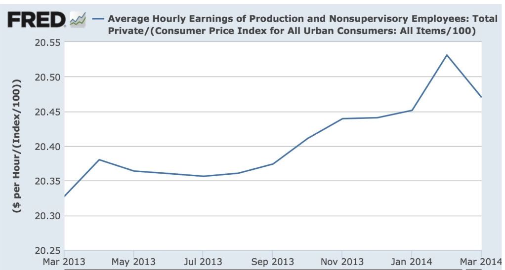
Real wages are still up YoY, and there is no sign that the trend is changing. Still, the average American household could use a raise, particularly since the increase in interest rates last year have brought refinancing to a screeching halt.
Monday, April 14, 2014
Indian Market Rallying on Election Hopes

India is in the middle of national elections. There is strong hope that a technocratic politician will win be nominated prime minister and that his pro-business orientation will help to break the log-jams inherent in Indian politics.
Right now markets have topped out at highs established in early May of last year. However, the uptrend remains firmly intact.
For more on this, see the NY Times coverage which has been very informative.
Sunday, April 13, 2014
International Week in Review: More Problems From China Edition
International Week in Review: More Problems From China Edition:
http://community.xe.com/forum/xe-market-analysis/international-week-review-chinas-problems-continue-edition
http://community.xe.com/forum/xe-market-analysis/international-week-review-chinas-problems-continue-edition
Subscribe to:
Posts (Atom)