Saturday, January 19, 2013

Weekly Indicators: Consumers, on a tear, ignore increased tax withholding edition


- by New Deal democrat

December monthly data reported this past week included housing permits and starts, both up to new 4 year highs. These are important long leading indicators and, needless to say, quite positive. Producer prices declined slightly, and consumer prices were flat. Retail sailes were up signficantly. The only negative news was the continuing decline in consumer confidence, especially expectations. Both housing permits and consumer expectations are components of the LEI which will be reported this week.

Let's start this look at the high frequency weekly indicators by checking out how the increase in tax withholding may be affecting consumer spending.

Consumer spending
  • ICSC -0.6% w/w +3.3% YoY

  • Johnson Redbook +1.9% YoY

  • Gallup daily consumer spending 14 day average $83 up $19 or +30% YoY!!!
Gallup remains blazingly positive, with spending up sharply compared with January last year, and remaining close to holiday season levels. The ICSC varied between +1.5% and +4.5% YoY in 2012. Johnson Redbook is also in its generally YoY growth range from 2012.

Housing metrics

Housing prices
  • YoY this week. +2.7%
Housing prices bottomed at the end of November 2011 on Housing Tracker, and have averaged an increase of +2.0% to +2.5% YoY for the last year, so this is a particularly positive reading.

Real estate loans, from the FRB H8 report:
  • -0.2% w.w

  •  +1.8% YoY

  • +2.6% from its bottom
Loans turned up at the end of 2011 and averaged about 1% gains YoY through most of 2012, and have recently shown somewhat more YoY strength.

Mortgage applications
  • +13% w/w purchase applications

  • +5% YoY purchase applications

  • +15% w/w refinance applications
Purchase applications have been going sideways for 2 years, and this week's reading was at the top of that range, the best reading since April 2011. Refinancing applications were very high for most of last year with record low mortgage rates. With the recent increase in rates, these declined substantially in the several months, but have turned back up in the last two weeks.

Interest rates and credit spreads
  • -0.01%% to 4.70% BAA corporate bonds

  • +0.03% to 1.90% 10 year treasury bonds

  • -.04% to 2.80% credit spread between corporates and treasuries
Interest rates for corporate bonds have been falling since being just above 6% two years ago in January 2011, hitting a low of 4.46% in November 2012. Treasuries have fallen from about 2% in late 2011 to a low of 1.47% in July 2012. Spreads have varied between a high over 3.4% in June 2011 to a low under 2.75% in October 2012. That makes the credit spread this week exceptionally positive.

Money supply

M1
  • -0.7%% w/w

  • -0.5% m/m

  • +8.3% YoY Real M1

M2
  • +0.1% w/w

  • +1.5% m/m

  • +5.7% YoY Real M2
Real M1 made a YoY high of about 20% in January 2012 and has generally been easing off since. This week's YoY reading is a new low since then. Real M2 also made a YoY high of about 10.5% in January 2012. Its subsequent low was 4.5% in August 2012. Both are still quite positive in absolute terms.

Oil prices and usage
  •  Oil $95.56 up $2.00 w/w

  •   gas $3.30 flat w/w

  • Usage 4 week average YoY -0.6%
Gas prices remain seasonally low. Usage continues to run negative YoY as it has for most of the last year plus.

Employment metrics
Initial jobless claims
  •   335,000 down 36,000

  •   4 week average 359,250 down 6,500
American Staffing Association Index
  • up 13 from 74 to 87 w/w
Daily Treasury Statement tax withholding
  •  $171.6 B (adjusted for 2013 tax changes) vs. $171.1 B +0.3% YoY last 20 days

  •  $106.6 B (unadjusted) vs. $109.1 B down -2.5 B 1st 12 days of January monthly YoY
Initial claims made a new 5 year low this week. The increase in the ASA Index is normal in early January. In the second half of 2012 the index's performance compared with 2011 declined significantly, although the absolute index was higher. Next week is probably the last week for any seasonal influence to dominate. Tax withholding was very weak this past week, which may be an anomaly. Please note I am adjusting my YoY figures to reflect the increase in personal withholing tax rates since the first of the year.

Transport

Railroad transport
  •  -19,100 or -6.4% carloads YoY

  • +2300 or +1.5% carloads ex-coal

  • -23,700 or +10.4% intermodal units

  • +4700 or +0.9% YoY total loads

  • 13 of 20 types of carloads up YoY, an increase of 7 from last week
Shipping transport
  • Harpex flat at 356

  • Baltic Dry Index up 77 to 837
Rail transport has been whipsawing between very positive and very negative readings over the last month. This may well be the aftermath of the dock strikes. Hopefully it will return to less volatile readings in the next week or two. The Harpex index is near its 3 year low of 352, but the Baltic Dry Index is well above its 52 week low of 52, although far off its 52 week high of 1100.

Bank lending rates
  • 0.232 TED spread down -0.008 w/w

  • 0.2047 LIBOR down .001 w/w
The TED spread is near its 52 week low. LIBOR is at a new 52 week low and is close to a 3 year low.

JoC ECRI Commodity prices
  • up 1.08 to 128.13 w/w

  • +3.44 YoY
Very little was negative this week. The Daily Treasury Statement was barely positive YoY. Gasoline usage continues to run negative YoY. Money supply was less positive than it has been recently. Consumer confidence, especially expectations about the future, continues to decline.

Almost everything else was positive to extremely positive. Consumer spending, especially as measured by Gallup, remains quite strong, despite the increased tax withholding in their paychecks. Initial jobless claims are quite positive. Bank lending rates and interest rate spreads are also very positive. Gas prices remain accomodative. House prices, loans, and mortgage applications are all positive, suggesting that the positive housing trend reflected in starts and permits will continue. Shipping rates are up slightly.

I remain most interested in when or whether the 2% increase in withholding tax rates will have an effect on consumers, although it certainly hasn't shown up yet! Right now, the high frequency indicators show continued economic expansion.

Have a nice weekend.

Friday, January 18, 2013

Thanks For Our "Linkiest" Week Ever -- and Have A Good Weekend

This week we have seen a tremendous amount of activity for out little slice of the economic blogsphere.

First, Abnormal Returns linked to several of our pieces over the week.

Second, yesterday Professor DeLong listed us on his frequently read reading list.

Third, Business Insider and Seeking Alpha picked up a few of our pieces.

And yesterday and today, NDD's piece holding ECRI to task for their recession call was linked to by FT Alphaville, Real Clear Markets, Barry Ritholtz and Tim Iocano. 

For both NDD and I, this blog is a labor of love.  We both find economics and finance utterly fascinating and enjoy writing about it.  We are also both very honored and flattered to be mentioned by some of the most esteemed and well-regarded economic bloggers around.

For those of you new to the blog, I take the weekend off.  NDD will post a piece tomorrow on high frequency indicators.  And while I usually publish pictures of our dogs to head into the weekend, this week I wanted to acknowledge the many gracious shout-outs from our peers. 

Until Monday, have a good and safe weekend.

------
NDD here with one caveat:  We're still pining away for the HOLY GRAIL OF PROGRESSIVE ECONOMIC BLOGGING, however ... a positive link from Paul Krugman.  So if someone wants to take him out and get him liquored up or something to help move things along on our behalf, that would be just fine with us.


What's Really Happening In Europe?

This is a great summation of what is happening economically in the EU, from the Economists Free Exchange blog:

Let's recall what the euro area is trying to do here. The single-currency area developed a big balance-of-payments problem during the pre-crisis era; capital flooded from north to south to take advantage of higher returns in the fast growing periphery. When crisis struck the capital flooded back, leaving overextended borrowers and overpriced, undercompetitive labour. To service its debts, the periphery needed to flip to running surpluses. Typically, this process would have been facilitated by a big devaluation, but the single currency prevented that. And so instead the euro area has opted for "internal devaluation": a long period of stagnant to falling wages pushed forward by prolonged high unemployment.

High unemployment is the flip side of the macro choices begin made by peripheral governments. Domestic demand is bound to remain low thanks to unproductive labour and attempted deleveraging. Governments are also pulling back, further shrinking domestic demand. That leaves external demand as the only means to power growth. Unemployment will stay high until wages fall enough to support the huge surpluses needed to spark growth and hiring.

But we all know the rub: euro-area members' biggest trading partners are...other euro-area members. Member states can't all simultaneously raise net exports to other member states. So unless the northern core begins running big surpluses vis-a-vis the periphery, rising external demand means rising surpluses with the world outside the euro area.

As the latest data make clear, that is occuring. In the year to November of last year euro-zone exports were up 8% relative to the same period in 2011 while imports rose just 2%. The euro area's surpluses with Britain and America increased by nearly €13 billion and €14 billion, respectively, in that time, and its deficits with China and Japan dropped by €10 billion and €8 billion, respectively. But these figures, while directionally appropriate, are tiny relative to the output boost needed around the periphery. And neither is it clear that much of the gains are occuring around the periphery. Greece, Spain, and Portugal were running smaller trade deficits last year than in 2011, but not by that much—gaps shrank roughly €6 billion, €12 billion, and €5 billion, respectively. Meanwhile, Germany's surplus expanded by €19 billion.

Placing the Yen's Movements in Historical Perspective

On the 25 year yen chart, we see a consolidation pattern between 1998 and 2008.

But most importantly, the yen had a strong rally starting with the financial crisis and continuing until the fall of last year.  Overall, this rally represents an increase relative to the dollar of ~60%.  This rally also belies several standard thought process that would indicate a massive debt/GDP ratio (Japan's is now over 200%) and incredibly easy monetary policy would lead to a large drop in the yen's value.  Instead, Japan's political stability has led investor's to view the island as a safe haven in a time of extreme danger.


Morning Market Analysis


Several weeks ago, I noted that thanks to the ECB stating it would do whatever it takes to prop up the EU economy, the European markets have been rallying.  However, in that post I used weekly charts.  The above charts show that over the last six months, we see the same situation.  There are four charts (ESR, EWG, EWU, EWQ) where the MACD is either moving lower or sideways.  However, in all of these charts also notice that prices are above the 20 day EMA, using it for technical support.  The MACD in these charts indicates the charts are consolidating gains -- at least for now.


Yesterday, the oil market made a big move higher, moving through key Fibonacci levels.  There is very little technical resistance between current levels and the 100 price level -- an increase of about 4.75% from current levels.  As we begin to think about the summer driving season, a rally of that size could be possible.  However, the US is still amply supplied with oil.


Both the Peruvian market (top chart) and Chilean market (bottom chart) have made strong advances since the beginning of December.  Peru's market established a very nice long technical base from the months September through December, trading in a very narrow range.  Since breaking free from this base, the market has rallied nearly 9%.  While Chile's market was more volatile over this period it has, it has risen from a low of about 58 to 65.97 -- an advance of nearly 14%.  


Thursday, January 17, 2013

A Big Thank-You and Welcome to Professor DeLong's Readers

Both NDD and I are very flattered to learn we are on Professor DeLong's reading list.  This is indeed a very high honor.

Will China Save Us -- Again?

Chinese economic growth was a primary driver of the world-wide economic recovery from the great depression.  Thanks to a massive stimulus program initiated and implemented by the Chinese (a purely Keynes based program), China went on a massive infrastructure build.  This in turn increased the country's demand for raw materials which drove the economic growth of raw materials exporters like Australia, Brazil and Russia.  In essence, the BRIC countries -- thanks to China's spending -- prevented the world from collapsing into a world wide depression.

However, over the last 18-24 months, the Chinese central bank increased rates and raised reserve requirements in an effort to slow inflation and stave off a real estate bubble.  Here is a chart from the St. Louis Fed system of the Chinese discount rate:


Notice the increase at the end of 2010 from 2.8% to 3.2%.  This had the intended overall effect one would expect from the central bank increasing rates and reserve ratios: the Chinese economy slowed (slow, however, is a relative term, as the economy is still growing at a 7.7% clip).   Just as importantly, inflation slowed:


Note that the year over year percentage change dropped from over 4% in late 2011/early 2012 to the 2.5% readings we see now.  In addition, the current inflation spike is largely attributed to a cold winter which is spiking food costs, a situation which should abate in the Spring.

Finally -- and certainly not to be overlooked -- is the transfer of power to a new generation of party leaders which also occurred last year -- a situation which is not conducive to bold strokes.  I believe that this process has greatly hampered the economic decision making ability of China.  However, with prices now more under control and the transfer of power complete, China appears ready to grow again. Let's take a look at the overall situation to get a better feel for what might be in store for 2013.

One of the most read and perhaps most influential Chinese economic  report is is the HSBC manufacturing index.  Here is the summation from the latest report:

After adjusting for seasonal factors, the HSBC Purchasing Managers’ Index™ (PMI™) – a composite indicator designed to give a single-figure snapshot of operating conditions in the manufacturing economy – posted 51.5 in December, up from 50.5 in November, signalling a modest improvement of operating conditions in the Chinese manufacturing sector. Moreover, it was the highest index reading since May 2011.
 

Output at manufacturing plants in China expanded in December, and for the second month in a row. Although the rate of expansion was modest, it was the fastest in 21 months. Total new orders also increased but at a faster pace than in November, the quickest since January 2011. Exactly 15% of panellists noted increased order volumes, a number of which attributed growth to increased client demand. Meanwhile, new export orders fell slightly following a modest increase in November. Just over 12% of firms reported lower new export orders in the latest survey period. Fewer export sales were linked to weak demand in Europe, Japan and the US.

Here is a chart of the composite index:


While this index has been right below an expansion reading for about a year, note it never collapsed.  This tells us there was still activity, but it was more subdued.  However, the last two months we've seen an increase about the 50 level, indicating an expansion is now a possibility.

Moving on to the Services index, see the following summation of activity:

The HSBC China Composite PMI data (which covers both manufacturing and services) signalled a modest expansion of business activity during December. Output has now risen for four consecutive months. Moreover, the rate of growth quickened slightly from November to the fastest in the current sequence. The HSBC China Composite Output Index posted 51.8 in December, up from 51.6 in November.

Output increased across both the manufacturing and service sectors during December. The rates of expansion were broadly similar, with both sectors signalling modest growth. However, the rate of expansion in services slowed further, with the HSBC China Services Business Activity Index recording 51.7 in December, down from 52.1.

New orders also rose in both the manufacturing and service sectors during December. Growth of new business in the service sector was slightly faster in December than in November, but remained modest overall. Total new orders in the manufacturing sector also grew at a stronger pace in December, and largely drove the increase in composite new orders,  which rose at the quickest rate since October 2011.


Notice that during the same period when manufacturing was slowing, services also printed more modest numbers.  However, this sector of the economy remained positive in comparison to manufacturing's slightly negative reading.

China is attempting to reorient its economic model from an export-oriented model to a consumer led model.  On that note, the Chinese consumer is certainly doing their fair share as evidenced in Chinese retail sales:


Notice that during the period of the manufacturing slowdown, Chinese retail sales were still increasing at a very fast clip, indicating domestic demand was still very much alive and in decent shape.  Here is the summation from the

In November, the total retail sales of consumer goods reached 1,847.7 billion yuan, up by 14.9 percent year-on-year (nominal growth rate. The real growth rate was 13.6 percent. The follows are nominal growth rates if there’s no additional explanation). Of the total, the retail sales of consumer goods of industrial enterprises (units) above designated size was 939.5 billion yuan, increased 15.1 percent. From January to November, the total retail sales of consumer goods reached 18,683.3 billion yuan, up by 14.2 percent year-on-year (actual increase was 12.0 percent after deducting price factors). The total retail sales of consumer goods increased 1.47 percent in November, month-on-month.


ECRI's "tell-tale chart" now telling a different tale


- by New Deal democrat

A little over a month ago, ECRI - who started forecasting an "imminent" recession a year and four months ago, saying it may even have already started in August or September 2011 - premiered what they called their tell-tale chart, opining:
Reviewing the indicators used to officially decide U.S. recession dates, it looks like the recession began around July 2012. This is because, in retrospect, three of those four coincident indicators – the broad measures of production, income, employment and sales – saw their high points in July (vertical red line in chart), with only employment still rising.
Here's the chart:


With yesterday's reports of industrial production and real retail sales, however, the chart is now telling a different tale (all series have been set to 100 for July 2012):


As you can see, between November and December all four coincident indicators - industrial production, real retail sales, real income ex transfer payments, and payrolls - have all made new highs.

While we don't have the inflation adjustment for real manufacturing and trade sales, the series used by ECRI instead of real retail sales, that series doesn't help their case any more either. Manufacturing and trade sales for November were reported Tuesday at 1,271.6, up 2% from their previous post-recession high of 1,247.7 set in March. Unless there is a huge mysterious spike of inflation in November reported by the BEA later this month in the incomes and spending report, real manufacturing and trade sales will also set a new high.

For a year now ECRI has stopped discussing either their long or short leading indicators in public. When they make the rounds of CNN, CNBC, and Bloomberg the next time, will any of the interviewers have the journalistic integrity to ask where those leading indicators stand? Will they question ECRI about its previous blown forecasts of recession in late 2011, and then most likely in the first quarter of 2012 but in any event by midyear? Or will it be a journamalistic fluffing, with ECRI being allowed to ignore its own, now busted, "tell-tale chart," and premiere some other rationalization?

Initial claims fall to "normal" range for fist time since Great Recession


- by New Deal democrat

Initial jobless claims were reported at 335,000 this morning. This is the lowest level since January 19, 2008, five years ago.

Beyond that, it is the first time that initial claims have been reported in what would be a normal, expansionary range on a population-adjusted basis since the Great Recession. In the last expansion, claims averaged between 280,000 and 325,000 before they turned south towards the end of 2007. US population has grown 4% since that time, according to the Census Bureau, making the top end of the proportionate expansionary range 338,000.

When the stragglers get added in next week, we could very well be back above that range, but for now, this is the very first time that initial claims can be reported as unambiguous "good" news.

Morning Market Analysis

 
The daily semiconducter ETF chart (top chart) shows that prices are in the middle of an upward sloping channel. Prices have risen about 10 % over the last two months. The underlying technicals remain strong. However, the really impressive chart is the monthly chart (lower chart) which shows that prices consolidated in a triangle pattern, but have broken through upside resistance starting in December. Most importantly, notice the buy signal given from the MACD.


The daily chart of the TLTs (top chart) shows that prices sold off sharply at the beginning of the year, largely as a result of Congress averting the fiscal cliff.  However, since then prices have staged a relief rally and are currently hitting resistance at the 200 day EMA.  The 60 minute chart (middle chart) shows that prices have rebounded for the entire month's trading and are currently ensnared in the Fibonacci levels.  The weekly chart (bottom chart) places the action in historical position, with prices consolidating in a triangle pattern after having broken a year+ long rally.


The Chinese market is still in a rally, although it's increasing long in the tooth.  Starting at the beginning of the year, prices started moving sideways, eventually hitting the 10 day EMA for technical support.  Prices have rebounded from this level, but the bar printed yesterday is fairly weak for a follow through day.  Also note the decreasing strength of the MACD.

Wednesday, January 16, 2013

Brazil's Little Inflation and Growth Problem


The chart above shows that Brazilian GDP growth is clearly declining.  While the GDP projections are encouraging, it could also be argued they are a bit unrealistic given the GDP trend over the last three years.

In this period of declining growth, one would expect the Central Bank to lower interest rates thereby encouraging growth.  And that is what they have done:


However, Brazil may also have an inflation problem.  Consider this chart:


Overall inflation dropped from over 7% in July of 2011 to about 5% in July of 2102.  However, since then it has been increasing, and is currently at 5.53%.  This is at the upper end of the central banks inflation tolerance range:

Brazilian consumer prices ended 2012 near the top of the central bank’s target range for the third year running, prompting concern from economists that the country is stuck in a phase of low growth and high inflation.

Brazilian inflation in December was 5.84 per cent against a year earlier – well above the middle of the central bank’s target zone of 4.5 per cent plus or minus two percentage points – despite economic growth last year that was estimated to have been only about 1 per cent.

And just to make matters worse, the latest inflation projections indicate an potential increase in projected inflation:

The comparison of the trajectories shown in this Report with those released in the previous one – the latter shown in Table 6.3 –, in the baseline scenario, shows an increase in inflation projections for 2012, reflecting inflation rates in recent months higher than the corresponding projections presented in the last Report. In part, these higher rates reflect localized pressures on the prices of agricultural commodities, which have arisen between the second and third quarter of this year, which, however, have moderated recently. Still in the baseline scenario, the inflation projection stays in levels higher than the ones presented in the last Report until the third quarter of 2013. Moves toward similar or slightly lower levels in the succeeding quarters, partially reflecting a less intense domestic activity level than the one considered in the last Report. In the market scenario, the projections stay above values presented in the last Report until the first quarter of 2014, essentially due to the same reasons as well as to the more depreciated exchange rate than the one considered in the last Report. In the following quarters, similarly to what occurs in the baseline scenario, the projections in the market scenario move towards levels similar to the ones considered in the last Report, also reflecting the less favorable dynamics of the domestic economic activity.
 

Dear Matt Yglesias: the Important People ARE wrong to hate Social Security


- by New Deal democrat

AAAARRRGGHHH!!!! I hate to step on Bonddad's stuff, of which there is a ton today, but I simply have to comment on this article by Matt Yglesias about why "Important People" hate Social Security.

It boils down to an embrace of trickle down economics, and I know Yglesias isn't agreeing with their prejudice, but after describing why the entrenched elites hate Social Security, he writes the following two sentences, which completely set me off:
The important thing to note about this hatred is that it's not unjustified. The haters aren't wrong.
No, Matt. The haters ARE wrong, dammit. The prejudice goes to a fundamental flaw in the way neoclassical economics treats labor and demand.

Here's the critical error. Yglesias writes that
The Economy wants you to spend money on things that can be plausibly described as "investments" that drive future prosperity. And mailing a check to your grandma doesn't fit the bill.

You've got this big scheme to levy taxes on working people who are participating in The Economy and transfer money to people who've dropped out of The Economy. They take that money and use it to pay the electricity bill and buy a cookie for their grandkids. If they didn't get that money, they'd probably have to work longer and spend more years being part of The Economy. And they'd have to spend their working years being thriftier, and amassing more savings that (via the magic of the financial system) finance private sector investments in The Economy.
[my emphasis]

Excuse me, but when grandma pays her electric bill or feeds your kids a cookie, it has exactly the same value as when you pay your electric bill and you feed your kids a cookie. In fact, with consumer spending driving 70% of the economy, transfering money to someone who is probably going to spend all of it (as the large majority of seniors will), is an excellent way to keep the economy moving - versus, you know, Mitt Romney hiving it away in a trust in the Caymans.

More to the point, unlike what you learn in Econ 101, when you go down the hall and take Psych 101, you learn the actual truth, which is that drives can be sated. I may like steak, but not 5 steaks in a row. Or (true story) I have a relative who hit the lottery. BIG. Did he take that as an incentive to work harder? No, he immediately retired and is building his family a very nice house on the water in palm tree land (and if he is reading this, please don't forget to invite me!).

Most people have a Magic Number. That's the number, where, if they have the money, they would like to cash in their chips and ride on off into the sunset. If you double their salary, they don't work harder, they actually hit the number earlier and retire from the workforce.

Beyond that, weren't we told by no less than an authority than George W. Bush that if people could have control of their own retirement funds, they would invest it far more efficiently than in Social Security (never mind that Vanguard has studied the issue, and in fact individual investors in the aggregate made a whopping 2% on their investments during the entire 1983-2000 stock market boom). Which would mean that instead of having their withholding payroll taxes return only the inflation rate, they would supposedly hit their magic retirement number sooner.

And what would they do then? Why, retire, of course. So if the theory of the Important People is right, the masses would retire earlier rather than later, not the other way around.

No. The theory of the Important People only works if you pull off a bait and switch, where you con people into withholding a part of their pay for a retirement annuity (so gramma and grampa didn't spend the money in The Economy when they were younger), and then steal the money to put to other purposes. So, you know, tough luck gramma and grampa, you'll have to keep working now. We stole the money you were counting towards your Magic Number. HAHAHAHAHAHA!!!!

So to amend Yglesias' writing to make the point as directly as possible:
If they didn't get that money, they'd probably have to work roughly the same amount of time, and take the money that is now withheld in payroll taxes and put it into private savings, investments, or insurance, amassing the same amount of savings that they now withhold for Social Security. But it would be a lot riskier, and history shows they would be bad at it. The only difference is the identity of the Economic actor (federal government vs. Wall Street) who would direct the flow of the money in The Economy.
The entire economy has been run like a mafia Bustout to loot middle class assets for the last 30 years. No, Matt, the Important People are wrong about Social Security.

Bonddad Blog Named Top 100 Financial Blog

The website Suitpossum: Post-Crisis Adventures in Financial Subversion has done a review of financial websites to determine the top 100.  We've been named a Q3 blog, placing us in the top 100.  This is the second award we've been awarded in the past 6 months, and are honored to be included and named on such lists. 

Morning Market Analysis


Yesterday, Germany announced a negative GDP rate for the fourth quarter.  The market appeared to take the announcement in stride.  The top chart shows no meaningful daily movement, with the market will firmly in an uptrend.  The weekly chart shows that prices have moved through Fibonacci resistance and have a fair amount of technical room to run.  In general, the underlying technicals are strong, with the exception of the top chart's MACD. 


After consolidating from mid-September to the end of December, the homebuilding ETF broke through resistance at the beginning of the year and moved higher.  However, the rally appears to have stalled around the 27.5/28 price level, with prices moving sideways for the last week or so.  The underlying technicals remain very strong, so this could simply be a period of consolidation.


The consumer discretionary sector -- like other sectors of the US market -- broke out at the beginning of the year, but has since been moving sideways.  Yesterday's retail sales number helped to boost this sector with a big candle on decent volume.  The underlying technicals remain strong as well.

The daily copper chart (top chart). shows that prices are consolidating around Fibonacci levels.  They tried to break out of the triangle consolidation pattern, but fell back to within the triangle quickly.  The weekly charts shows that prices are still consolidating in the larger time frame.

Tuesday, January 15, 2013

Deflationary recessions are different


- by New Deal democrat

Last week my colleague Jeff Miller from A Dash of Insight unveiled a long essay about business cycle forecasting in which he showcased the nearly 40 year track record of Bob Dieli's "Mr. Model." Dieli started developing this model in the 1970s and has kept track of it in real time since. While the timing has sometimes been off, it has flashed at least a yellow signal in advance of every recession in the last 50 years, and an all clear in advance of the end of the recession - and, needless to say, well in advance of the NBER officially dating the recessions.

The model relies upon what Dieli calls the "aggregate spread." This spread measures the yield curve (defined as the spread between long term treasuries and the Fed funds rate) plus a linear version of the Phillips curve (specified as the unemployment rate minus the inflation rate). Whenever the yield curve, plus the unemployment rate, minus the inflation rate, is above 2% (or 200 basis points), the shows expansion. Below 2% (or 200 basis points) it warns of recession. If it falls below 0%, the recession is bound to occur. The model looks out about 9 weeks in advance.

While this metric has an excellent 40 year track record, unfortunately, I think the model stands a 50/50 chance of completely missing the next recession. Here's why.

The model works perfectly for the inflationary era in which it was designed. Typically, in inflationary expansions and recessions, the rate of inflation increases (a negative for the model). Trying to rein in that inflation, the Fed raises rates (hence the yield curve narrows or even inverts, another negative for the model). Usually the Fed increases rates above the rate of inflation. So long as unemployment remains relatively low and relatively constant, this will be sufficiently negative for the model that a yellow and usually red signal will be given.

When the recession hits, demand falters, and the inflation rate decreases (a positive) while the unemployment rate spikes (also a positive in this model). Seeing the weak data, the Fed begins to lower rates (making the yield curve more positive). The model gives an all-clear. Meanwhile, the subdued inflation and lower interest rates restore or increase corporate profits and spending. A new expansion begins.

But what about a debt-deflationary driven recession, such as described by Prof. Irving Fisher or Hyman Minsky as an explanation for the Great Depression? In that case, deflation isn't a positive, but a negative, and the deeper the deflation, the more pernicious the result. Further, to the extent these types of recessions tend to result in longer periods of recovery, the unemployment rate remains elevated - giving a false positive signal in the model.

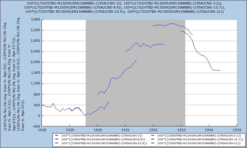
We don't have to speculate because I've done the math, and I can show you the results Dieli's model gives for the 1929-32 catastrophe, as well as the 1938 deep recession. In order to give me a yield curve measure, I had to substitute for 10 year treasuries the series LTGOVTBD (long term government bonds), and also the discount rate of the NY Fed instead in lieu of the Fed funds rate. Because the unemployment rate for this period is only available on an annual basis, the measure becomes somewhat disjointed. I've also carried the data including the unemployment rate 6 months into the next year, to give a better idea of what the range for any monthly unemployment rate would have been. But the results are unambiguous.

Here is the yield curve, plus the unemployment rate, minus the inflation rate, for 1928-33:


And here it is for 1937-38:


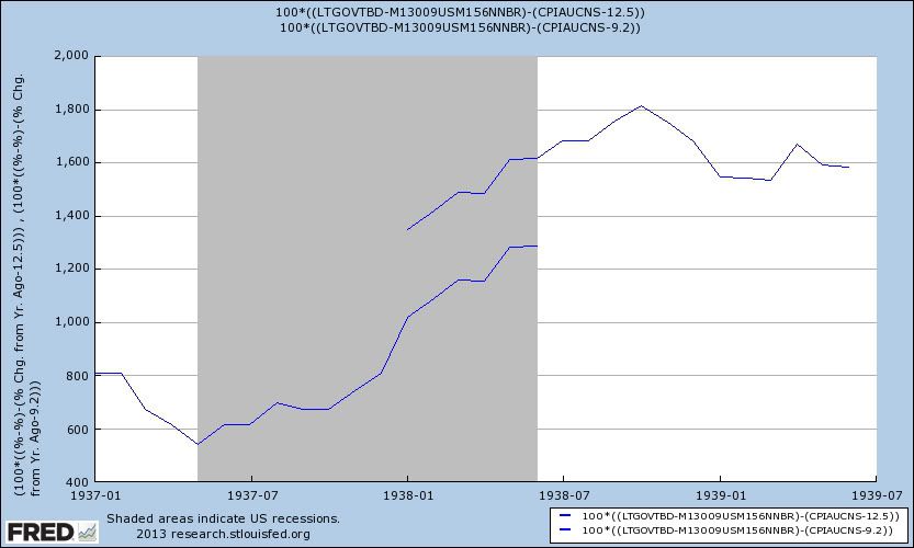
The model does predict the onset of recession in 1929, dipping into its warning signal territory, although it never goes below zero. But then, because it reads the double-digit unemployment rate as a huge positive, it forecasts robust economic expansion for 1931 and 1932! Just as badly, it never sees the 1938 recession coming at all, having never dipped below about 400 basis points.

Part of the problem is that the unemployment rate, as used in the model, really just tells us that inflationary recessions tend to be short, so when unemployment spikes, the bottom of the recession is probably less than a year away. But in so doing, it also tacitly assumes that a recession cannot start in the presence of an already high unemployment rate -- something definitively rebutted by the 1938 recession, which started in the presence of nearly 10% unemployment, even counting CCC and WPA workers among the employed. But even moreso, the simple fact is that deflationary recessions are different, and a model perfect for inflationary recessions -- most notably, any model relying too heavily on the yield curve -- fails with deflationary recessions. Deflationary recessions can and do take place in the presence of a positive yield curve. For example, the curve was positive from late 1929 into 1931, and all through the mid to late 1930s.

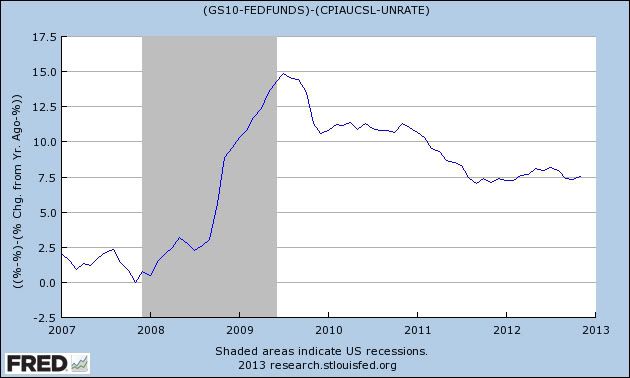
The "great recession" of 2008-09 was in part just such a deflationary event. YoY deflation bottomed out at -2%. Asset prices - particularly of housing, but of all sorts of fancy financial paper as well - collapsed. Unsurprisingly, after correctly giving a warning before the onset of the recession, it surged in mid 2008, as unemployment surged and inflation plummeted. It gave one of its weakest negative signals ever, for the deepest recession in 70 years:


With paltry wage and salary gains, and a government fetish for austerity, the next recession is likely to have deflationary components as well, although it may start with a brief inflationary spike.

Suppose the unemployment rate remains stable, but long term interest rates rise 1%. Yield curve models will see the spread widening and read it as a positive. But Joe Sixpack's refinancing of debt will come to a screeching halt, and if we were to get an oil price driven spike of inflation to 5%, he would never be able to keep up. It is extremely likely that a new recession would ensue. But yield curve driven models such as Dieli's will see a +2% yield curve, plus 7% or higher unemployment, minus 5% inflation, for a net of 4%, or 400 basis points. As with 1938, it would completely fail to see the recession coming.

Similar concerns about business cycle models that rely upon a particular structural elements of the economy have been shown by Dwaine Van Vuuren in this RecessionAlert post, which I highly recommend to you. The bottom line is, before embracing any particular model at any given time, it is necessary to keep in mind the structural background in which it was developed.

Are We In For Another Year of Drought And Spiking Crop Prices?

First, consider the following chart:


Also consider this chart of the US drought monitor:


Now, consider the these increased temperatures in conjunction with these lowered crop estimates:

USDA’s lowered 2012/13 domestic ending stocks estimates for corn and wheat, anticipating solid demand.

U.S. wheat ending stocks are seen at 716 million bushels, compared to 754 million a month ago and 743 million a year ago, raising projections for seed, and feed and residual use. Estimates ranged from 637 million to 792 million bushels, for an average of 743 million. The average farm price is estimated at $7.65 to $8.15 per bushel, compared to December’s range of $7.70 to $8.30.

Domestic corn ending stocks are expected to be 602 million bushels, compared to 647 million last month and 989 million last year, due to an increased feed and residual use guess cancelling out a larger crop estimate and a lowered export projection. Before the report, the average guess was 667 million bushels, in a range of 489 million to 764 million. The average farm price is estimated at $6.80 to $8.00 per bushel, unchanged from December.

U.S. soybean ending stocks came out at 135 million bushels, up from the 130 million in December but down from the 169 million from this time last year. Analysts’ projections ran from 107 million to 178 million bushels, for an average of 135 million. That’s with USDA raising last year’s production total, cancelling out increased expectations for crush and residual use. The average farm price is estimated at $13.50 to $15.00 per bushel, compared to December’s range of $13.55 to $15.55.


Wheat stocks estimates dropped by 38 million bushels.  Corn stocks dropped by 45 million bushels over the last month and are down from 989 million bushels last year.  Soy bean estimates did increase from levels earlier this year, but are also down from last year's levels.

Finally, let's place all of this data in context by looking at some long (25 year) price charts.

Corn spend the better part of 20 years (1988-2006) trading between roughly 1.75 and 3.50, with one price spike in early 1996.  However, starting in mid 2006 prices spiked sharply, trading between 3.00 and 8.00.  Also of important is the sharp, upward sloping trendline starting in mid 2010 which supports prices moving from the 3.50 level to the current 7.06 price.

Spy beans spend a long time trading between 4.00 and 8.00 a bushell.  However, prices now have a sharp uptrend that is carrying them from into the 12.00 and 16.00 range.

Like corn and soy beans, wheat spent nearly 20 years trading in a disciplined level -- roughly 2.00-5.00 a bushel.  Prices consolidated in a symmetrical triangle between 2006 and 2012.  They broke through upside resistance during last year's drought.  Prices have moved lower, but they are still above the top symmetrical triangle trend line.

So, we have

1.) Increasing temperatures,
2.) Declining estimates and actual crop inventories, and
3.) Already spiking long term (25 year) price charts.

This year could be another roller coaster ride for crop prices.


Remember that report that Christmas sales only grew 0.7%? ... Never mind ...


- by New Deal democrat

A couple of weeks ago it was breathlessly reported that Holiday retail sales growth comes in at just 0.7%, Weakest since 2008:
U.S. holiday retail sales this year grew at the weakest pace since 2008, when the nation was in a deep recession. In 2012, the shopping season was disrupted by bad weather and consumers' rising uncertainty about the economy.

A report that tracks spending on popular holiday goods, the MasterCard Advisors SpendingPulse, said Tuesday that sales in the two months before Christmas increased 0.7 percent, compared with last year. Many analysts had expected holiday sales to grow 3 to 4 percent.
Uh ... well .... Never mind. This morning it was reported that seasonally adjusted December retail sales grew 0.5% month over month, and over 4% YoY. Just as analysts had expected.

As I pointed out at the time, citing Gallup's daily consumer spending report:
The last two weeks [before Christmas] have seen the highest amount of consumer spending since 4 years ago, and the spike last week is by far the highest since 4 years ago as well. ....

Bottom line: the consumer may not have been as Scrooge-ish as reported yesterday.
Once again, the Gallup daily consumer spending report has earned its bones.

Morning Market Analysis


The top chart (SPY, 30 minute time frame), shows that after the big move higher at the beginning of the year, prices have meandered higher.  There is support around the 145-145.5 level.  The lower chart (SPY, daily time frame) shows that the daily action has been printing small candles on declining volume.  While prices have advanced through technical resistance, there really isn't any meaningful rally since.


Since the start of the year, oil prices have have been inching higher, slowly approaching the 38.2% Fib level.  Prices are now about the 200 day EMA, with the 10 and 20 day EMA crossing over the 200 day EMA.  While the CMR is giving a very strong buy signal, the MACD is approaching a sell signal.


The daily chart of the Russian market (top chart) shows that prices have been rallying since mid-November.  Prices have broken through the 200 day EMA and are now just below 6-month highs.  The lower chart (weekly time frame) shows that prices are right at year long consolidation range between ~24 and 30.


The yen has dropped a little over 12.5% since the end of last summer.  Also note the severity of the sell-off; traders continue to dump the currency.


Monday, January 14, 2013

Is Manufacturing Getting Ready to Save Us Again?

One of the primary economic drivers that pulled the US out of the recession was manufacturing.  While this sector has slowed over the last 6 months, it may be getting ready to make a comeback.

First, consider these sector ETFs:


The basic materials ETF (top chart, daily time frame) has broken through resistance at the 38 level and continued to move higher.  The underlying technicals (rising MACD, strong CMF and rising EMAs) are also very strong.  Prices have risen about 4% since the end of December.  The industrial sector (lower chart, daily time frame) has also moved through resistance twice over the last month.  Like the XLBs, this chart also has strong underlying technicals (rising MACD, strong CMF and rising EMAs).  Prices have risen about 2.6% since the end of December.

In addition, consider the following from the latest ISM report:

"The PMI™ registered 50.7 percent, an increase of 1.2 percentage points from November's reading of 49.5 percent, indicating expansion in manufacturing for only the third time in the last seven months. This month's PMI™ reading moved manufacturing off its low point for 2012 in November. The New Orders Index remained at 50.3 percent, the same rate as in November, indicating growth in new orders for the fourth consecutive month. The Production Index registered 52.6 percent, a decrease of 1.1 percentage points, indicating growth in production for the third consecutive month. The Employment Index registered 52.7 percent, an increase of 4.3 percentage points, indicating a resumption of growth in employment following only one month of contraction since September 2009. Both the Exports and Imports Indexes registered 51.5 percent, returning both indexes to growth territory following consecutive periods of contraction of six and four months, respectively. Comments from the panel this month are mixed, with some indicating a strengthening of demand and others indicating a continuing softness in demand. Additionally, many respondents express uncertainty about government regulations, taxes and global economics in general as we approach 2013."

While manufacturing has been weak for the last 7 months, internal readings from the latest report may indicate the sector is moving back into expansion.  New orders have grown for four consecutive months and production has increased for the last three months.  However, the internals of these two indicators show that only 5 of 15 industries were growing.

Here is a chart of the overall ISM reading:


In comparison to the ISM number, consider the Markit manufacturing reading:

The final Markit U.S. Manufacturing Purchasing Managers’ Index™ (PMI™)1 was 54.0 in December, down slightly from the flash estimate of 54.2, and signalled a further expansion of the U.S. manufacturing sector. Moreover, up from 52.8 in November, the headline PMI indicated the strongest rate of growth since May.

In addition, consider these two tables:


Five important components -- output, new orders, new export orders, employment and backlogs of work -- are all expanding at a faster rate.  Also consider the overall Markit index:


Unlike the ISM number, the Markit number never showed contraction.  Instead, the index approached contraction but has rebounded over the last few months.

I think the real issue here is the importance of China potentially coming out of its slow period and the overall effect that will have on worldwide manufacturing and raw materials.  Over the last month, the Chinese market has rallied strongly from a bottom as indicators have pointed to renewed economic strength.  Ultimately, they are the only economy that has the potential right now to drive world wide growth.