If we use logic, it will save us all
Saturday, August 25, 2012
Weekly Indicators: Summer's almost gone (morning found us calmly unaware) edition
- by New Deal democrat
The monthly data for July released last week was sparse, and mixed. Both new and existing home sales rose. New home sales equalled their springtime highs, but existing sales are still below that level. Durable goods orders reached a new post-recession high, but "core" capital goods orders, which strip out defense and transportation were down, and are now down YoY, a bad sign.
The high frequency weekly indicators are as close as we can reasonably get to observing economic trends in real time, as turns will show up here before they show up in monthly or quarterly data. Twice in the last two years, as initial jobless claims established new lows, Oil prices turned up and shortly thereafter initial claims followed. But those were in early spring. Will the turn up in gas prices derail declining initial claims again this fall? Let's start with those two items.
As I said, the energy choke collar has now re-engaged, while there is some enocuraging news agout gasoline usage.
Gasoline prices rose yet again last week, up $.02 from $3.72 to $3.74, and are now higher than a year ago. Oil prices per barrel also rose slightly for the week, closing at $96.02. Gasoline usage looks like it is holding up. On a one week basis, it was 9081 M gallons vs. 9009 M a year ago, up for the second week in a row, +0.8%. The 4 week average at 9012 M vs. 9166 M one year ago, was off -1.7%. That the last two weeks have been positive 1 YoY is encouraging, but it must continue to not signal further weakness.
Employment related indicators were again mixed this week.
The Department of Labor reported that Initial jobless claims rose 6000 to 372,000 from the prior week's unrevised figure. The four week average rose 4,250 to 368,000, still less than 2% above its post-recession low. If higher oil prices are again acting as a governor preventing fast economic growth, then this number, unforturnately, should continue to rise in coming weeks.
The Daily Treasury Statement showed that for the first 17 days of August 2012, $113.1 B was collected vs. $112.4 B a year ago, a very slight $0.7 B increase. For the last 20 days ending on Thursday, $132.4 B was collected vs. $125.9 B for the same period in 2011, a solid gain of $6.5 B or +5.2%.
The American Staffing Association Index declined 1 to 93. This index was generally flat during the second quarter at 93 +/-1, and for it to be positive should have continued to rise from that level after its July 4 seasonal decline. That it has not done so is a real concern.
Same Store Sales and Gallup consumer spending were again positive:
The ICSC reported that same store sales for the week ending August 18 fell -1.4% w/w, but rose +3.1% YoY. Johnson Redbook reported a 1.9% YoY gain. Shoppertrak did not report.
The 14 day average of Gallup daily consumer spending as of August 24 was $84, a huge $15 over last year's $69 for this period. This is the fourth week of real strength after six weeks in a row of weakness. This is very encouraging, and indicates that consumers are regaining their footing.
Bond yields and credit spreads both rose:
Weekly BAA commercial bond rates rose another .13% to 5.02%. Yields on 10 year treasury bonds rose 0.11% to 1.76%. The credit spread between the two roseto 3.26%, which is about halfway between its 52 week maximum than minimum, and a significant improvement from 6 weeks ago.
Housing reports were mixed:
The Mortgage Bankers' Association reported that the seasonally adjusted Purchase Index rose 0.9% from the prior week, and were also up about +1.7%% YoY, the first positive YoY reading in many weeks. Generally these are in the middle part of their 2+ year range. The Refinance Index fell -9% for the week due to higher mortgage rates, but is still in the vicinity of its 3 year high.
The Federal Reserve Bank's weekly H8 report of real estate loans this week fell 15 for the week to 3507, or about -0.4%. The YoY comparison fell to +0.7% On a seasonally adjusted basis, these bottomed last September and are also up +0.8%.
YoY weekly median asking house prices from 54 metropolitan areas at Housing Tracker were up + 2.2% from a year ago. YoY asking prices have been positive for almost 9 months.
Money supply remains generally positive despite now being compared with the inflow tsunami of one year ago:
M1 was off a sharp -2.3% last week, and was down -0.5% month over month. Its YoY growth rate was steady at +10.7%, as comparisons with last year's tsunami of incoming cash are in full progress. As a result, Real M1 remained at +9.3%. YoY. M2 rose +0.5% for the week, and was up 0.6% month/month. Its YoY growth rate rose from +6.5% to +6.7%, so Real M2 grew at +5.3%. The growth rate for real money supply has slowed, but is still quite positive as the tsunami of cash arriving from Europe last summer disappears from the comparisons.
Rail traffic was slightly positive while its diffusion index worsened:
The American Association of Railroads reported a meager +0.4% increase in total traffic YoY, or +2,300 cars. Non-intermodal rail carloads declined -2.1% YoY or -6,200, once again entirely due to coal hauling which was off -11,400. Negative comparisons rose back from 8 to 10 types of carloads. Intermodal traffic was up 8,500 or +3.6% YoY.
Turning now to high frequency indicators for the global economy:
The TED spread fell from 0.37 to a new 52 week low of 0.33. The one month LIBOR declined to 0.235, also a 52 week low. It remains well below its 2010 peak. Even with the recent scandal surrounding LIBOR, it is probably still useful in terms of whether it is rising or falling.
The Baltic Dry Index rose slightly from 714 to 717, only 47 points above its February 52 week low of 670. The Harpex Shipping Index was flat at 398, and remains only 23 above its February low.
Finally, the JoC ECRI industrial commodities index rose from 117.89 to 120.51. YoY comparisons for this number are improving sharply as its August 2011 swoon will leave the comparison period. Nevertheless, it is generally near its recent 12 month lows and thus remains a strong sign that the globe taken as a whole has been slipping back into recession.
Global indicators of shipping and industrial metals prices continue to indicate a downturn. US weekly indicators, however, remained generally positive, with the noteworthy exceptions of temporary services and gas prices. Housing sales remain a very important positive, as does money supply. Once again the consumer is showing resilience. All in all, the domestic tone remains positive
Have a nice weekend!
Friday, August 24, 2012
Seasonality vs. Oil choke collar: a real-time test
- by New Deal democrat
As everyone who drives knows, instead of going down after Memorial Day as they usually do, gasoline prices have gone up by about $0.40 in the last couple of months. Had gas prices continued the decline they started in April, we probably would have $2.xx a gallon of gas in most parts of the country by now, the economy would be picking up smartly, and I would be doing a victory dance on Lakshman Achuthan's bonus check. Well, okay, maybe not that last part, but it sure looked like the upturn in the economic data that we've seen in the latter part of the year like clockwork in 2009, 2010, and 2011 was set to start.
But as of this past Monday, gasoline was up to $3.74 a gallon, only $0.20 below its high earlier this year. Oil was over $96 a barrel for awhile this week. In other words, the Oil choke collar has re-engaged.
This sets up a real-time test. Is the springtime slowdown and autumn acceleration we've seen in the economic data for the last several years reflective of seasonal adjustments gone awry? Or does it simply reflect the engaging and disengaging of the Oil choke collar?
We should find out over the next 4 to 8 weeks. Probably the easiest way to keep track of the test is to compare initial jobless claims against gasoline prices. Twice in the last 2 years, as initial jobless claims reached new post-recession lows in March, the Oil choke collar has engaged and during the second quarter the economy slowed to a crawl, with initial claims spiking up by about 30,000 a week. As the price of gas dropped from summer to late autumn, initial claims dropped and made new lows again.
Unfortunately, for the third time in a row, I believe the price of gas is going to win its duel with initial jobless claims. If I'm right, yesterday's uptick in claims was only the first week of the wave, and we should see claims over 380,000 on average within the next few weeks. A bad week of 400,000+ claims can't be rules out.
If I'm wrong, initial claims will continue to drop as they have seasonally for the last several years.
I've been shouting from the rooftops about the Oil choke collar for several years now. While Political Calculations has picked up on the same thing, virtually the entire rest of the economic blogosphere has failed to see what in my opinion is right in front of their noses.
The next month or two will either disprove my hypothesis, or else maybe the crucial role the the price of gasoline has been having on the economy -- acting as a governor on the pace of economic growth -- will finally be acknowledged.
The Gold Standard Is Still A STUPID IDEA THAT WON'T WORK
From the Financial Times:
The gold standard has returned to mainstream US politics for the first time in 30 years, with a “gold commission” set to become part of official Republican party policy.
Drafts of the party platform, which it will adopt at a convention in Tampa Bay, Florida, next week, call for an audit of Federal Reserve monetary policy and a commission to look at restoring the link between the dollar and gold.
First -- the Fed is already audited. Here's a link to the Fed's complete audit page. If they want to audit monetary policy, well, that's done everyday by the financial press and economic bloggers all over the world.
How these ideas that the Fed isn't audited get into mainstream political thought when they are so easily fact-checked (Google, anyone?) is absolutely amazing. At best, it completely destroys the "rational expectations" garbage that's partially the basis of the University of Chicago school of thought.
But, more to the point. In uncertain times people clutch at straws. This is partially understandable considering the overall economic environment. However, the gold standard -- which is seen by some as a silver bullet that will magically restore "sound money" -- is not the answer. In fact, it's a really bad idea. I wrote a piece in March that explained this in detail.
In a recent lecture, Bernanke explained why the gold standard is a bad idea. He did so in a very convincing way, as highlighted by Joe Weisenthal and agreed to by Professor Brad DeLong. (for background on this issue, please read Monetary Theory and Bretton Woods by Filippo Cesarano). I would also encourage you to read Mr. Weisenthal's article. However, let me address Mish's love of the gold standard, or, more precisely, the fact he's never addressed the fundamental problems with the gold standard as expressed in the following identity:
Let me add three other points.
From Mish:

The gold standard has returned to mainstream US politics for the first time in 30 years, with a “gold commission” set to become part of official Republican party policy.
Drafts of the party platform, which it will adopt at a convention in Tampa Bay, Florida, next week, call for an audit of Federal Reserve monetary policy and a commission to look at restoring the link between the dollar and gold.
First -- the Fed is already audited. Here's a link to the Fed's complete audit page. If they want to audit monetary policy, well, that's done everyday by the financial press and economic bloggers all over the world.
How these ideas that the Fed isn't audited get into mainstream political thought when they are so easily fact-checked (Google, anyone?) is absolutely amazing. At best, it completely destroys the "rational expectations" garbage that's partially the basis of the University of Chicago school of thought.
But, more to the point. In uncertain times people clutch at straws. This is partially understandable considering the overall economic environment. However, the gold standard -- which is seen by some as a silver bullet that will magically restore "sound money" -- is not the answer. In fact, it's a really bad idea. I wrote a piece in March that explained this in detail.
In a recent lecture, Bernanke explained why the gold standard is a bad idea. He did so in a very convincing way, as highlighted by Joe Weisenthal and agreed to by Professor Brad DeLong. (for background on this issue, please read Monetary Theory and Bretton Woods by Filippo Cesarano). I would also encourage you to read Mr. Weisenthal's article. However, let me address Mish's love of the gold standard, or, more precisely, the fact he's never addressed the fundamental problems with the gold standard as expressed in the following identity:
MV = PQ
Where
M=the money supply (gold), V=velocity, P=price and Q = physical volume
of all goods produced. In a gold based monetary system, the above
equation explains how balance of payment equilibrium is achieved. As a
country runs a trade deficit, M decreases. In order for the
identity to maintain balance something must decrease on the other side
of the equation. This is usually prices (P), which in turn makes
the country's goods more competitive in international trade, thereby
leading to equilibrium once again being achieved. Sounds simple, right?
Not
really, as there are several problems. Like most economic models, this
one assumes that prices move freely; or, put another way, prices are
not sticky. This is hardly the case in the real world, where prices can
remain at unrealistic levels for some time. This makes the adjustment
mechanism anything but instantaneous. Secondly, "classical economists
took the volume of final output to be fixed at the full employment level
in the long run." (International Economics by Robert Carbaugh,
Kindle Reference 6753-55). Considering the US economy has been
operating far below the full employment level for the last three years
(as have a fair number of other economies), this "magic equation"
wouldn't apply very well to the current situation. In addition, a
decrease in the money supply created by a trade deficit leads to an
increase in the cost of money -- namely, interest rates. While these
should theoretically make the deficit country a more attractive place to
send money (thereby lowering the trade deficit), higher interest rates
will also slow economic growth in the deficit running country, making it
less attractive from a foreign investment position. This slows the
correction process even more. There is also the issue that the gold
standard does not survive war spending, which is what led to it's fall
in the first place after WWI. Finally, there is the issue that no one
can futz with the system -- that is, there can be no government
intervention in the currency markets for this to work. Raise you hand
if you think that will last longer than a few years in the current
environment; I have a bridge to sell you.
In
reality, the golden age of the gold standard only lasted about 30 years
from the end of the 1800s to WWI. Several countries tried to get back
on the gold standard after WWI but to little avail (as an aside, Britain
tried to get back on the gold standard. However, Churchill set the
conversion rate too high, a policy move critiqued by Keynes). All of
this led to the Bretton Woods agreement after WWII.
From Mish:
Weisenthal: The gold standard ends up linking everyone's currencies.Actually, being that inter-lnked means all economies rise and fall together, preventing one economy from taking a different approach to a problem and helping to prevent an economic free fall from occurring. For example, during the last recession both China and Germany engaged in stimulus spending, which essentially saved both economies and helped to avert disaster for the world as a whole. Had we all been inter-linked, that couldn't have happened. I should also add that this level of currency inter-linking is a big problem in Europe right now -- a situation which Mish has written about extensively.
Mish: So what? Look what happened after Nixon closed the gold window. We have had nothing but problems, temporarily masked over by printing more money until things blew sky high, culminating in bank bailouts at taxpayer expense, and those on fixed income crucified in the wake.
Weisenthal: [A gold standard] creates deflation, as William Jennings Bryan noted. The meaning of the "cross of gold" speech: Because farmers had debts fixed in gold, loss of pricing power in commodities killed them.Deflation does not mean just lower prices; it also means unemployment, caused by a deflationary spiral that goes like this: demand drops, leading to lower production, leading to lay-offs, leading to lower demand ... you get the idea. The Great Depression is the classic example of this phenomena.
Mish: Hello Joe. Please tell me how many in this country would not like to see lower prices at the gas pump, lower prices on food, lower rent prices, lower prices on clothes? The fact of the matter is price deflation is a good thing. The only reason why it seems otherwise is debt in deflation is harder to pay back. That is not a problem with deflation, that is a problem of banks foolishly lending more money than can possibly be paid back. Fractional reserve lending is the culprit.
Weisenthal: The economy was far more volatile under the gold standard (all the depressions and recessions back in the pre-Fed days).Actually, Mish, on this planet. An inquiring mind would seek out a book such as A Brief History of Panics, which shows that in the 1800s there was nearly a panic every 10 years. As professor James Hamilton pointed out:
Mish: Really? On what planet? Did the collapse in the housing bubble affect your ability to reason? Except for cases like Weimar, Mississippi Bubble, and for that matter all bubbles, gold provided stability. The bubbles (and the subsequent collapses) were caused by fractional reserve lending, not the gold standard.
The graph below records the behavior of short-term interest rates over 1857 to 1937. Over much of this period, the U.S. maintained a fixed dollar price for an ounce of gold, and prior to 1913 (indicated by a vertical line on the graph) there was no Federal Reserve System. The pre-Fed era was characterized by frequent episodes such as the Panic of 1857, Panic of 1873, Panic of 1893, Panic of 1896, and Panic of 1907 in which even the safest borrowers would suddenly find themselves needing to pay a very high rate of interest. Those events were associated with significant financial failures and business contraction. After establishment of the Federal Reserve, the U.S. short-term interest rate became much more stable and exhibited none of the sudden spiking behavior that used to be so commonHere is the accompanying chart:
...
The pre-Fed financial panics were also accompanied by long contractions in overall economic activity, as indicated by the NBER dates for economic recessions noted in the graph below. Although of course we still had recessions after the Federal Reserve was established in 1913, they tended to be less frequent and shorter in duration.

In
short, the gold standard argument doesn't hold up after a modicum of
scrutiny. Frankly, the old Mish wouldn't have bought an argument this
shallow. However, the new and greatly unimproved Mish clearly has.
While I'm sure his numerous acolytes will nod their heads in agreement
at the simplistic "gold standards are the magic panacea to all your
ills" argument, I lament the loss of a great critical mind and hope for
the day when he returns.
Morning Market Analysis


The top chart shows the SPYs daily chart, which has broken through support established a little under six months ago. The most logical price target is the 20 day EMA, which is right around the 140 level. On the 60 minute chart, notice that 140 is an important level from the last 30 days.

The treasury market has rebounded, moving beyond its downward sloping channel line. It is currently right in the middle of a Finonacci resistance area. However, so far this is merely a technical reaction to the treasury market's sell-off and the weakness in the equity markets.

Like most markets, the Canadian market is trading in a range right now. The ETC is moving between the 24.5 and 29 price level.

Also note the Canadian dollar is trading in a range as well.
Thursday, August 23, 2012
The Complete Failure of the Economic Pundit Market
From Ezra Klein:
As Joe Weisenthal details, back in September 2009, Ferguson was warning that “long-term rates have risen by 167 basis points in the space of five months,” which “settled a rather public argument” Ferguson had been conducting with Paul Krugman, in which Ferguson argued the markets were turning on our debt and Krugman argued that they were not. So who was right? Well, the interest rate on 10-year Treasuries was 3.73 percent when Ferguson wrote that column. Today, they’re 1.81 percent. Point, Krugman.
Having been rebuffed by the bond market, Ferguson then predicted that we were entering a period that would come to be known as “the great inflation of the 2010s”. We were not. On Sunday, Bloomberg News published an article that began with the sentence, “So much for the inflation warnings.”
These predictions — and others, like when Ferguson warned that ”the Chinese clearly feel they have enough U.S. government bonds” — were the testable hypotheses generated by Ferguson’s worldview. That worldview, in essence, was that the United States was under imminent threat from its debt, and that the result would either be a crisis as the U.S. proved unable to pay its creditors or runaway inflation as the Fed printed money in excess of what the economy could handle.
These predictions were wrong. But Ferguson hasn’t updated the theory to account for their failure. Instead, he has simply applied that same theory to argue that Paul Ryan, who he first met at “a dinner in Washington where the U.S. fiscal crisis was going to be the topic of discussion,” should be vice president, because his deficit-reduction plan could “end four years of economic underperformance [and] stop the terrifying accumulation of debt.”
If Ferguson’s theory had passed its previous tests and we had evidence that the debt is what’s holding back our economy, perhaps that would be a reasonable prediction. But Ferguson’s theory failed its previous tests, and there’s no evidence that debt is what’s holding back our economy right now. Which is one more thing Ferguson never tells you.
And this is really a rather important point about the current crisis. There is a strain of thinking that argued, from the beginning, that Obama’s policies would fail because the required borrowing would send interest rates soaring. Ferguson was a member of this club, but so was the Wall Street Journal editorial board, which warned, back in May 2009, that the bond vigilantes “appear to be returning with a vengeance now that Congress and the Federal Reserve have flooded the world with dollars to beat the recession.”
It is no surprise that most of the folks who bought into this theory were early and enthusiastic backers of Paul Ryan. After all, he bought into this theory, too, and his initial budgets included deep, quick cuts. More so than any other politician, he translated this theory into legislation. But the theory’s primary predictions proved wrong. That has not, however, had any reputational impact on the people who believed those predictions, and their champion is now on the GOP’s presidential ticket, but neither he nor his backers appear to have rethought any element of their critique or of their program.
The above was written in response to the Newsweek cover story story, but it goes to something entirely deeper in the world of economics.
However much the political right may hate Krugman (and there is an almost vitriolic hatred for the man) they can't ignore one basic fact: he's been right for the last three years. Inflation has not reared its ugly head; the bond vigilantes have not come out to play in the markets and we are still mired in a slow-growth environment. Compare that track record to the likes of Art Laffer (perhaps the most appropriately named individual on the plant) and the economists who have been counseling the political right -- and who have also been consistently wrong. And not just slightly wrong, but nearly 100% wrong for the last three years regarding most of the events which have been occurring.
This goes to a deeper division in economics, which you can divide into two camps. Those that agree with Keynes and those that don't. And it is those that agree with Keynes have been right about the current crisis. Case in point are Paul Krugman and Brad DeLong. Also put Marc Thoma in there. Those that are from the University of Chicago School -- John Cochrane and John Taylor are good examples -- have been consistently wrong.
The reason for this is the near pathological avoidance coming from the University of Chicago folks regarding the Great Depression. There is a giant black hole in all of their analysis and it starts in 1929 and ends about 1940. As I wrote a few days ago, the most logical comparison for our current economic situation is that period. This is not rocket science; it's actually pretty simple logic at work. To make the point, read the first 10 pages of Irving Fisher's Debt Deflation Theory of the Great Depression; the parallels to the current situation are near 100% dead-on. And yet no one from the U Chi school of thought is making the comparison. I recently saw a video of John Taylor giving a speech at either the Heritage Foundation or Cato Institute, where he mentioned the current situation. He quickly dismissed the idea that we were in the middle of a debt deflation environment, yet offered no in-depth explanation as to why. And further highlighting this issue -- at least from Taylor's perspective -- is his continual comparison of this expansion to the Reagan recovery which was an entirely different fact pattern. Again, figuring out the appropriate historical comparison isn't that complicated, yet we still see people making it on a regular basis. The 10 year period when Keynes theories were implemented -- and proved successful -- are completely ignored in the hopes that, by ignoring this period -- it will simply retreat from the history books.
But most importantly, despite being universally wrong about the current environment, these people not only have a platform but are actually listened to on a regular basis, And, their opinions -- regardless of the near universal failure of those predictions and prognostications -- are still considered with the same weight as those who have been right. This is what I find utterly baffling. If you have choice between any other professionals and one has a track record of being right and the other has a track record of being wrong, you'd go with the person who was right. That's what the market should do. And yet, it is those people who argue for the absolute unfettered outcome of the market -- who, according to their own analysis should be considered failures -- that still have a platform and are still sought for counsel. That's an amazing failure of the market.
Morning Market Analysis


The entire grains complex is still at elevated levels. Corn (top chart) broke through resistance, but printed a hanging man bar yesterday (which many traders take as a reversal pattern). Soybeans (middle chart) has a similar chart to corn, although there were a few days of pretty solid gains. Wheat (bottom chart) is still in a downward sloping pennant pattern.
The reason for these high prices is the worst drought conditions since the late 1980s.

The longer term chart of the British market still shows a sideways consolidation pattern in play. Prices are still a bit above the 200 week EMA with a rising MACD. But the CMF shows declining market participation. Also note the declining volume as prices have rallied over the last few weeks.

Last week I noted that the Spanish market may be making a bottom, based on the possibility of a classic double-bottom pattern. Now the market has rallied from its bottom. , moving through resistance around the 25 price level. However, this is more of a technical bounce than anything else.

In the same post, I noted the Italian market was in a similar situation, although I wasn't as confident with the overall pattern. Well, it, too, has rebounded in a similar manner.
Wednesday, August 22, 2012
Bonddad Linkfest
- Can more Chinese Stimulus help? (Marketwatch)
- China's steel production paradox (Marketwatch)
- Ag markets "panic" (Agrimoney)
- Winter wheat prospects declining (Agrimoney)
- West Australia wheat crop in jeopardy (Agrimoney)
- Japan's exports to the EU drop a quarter (FT)
- Chinese steel prices drop to 2009 levels (FT)
- Midwest crop tour issues weak estimates (FT)
In which I trash a garbage indicator (literally)
- by New Deal democrat
In the last few days, the following graph has gotten a lot of attention, in particular from Ezra Klein, who discussed it last night on MSNBC:
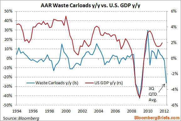
This graph purports to show that, based on railroad hauling of trash, the economy is tanking this quarter.
Being a nerd, when I saw the graph I did some research. It turns out that the graph is very misleading. In the first place, it is computed on a quarterly basis - except for this quarter, in which it is YoY only for the first 6 weeks of this quarter vs. the first six weeks of the third quarter of 2011 (note the latest value in the graph is labeled "QTD" or "quarter to date.").
Further, since it is YoY, you have to check to see if the real anomaly is in the last year vs. this year. And when you do that, you find out that there was a huge bump in railcar hauling in July and August of last year of scrap metal (I haven't found any particular reason why at this point). This year is about 1.5% ahead of 2010 for the comparable 6 weeks, but in 2011 scrap metal hauling was about 32% ahead of 2010 for the same 6 week period. In the final 7 weeks of the quarter, (particularly in September) of last year, scrap metal hauling was much more subdued compared with 2010.
More specifically, the information on the graph above comes from lines 18 and 19 of the weekly AAR report, the same report I describe every Saturday in my "Weekly Indicators" column. Here's the total of rail carloads for the first 6 weeks of the third quarter in 2010, 2011, and this year for line 18, scrap metals:
- 2010: 21,071
- 2011: 27,769
- 2012: 21,392
Now here's the same totals for line 19, municipal waste:
- 2010: 23,279
- 2011: 19,546
- 2012: 18,223
Thus, there was actually a much more severe contraction for the same 6 week period last year, -12.1%, in municipal waste hauling than this year, due to increasing recycling efforts, apparently without causing an economic crash. Put another way, last year a large contraction in municipal waste hauling acted largely to counterbalance the anomalous surge in scrap metal hauling. This year a much smaller decline in municipal waste hauling is amplifying the return to prior trend in scrap metal hauling.
By contrast, here are the number of rail carloads for the remaining 7 weeks of the third quarter in 2010 and 2011 for scrap metals:
- 2010: 30,034
- 2011: 33,205
And here are the totals for the remaining 7 weeks for municipal waste:
- 2010: 27,612
- 2011: 24,320
In the last seven weeks of the third quarter last year, scrap metal hauling was only up +10.6%, and municipal waste was down -12.0%. So for the full quarter last year, the YoY increase of scrap metal and municipal waste combined was only +2.8%.
But the comparison of the first 6 weeks vs. the final 7 weeks of the third quarter last year -- which was huge -- isn't reflected in the graph.
Had the graph compared apples to apples, there would have been a huge increase last year balanced by an equal decrease this year. If you're not going to do that, then you have to wait to see how the entire third quarter plays out - which would deprive you of the trashy sexy graph of DOOM!
So here's the moral of the story of the alleged trash indicator: garbage in, garbage out.
France: Weakening Growth With Some Underlying Problems
Let's now turn to France, to get an overview of their economy.
 Overall, we see the same type of growth pattern as Germany; coming out of the recession France printed some OK numbers, but the economy has been slowing and is now just barely positive.
 Industrial production's overall Y/O/Y growth has been negative for the entire year -- obviously not a good development.

Oddly enough, Y/O/Y percentage change in retail sales have been fairly decent.

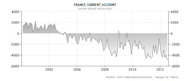
There are two big deficit issues with the French economy: a budget deficit and current account deficit. As a result, France must continually be attractive to foreign investors in order to continue operating in this manner.

Despite the above mentioned deficits, notice that government bond yields are actually very low -- currently coming in at just over 2%.
 The unemployment rate is big issue for obvious reasons.
 However, inflation appears to be under control.


Oddly enough, Y/O/Y percentage change in retail sales have been fairly decent.


There are two big deficit issues with the French economy: a budget deficit and current account deficit. As a result, France must continually be attractive to foreign investors in order to continue operating in this manner.

Despite the above mentioned deficits, notice that government bond yields are actually very low -- currently coming in at just over 2%.


Why John Carney Needs to Buy a Dictionary
John Carney wrote (I am almost embarrassed to link to this 3rd grade level of logic) a defense piece of self-proclaimed (and widely discredited) economic expert Niall Ferguson over at CNBC that demonstrated little other than the fact that Carney is an anti-tax shill and is willing to redefine words to his own liking in order to make a case. In case you were wondering John, the word "deficit" actually has a meaning:
"a : an excess of expenditure over revenue"(from Merriam-Webster)
Notice that the definition of the word itself references revenue. In other words, things that are paid for with revenue do not create deficits. By definition they cannot, as a deficit is the difference between revenue and expenditure, not expenditure by itself. While I know that CNBC (like many other news organizations sadly) cares little about the accuracy of its reports or their neutrality, someone needs to call people that do not have a basic understanding of the English language and facts to the carpet for misrepresentation and outright fabrication.
Not only was Niall Ferguson 100% wrong, but now John Carney and CNBC have doubled down with an intentional redefinition of the word deficit in a weak defense of Ferguson. How about some integrity CNBC?
========
NDD here with the incredibly stupid claim Carney is making, verbatim:
Oh.
The Stupid. It burns!
"a : an excess of expenditure over revenue"(from Merriam-Webster)
Notice that the definition of the word itself references revenue. In other words, things that are paid for with revenue do not create deficits. By definition they cannot, as a deficit is the difference between revenue and expenditure, not expenditure by itself. While I know that CNBC (like many other news organizations sadly) cares little about the accuracy of its reports or their neutrality, someone needs to call people that do not have a basic understanding of the English language and facts to the carpet for misrepresentation and outright fabrication.
Not only was Niall Ferguson 100% wrong, but now John Carney and CNBC have doubled down with an intentional redefinition of the word deficit in a weak defense of Ferguson. How about some integrity CNBC?
========
NDD here with the incredibly stupid claim Carney is making, verbatim:
I think it is fair enough to argue that increased expenditures paid for by new taxes and fees are the equivalent of deficit increases. ...See, when you pay cash for something at the store, all you're really doing is fast-forwarding your credit card bill.
The primary critique of budget deficits is that they create debt obligations that will have to be paid for by tax increases on future generations. But the ACA creates new government obligations and pays for them (in part) with tax increases immediately. That is just debt in fast-forward. It inflicts immediately the very harm—higher taxes—that deficit-spending supposedly inflicts in the future.
Oh.
The Stupid. It burns!
Morning Market Analysis


All of the above charts are of the SPYs. The top chart shows the daily price action. Prices have moved about resistance and are now near 6 months highs. All the EMAs are moving higher; momentum and prices are strong. The lower two charts put the latest rally in perspective. The middle chart shows 60 minutes time increments. The market has enjoyed a nice, consistent uptrend. However, the lower chart -- which is in 30 minute increments -- shows prices have broken trend.

Above is a 5 minute SPY chart. After 10 AM, prices started moving lower, and continued moving lower for the entire trading session. This is what led to the trend break on the 30 minute chart.
Given the length of the latest rally and yesterday's price action, I think we'll see some profit taking over the short term.

The homebuilding sector rallied from October to April of this year. Then the sector sold-off to highs established last spring. However, prices have now moved through highs again. Also note the bullish EMA picture, rising CMF and buy signal from the MACD.

The daily chart of the XHBs shows prices consolidating for most of the last six months, trading between the 19.5 and 22 price levels. However, prices have clearly broken out. Notice the bullish EMA pattern and rising MACD.
Tuesday, August 21, 2012
Germany: The EU Powerhouse
Germany stands out as an economy that has basically done everything right. Let's look at the data.

First, note that coming our of the recession, Germany was printing some impressive annual GDP growth numbers. But, while Germany's overall growth rate is still positive, notice that it has been slowing over the last four quarters.
 Oddly enough, the lowest German unemployment reached was about 6.4%. In the US, 5% is considered full employment; this number will change depending on the economy, but 6.4% seems high for a maximum employment reading. This number has ticked up recently, largely because of the GDP drop. But, that is to be expected.
 In general, the pace of retail sales is positive, and is largely due to the strong growth and low unemployment.
 And German industrial production has rebounded from the downturn that occurred earlier in the year.
 To me, this is the strongest chart from Germany: their overall current account as a percent of GDP has been strongly positive for nearly 10 years. Put another way, Germany is an export powerhouse.

And while the government is running a budget deficit, it's clearly under control
 And, inflation appears to be under control, although the ECB is as much responsible for this as the Bundesbank.
In short, even with the GDP slowdown, German looks to be in decent shape.

First, note that coming our of the recession, Germany was printing some impressive annual GDP growth numbers. But, while Germany's overall growth rate is still positive, notice that it has been slowing over the last four quarters.


And while the government is running a budget deficit, it's clearly under control

In short, even with the GDP slowdown, German looks to be in decent shape.
The Stupid. It Burns.
Quick -- what was the last big financial crisis in the US? If you said The Great Depression, you get prize (in inflation adjusted dollars). So, given that we've just experienced a big financial crash (the popping of a very large credit and asset bubble), what would be the first place in economic history you'd look to make comparisons to the present recovery? The Great Depression -- again, you get a prize.
So -- what is it with conservative economists and their deliberate attempt to completely overlook the Great Depression comparison to our current recovery? It's like there's a blind spot in their analytical abilities which prevents them from even mentioning this period in history.
Let's start with John Taylor -- WSJ editorial page darling and one of four authors of the Mitt Romney economic manifesto. Once again, Taylor compares the current recovery to the 1980s recovery. Of course, the two are entirely different fact patterns, with the 1980s recession caused by the Fed spiking interest rates to kill inflation, while here we're dealing with a massive de-leveraging of the household sector. As I've pointed out before (see here and here) Taylor has a habit of doing anything to demonstrate his unadulterated fealty to the Reagan myth (BTW: Reagan's dead, you're old; get over it.). Your absolute devotion is noted, although it's not helping your reputation.
And now -- not to be outdone in demonstrating the absolute highest level of stupidity -- is John Cochrane, who argues that slow recoveries after a financial crisis aren't the norm because the Administration's Budget Proposals proposed a faster than normal recovery from the 2008 financial crisis. First, raise your hand if you think this is an economic document or a political document (hint: the source of the writing may be a more than insignificant clue). Secondly, when was the last time you say a government agency involved in the economy say, "things are really going to suck for awhile." In fact, what they really say is things like, "below trend growth," or "we expect sub-par demand." Why? Because they have to instill confidence in the markets that they have a handle on what's happening. And then there's the fact the the original estimates for the depth of the recession were way too shallow:
The Bureau of Economic Analysis, the agency charged with measuring the size and growth of the U.S. economy, initially projected that the economy shrank at an annual rate of 3.8 percent in the last quarter of 2008. Months later, the bureau almost doubled that estimate, saying the number was 6.2 percent. Then it was revised to 6.3 percent. But it wasn’t until this year that the actual number was revealed: 8.9 percent. That makes it one of the worst quarters in American history. Bernstein and Romer knew in 2008 that the economy had sustained a tough blow; t hey didn’t know that it had been run over by a truck.
And finally, compare the budget projections in the 2003 Economic Report to the President (see table 1.1) with the actual performance. The Report's projections are off between .5% and 1% for the recovery -- and you really don't want to go into a comparison of the mammoth numbers of jobs promised versus what was really delivered, do you? In short, this isn't the first administration to over-promise and under-deliver.
Memo to Taylor and Cochrane: you're smarter than this. No, really, you are. Please rise to the level of analysis I've come to expect from people who have supposedly studied a particular discipline in depth.
Morning Market Analysis


Above we see weekly charts for the treasury curve. The IEIs (top chart) have broken a trend and the IEFs and TLTs (middle and bottom) charts are right at longer-term support. Also note that all three charts have a weakening momentum and relative price indicators. Money is clearly leaving the market, indicating that the overall risk on trade is back.

The long-term dollar chart shows a slight upward bearing, but certainly not a strong rally. It's really more of a meandering/moving grudgingly higher rally.

Copper is consolidating between the 42 and 44 price levels. Also notice the importance of the 42 price level from prices established in late 2012.
Monday, August 20, 2012
The one crucial graph that shows why we haven't gone back into recession
- by New Deal democrat
Mortgage refinancing:
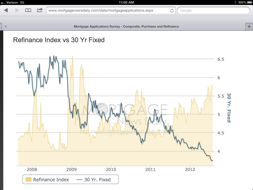
(via Mortgage News Daily)(blue line represents mortgage rate; yellow area represents amount of mortgage refinancing. Note the nearly continuous surge in refinancing during the last year).
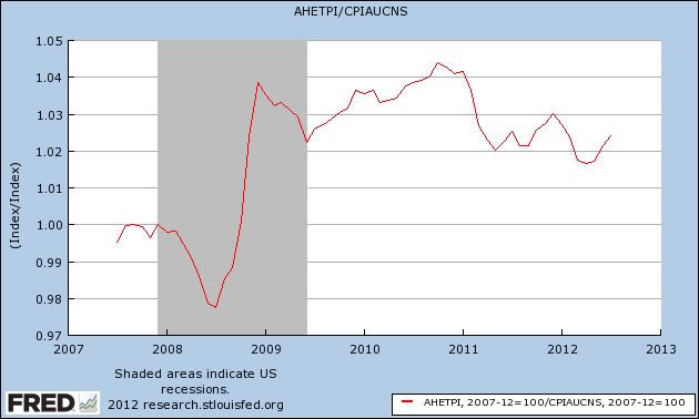
As I pointed out as recently as Friday, real income growth during the last three years since the recession bottomed has been lackluster to say the least. One of the mainstays of ECRI's likely incorrect recession call is that real income has never fallen below +1.5% without a recession ensuing. Truth be told, during the recovery real income has barely ever gotten above that level, an abysmal showing compared with all past WW2 recoveries:

In fact, in real terms, average wages have fallen in the last couple of years:
 "width=500>
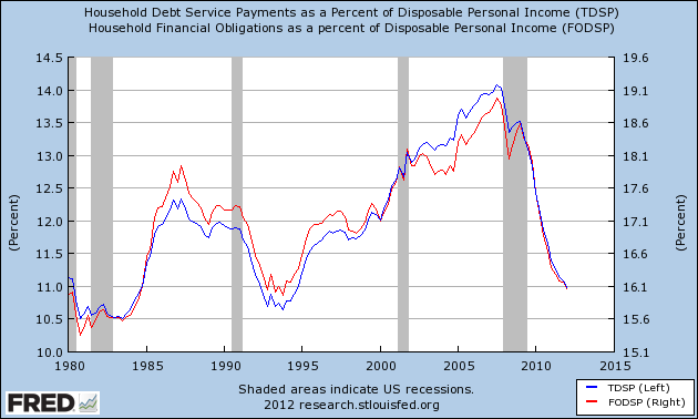
But because of refinancing of debt, the total household debt purden as a percentage of income has continued to fall:
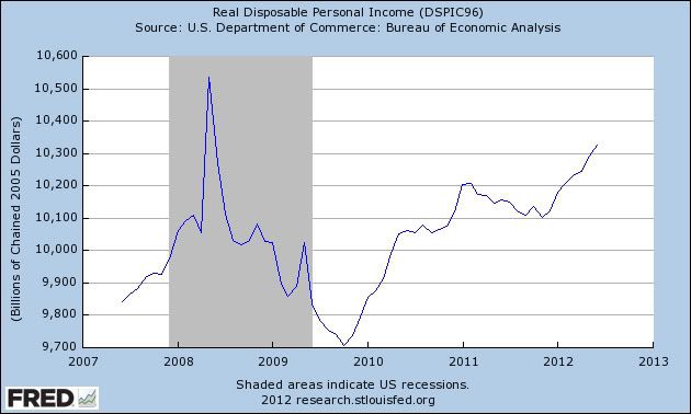
And real disposable personal income has risen at the annualized rate of 4%+ since bottoming last November:
While rising real pesonal disposable income hasn't always negatived a rescession (see 1970 as well as 2008), typically it falls during a recession, and as the below graph shows, when it has fallen during recessions, once the rate has risen back above +2.5% on a YoY basis, the recession has always been over:
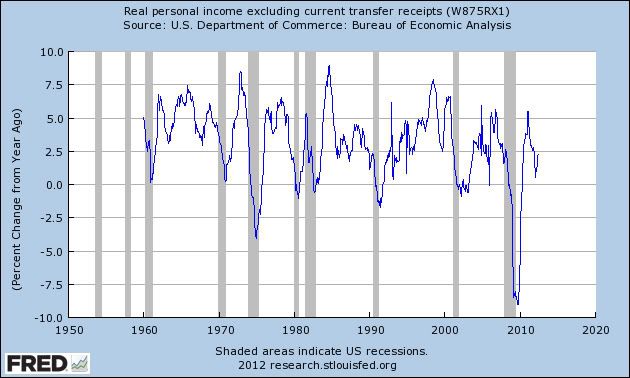
If the trend since the end of last year continues (as to which there is no guarantee), then we are at 2.5%+ YoY in real disposable personal income right now, although we won't know it until the data is reported 2 months from now.
To the extent the Fed's quantitative easing programs have enable the refinancing that has stopped the economy from entering a renewed recession, they have been a resounding success.
An Overview of the EU Economic Situation
Lost in the headlines coming out of Europe is any real mention of their overall economic well-being. So, let's remedy that problem by doing just that -- looking at the data.

The overall annual EU growth rate has been declining for the last 5 quarters. This is obviously caused by the Greek/debt crisis (which is negatively impacting confidence) but is also the end result of austerity policies which also lower growth.
 The above data is from the latest Eurostat GDP report. The left side contains quarter to quarter data, while the right side contains year over year data. I've circled the last quarters where there has been a decrease and placed rectangles around time series that show more than one quarter of contraction. Notice that Italy, Cyprus, Hungary, Greece, Spain, Portugal and the Czech Republic are experiencing lengthy economic downturns. Also note the UK falls into this category. Belgium and Finland are now adding to the countries that are experiencing trouble. In short, there are problems across the eurozone that are widespread.
 As a result of the weak economic growth, we see a continued increase in unemployment, which hit 11.2% recently and has held there.
 Slower economic growth also leads to lower industrial production. This number has been negative for the better part of the year.
 The above chart from the latest Markit manufacturing report shows the breadth of the manufacturing slowdown. It's basically hitting the entire euro area.

The above chart shows the Y/O/Y percentage change in retail sales. This is another poor chart, but it is to be expected considering the overall economic backdrop.
There are a few good data points.
 Inflation is low -- and it's been declining.
 While there is a current account deficit, it's actually pretty low.
But, in short, the EU economy is grinding slower.

The overall annual EU growth rate has been declining for the last 5 quarters. This is obviously caused by the Greek/debt crisis (which is negatively impacting confidence) but is also the end result of austerity policies which also lower growth.


The above chart shows the Y/O/Y percentage change in retail sales. This is another poor chart, but it is to be expected considering the overall economic backdrop.
There are a few good data points.


But, in short, the EU economy is grinding slower.
Subscribe to:
Posts (Atom)