I see three items of particular importance.
1. The price of Oil and gasolineLet's start with my January forecast,
"2010: Gilded Recovery or Double Dip". Generally, I relied on the LEI to posit that the first half of the year would see a recovery stronger than most anticipated, but that Oil would determine the outcome in the second half (because the yield curve, which usually is reliable predicting the economy a year or so in advance, does not do so in a deflationary environment):
if consumers once again have to pay over $3 a gallon for gas (which ~$90 Oil would give us), it will have a psychological as well as economic impact on consumers, and I would expect them to cut back in other areas. This looks likely to be the case. We are just 6 months into renewed economic expansion, and at the seasonal low for Oil prices, and already Oil is at $80 a barrel. It is a near certainty that the expansion will continue for at least 3-6 more months....
Whether $90+ Oil will lead to a full-blown double-dip economic contraction, or just a slowdown later in the year, is almost impossible to gauge. It depends upon how far over $90 Oil shoots, and how long it stays there. If there is a dramatic overshooting a la 2007, there will be a double-dip. If there is a gradual increase over $90 that does not last that long before consumers cut back and the feedback loop causes price declines, then there may just be a slowdown, or if there is a contraction, it may be shallow and only last a quarter or two -- which is my best guess, and only a guess, at this point.
We now know two things:
1. Oil topped just shy of $90/barrel (or 4% of GDP) in April, and
1. From April on, we have started a shallow deflation.
Here's a graph from
Prof. James Hamilton of UCSD showing that Oil just barely touched the level of 4% of GDP that historically has led to oil-price-induced recessions since WW2:
According to his analysis, each monthly increase or decrease in the price of Oil creates outsized effects that peak about 12 months later. That means that the effects of Oil's increase from $35 a barrel in January 2009 to $80 a barrel in June 2009 peaked this spring, and continue but are beginning to lessen. It was nevertheless a sufficient impact to cause both producer and consumer price deflation for the last 3 months.
This means, as I thought back in January, that the yield curve would not be a reliable forecasting device for the second half of this year. Secondly, by not going over $90/barrel, any economic slowdown brought about by Oil should not tip all the way over into a double-dip recession. The weaker the economy becomes, the more likely Oil continues to decline, setting up a rebound next year.
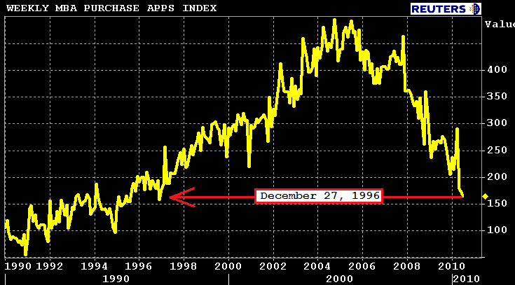
2. The cliff-diving of new home salesThe problem with Oil prices, however, has been exacerbated by the exaggerated decline in the housing market following the expiration of the $8000 tax credit. It seemed obvious there would be a slowdown, just as there was at the end of last year when the credit was initially slated to expire. But instead of slowing down, housing fell off a cliff. The much discussed "crash" of the ECRI leading index is apparently mainly due to the decline in purchase mortgage applications, which as of last week, have continued to crash:
What we know from the business cycle research of
Prof. Leamer of UCLA is that housing declines typically lead recessions by about 5 quarters. Before the recession starts, other durable goods such as autos, also turn down. Yet here autos came in at their lowest sales number in 5 months, only one month after housing fell apart. Is this a feint, or is it because Leamer's research did not go all the way back to the deflationary busts that regularly occurred before the Second World War, which tended to come on quickly?
One hint as to what might happen is to look at the 2 other times in the last 5 years that Oil prices approached or passed $90/barrel, at the same time as housing was decreasing. That would be the second quarter of 2006, and the fourth quarter of 2007. Here's a graph of Oil prices per barrel, matched with quarterly GDP:
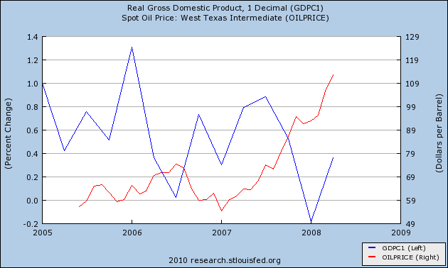
As you can see, in 2006 GDP slowed almost to a stall. In the first quarter of 2008, GDP declined, but only slightly.
The economy is sufficiently fragile at this point, and new home sales have fallen sufficiently long enough and deep enough, to make me believe that we will probably see one quarter of (slightly) negative GDP. But when?
A year and a half ago I took a very detailed look in five installments at the
Economic Indicators during the Roaring Twenties and Great Depression. I examined those indicators because our current situation more closely resembles those debt-deflationary downturns, as opposed to post-World War 2 inflationary recessions. That data from the Deflationary period of 1920-1950 showed that all of those deflationary recessions followed a pattern. The CPI declined from the beginning of the recession and its YoY rate of decline bottomed immediately before the recession's end. M1 money supply followed a similar pattern, sometimes coincidentally, sometimes leading slightly. In all 6 of those deflationary recessions, once M1 and CPI began to decline at a decreasing rate, the recession was about to end.
For example, looking at the Great Depression of 1929-32 (1= no change YoY, .9 = 10% decline YoY etc.):
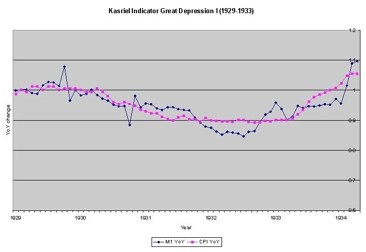
we see that in this, the biggest of all economic contractions of the last century, like all other deflationary recessions,
there was a clear pattern of M1 and CPI on the graphs --both money supply and inflation contracted at an increasing rate, then at a constant rate, before simultaneously or with M1 leading the way before CPI, both turn back up (meaning, prices and money supply are still declining, but at a decreasing rate) near the end of the deflationary recession. In other words, these deflationary recessions began to end once demand picked up. As demand picked up (recall Econ 101) inflation reappeared.
Turning our attention to our current financial crisis, which also features a debt deflation, here is the graph of the same indicators (M1 in blue, CPI in red as in the above graph):
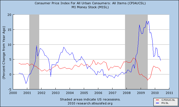
The first thing that stands out is how "Helicopter Ben" intervened in the cycle by flooding the system with cash. The continuing good news is, M1 has not turned negative. "Real" inflation adjusted M1 is still positive, although at a decreasing rate. Remember, though, that pre-WW2, M1 money supply could be a more coincident than leading indicator, meaning if it declines, that would still signal a new round of recession. Assuming that happened, the monthly CPI readings do give us a clue as to when the maximum YoY deflation might be. Here is a chart of monthly CPI for the last five years:
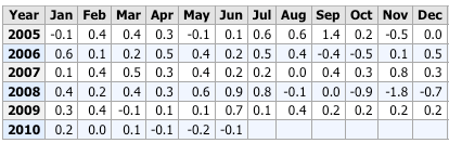
If deflation persists for the remainder of this year, all the positive readings from the second half of last year will be replaced, and YoY deflation will intensify. But, absent a wage deflationary spiral (let's not even go there), there should be no further deterioration after early next year. In other words, if we do slide down into negative GDP for one quarter, it is likely to abate about in the first quarter of next year. The yield curve from this winter and spring was quite positive, and with a return to inflation, that would suggest renewed growth by next spring -- as is also indicated by the money supply and yield curve indicators from the 1920s and 1930s.
In summary, even if there is a brief "double-dip". it should not wipe out the advances in the GDP and Industrial Production we have seen since the bottom in June 2009. It will be a "recession within the recovery" just as 1938 was a "recession within the Depression" that did not return the economy to its former low point.
3. Income stagnation due to persistent high unemploymentOne trend that stands out as deserving of more attention - including by me - is the affect of income stagnation. Here is a graph showing average (i.e., mean) hourly income for the last 5 years (blue), median wage growth (green). and inflation as measured by the CPI (red):
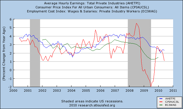 (Note: both mean and median income are included because the mean can be distorted by the top income earners. The median is the 50th percentile, but is measured only quarterly and not monthly)
This graph tells a story of income stagnation - increasing less than even tame inflation - leading up to the Great Recession, and also for the first 5 months of this year.
Shortly after I became convinced in April 2009 that the Recession was about to bottom, I penned a note stressing that there could be
no sustained economic growth without real wage growth.. Here's a slice of what I said then:
with anemic wage growth to say the least, any incipient recovery appears doomed. For example, if our current (- 0.7%) deflation bottoms out and turns up within the next 2-4 months, how could there possibly be any significant expansion, if once again wages fail to keep up? Any such recovery would be short lived, strangled by the inflation caused by its own increase in demand. If the inflation rate agains exceeds wage growth, consumers will simply cut back again....
I went on to point out that in the last 3 decades, that statement had also been true, but had been avoided by consumers either cashing in appreciating assets or refinancing debt at lower rates -- and that the second possibility might still happen one more time. I concluded that:
if lower mortgage rates persist, there will be space for an economic breather ....
After that, the signs of a much stronger recovery, particularly in manufacturing, appeared, and GDP made up 3/4's of what it had lost in the "Great Recession." Jobs also began to be added much more quickly than following the 2001 recession. This was a strong, not weak, recovery, compared with the last two. But the nagging issue of wage stagnation remained. For example,
in January, I asked:
If gas prices go up too much, or as the effect of last year's stimulus plan begins to wane, can gains be sustained?
And two months ago
I reiterated that:
The most acute threat to the economic recovery that has begun is the same as the biggest chronic problem for the middle/working classes for the last 45 years: a lack of real wage growth.... In 2009, the bottoming of the Great Recession was helped by the fact that wage growth, although paltry, nevertheless was accompanied by a decrease in gasoline prices that gave consumers (the 85% or 90% who were employed) more disposable income.
That situation reversed in the last 6 months and now poses the most direct threat to the sustainability of the recovery.
The LEI have been slowly rolling over, and June's number will almost certainly show a substantial decline. This strongly suggests a stall if not an actual contraction within the next 3-6 months. Income stagnation -- that could not keep up with even a 2%+ YoY increase in inflation, and itself due to persistent high unemployment -- is a third potent reason why.
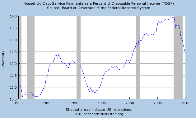
Let me conclude by making a few observations about the longer term:1. With no structural assistance from Washington, Americans are solving their debt problems the way their forebears before 1932 did -- on their own, by saving more:
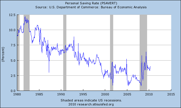
and paying down debt:
This process is likely to take another 2-3 years to undo the lion's share of the damage done since 1980.
2. While we are probably only a very short time away from the ultimate bottom in new home sales, price declines are likely for at least another 2 years until house prices return to their normal long term cost vis-a-vis average income. Yesterday's not good but un-bad news was that housing permits stabilized. If purchase mortgage applications also do so, that at least will mean we've reached the bottom.
3. Energy prices are another structural concern. We could get lucky and as new deepwater sources of Oil, e.g., off the coast of Brazil, come online, Oil prices could decline. But it was a fundamental miscalculaton of the Obama stimulus not to get to work on mass transit and power generation issues that weren't immediately "shovel ready" and bring them to fruition over a course of several years. But for now, proponents of the theory of "peak Oil" have been winning the argument.
4. Despite all of the above, there is no desire inside the Beltway for demand-side economics, building up the income and wealth of average Americans. Campaign contributions for both parties are dominated by wealthy banks and other corporate interests. Until Washington ceases to be Versailles on the Potomac, the structural problems facing 90% of Americans will not fundamentally change either.
To sum up, the idea of a reverse-square-root recovery, with an initial V that is incomplete may be the most fitting. Certainly with "peak oil" at least temporarily true, wage stagnation continuing, and several years until the bottom in housing prices, a recovery that is both strong and sustained will be hindered by powerful headwinds.


 Gross private domestic investment was very weak for the four quarters before the recession. During the recession they numbers turned sharply negative, largely as a result of a large decrease in business investment. Investments increased for the two quarters after the recession ended, but then turned lower, advancing very little.
 Exports and imports turned negative the quarter before the recession and turned sharply lower during the recession. After the recession, both increased at decent rates for the first two post-recession quarters, but thereafter started to weaken.


 Above is a chart of total non-farm employees for the years 1989-1994. Notice a few points.

 Remember that total manufacturing employment decreased by 1.3 million over the recession at maximum employment losses. Total employment of durable goods manufacturing contracted over 1 million, meaning it bore the brunt of the losses.
 Non-durable manufacturing lost the obvious remainder of jobs. with losses totaling a little over 150,000.
 Above is a chart of durable goods manufacturing employment for the entire recovery. Notice it took nearly the entire expansion -- 6 years -- before the durable goods sector returned to near the level it reached before the recession.
 Above is a chart of service sector employment for the duration of the 90s expansion. Notice this is where a bulk of the job creation occurred. However, the recession ended in 3/91, year employment did not ramp up until the end of 92, over a year after the end of the recession.


