Saturday, January 30, 2010

In Which I Repair Prof. DeLong's Broken Okun

- by New Deal democrat

In a post yesterday in response to the Q4 2009 GDP report, Berkeley Prof. Brad DeLong asks, "Where Oh Where Is My Okun's Law?" and includes the following graph:
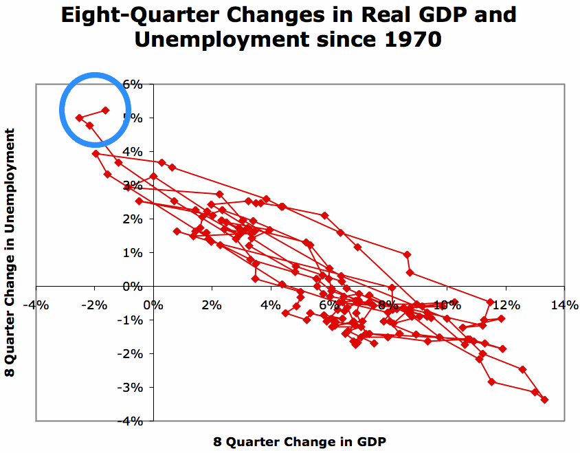
The circled area to the upper left is the most recent GDP and unemployment rate data which the Professor suggests have broken Okun's law.

In my opinion, the Professor already has the answer at his fingertips. Here is a graph he put together last August purporting to show that"Restricting yourself to post-1995 data seems to make very little difference in Okun's Law":


At that time I suggested to Prof. DeLong that he needed to break out 1995-present from 1948-94, and the change would appear. I suggest now that the most recent data circled by Prof. DeLong in the first graph above shows the following change in the relationship from 1995-present:

The two red dots in the upper left hand corner and the amateurish blue line are mine, and obviously aren't meant to convey mathematical precision, but you get the drift.

I submit that Okun's law still prevails, but the slope of the tradeoff has changed, and the point at which it intersects with a zero change in unemployment has shifted slightly to the right compared with pre-1995 data.

Needless to say, I stand by my posts of earlier this week indicating that if we have another good quarter of GDP growth now (which I regard as baked in the cake per the LEI), we are going to see some job growth.
Weekly Indicators: Caution Flag edition

- by New Deal democrat

This week, for the first time, the weekly indicators flashed a warning about the sustainability of consumer spending.

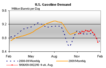
Let me get right to the most important news, which is shown in the graph below. Here's demand for gasoline for the last two years from the E.I.A.:

While gasoline stocks are considerably higher than normal (separate graph,not shown), for the first time, gasoline usage is DOWN from the same time a year ago, indicating that the price of gasoline is taking a toll on the economy. Prices at the pump did back off slightly last week. You may recall a couple of weeks ago I called the Oil the "Joker in the Deck" that could derail growth and cause a double-dip contraction later this year.

Another yellow flag comes from weekly reports of retail sales. The ICSC reported that same store sales decreased 2.5% from the week prior, but more importantly were only up 1.9% from a year ago. For the 4 weeks of January, YoY sales are up an average 2.2% -- about 0.5% less than the likely CPI increase. ICSC itself "expects same-store sales for January to be up by about one percent," which is even worse.

Similarly ShopperTrak "reported that year-over-year ... retail sales slipped 2.5 percent for the week ending January 23 while sales increased 4.5 percent versus the previous week ending January 16."

You may recall that Edmunds.com sounded very cautious about January auto sales last week. We may get an unpleasant January real retail sales number.

The BLS reported that initial jobless claims declined to 470,000, a decrease of 8,000 from the previous week. The 4-week moving average increased slightly again to 456,250. I am not concerned by this as it most likely indicates an overly aggressive seasonal adjustment in the later part of December and in no way compromises the downward trend from last April. Another couple of weeks should tell.

Railfax reported that cyclical rail traffic rose seasonally and is also up about 10% from last year. Intermodal and total traffic are both also up slightly. Baseline traffic remains significantly below even last year's depressed levels. This is similar to the pattern coming out of the 2001 recession.

Finally, the Daily Treasury Statement for the month through January 28 shows $132.8B withholding taxes paid this year vs. $142.9B a year ago, a decline of about 7%. I continue to believe that the seasonally adjusted bottom for withholding taxes was probably in October.

Friday, January 29, 2010

Weekend Weimar and Beagle

It's that time of the week -- it's time to stop thinking about the markets and the economy. So -- don't think about them. See you on Monday

Oh yeah -- a special shout-out to Miss P in D.C. The puppies are back!!!!!!


Weekly Indicators Protest! We can haz doggies???

- by New Deal democrat

I'm swamped. I'll post the indicators over the weekend.

Maybe in the meantime there are a few photos of doggies someone has laying around?

GDP -- A Look At Imports and Exports

Finally, let's take a look at exports and imports. Click on all images for a larger images.


Imports are increasing on a quarter to quarter basis.


As are exports.

The good news is in both areas. The increase in imports means consumption is increasing and the increase in exports indicates that other countries are growing. However, the overall trend is negative because imports are still larger than exports.

GDP -- A Look At Investment

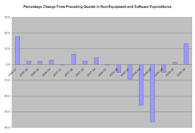
Let's continue out look at the GDP report by looking at the percentage change from the preceding quarter in real (inflation-adjusted) investment. Click on all images for a larger image


Total private investment increased smartly in the fourth quarter, although some of that increase is the result of a bungee like snapping back from a very low level.


Non-residential structures are still contracting. However,


Increases in software and equipment are increasing, as are

investments in real residential investment.

GDP -- A Look At PCEs

Personal consumption expenditures -- PCEs -- account for about 70% of GDP growth. In addition, PCEs have three sub-parts -- service expenditures (about 66% of PCEs), non-durables (about 22% of PCEs) and durable expenditures (about 12% of expenditures). Here are the charts that show the percentage increase from the preceding quarter in real PCEs and its components from the largest to the smallest. Click on all images for a larger image


The percentage change from the preceding quarter in overall PCE growth is now larger than the three quarters that preceded the recession.


The pace of increase in service expenditures is increasing, as is


The pace of increase in non-durable PCEs.


Durable goods purchases are languishing still. But, remember that these only account for 12% of overall PCEs.

GDP and Jobs 2

Yesterday I wrote about the extremely close fit between % changes in GDP and % changes in jobs on a year-over-year basis. Generally speaking, take the YoY %age change in GDP, subtract 2, and you are probably within a percent or two of the YoY % change in jobs, with a lag of a few months.

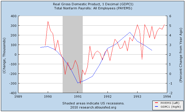
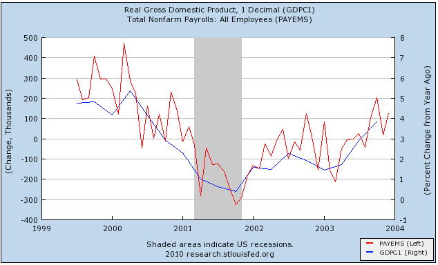
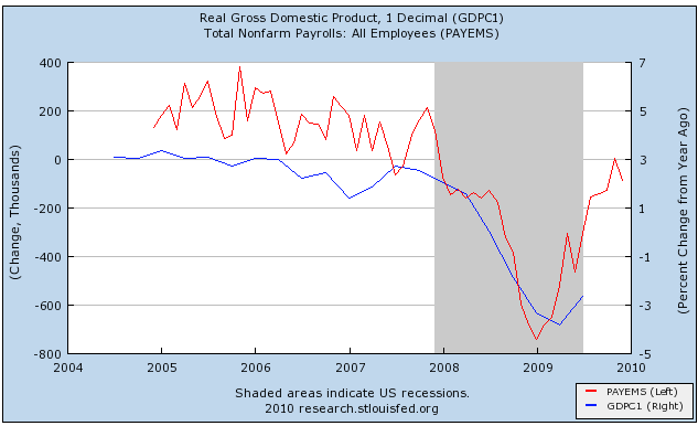
But the YoY change doesn't tell us about when we begin to add jobs coming out of a recession. For that we need to compare changes in GDP with monthly gains or losses in payrolls, which is what I've done below.

First, let's look at a graph of the 1992 "jobless recovery." YoY GDP is in blue (right scale, note I am not subtracting 2 in this graph), monthly gains/losses to payrolls is in red (scale to the left, in 1,000s):

Once YoY GDP turned positive in 4Q 1991, there was only one more month in 1991 and one in 1992 where jobs weren't added to the economy.

Next is the very lackluster "jobless recovery" of 2002-03:

The offshoring of manufacturing was in full swing by this time, and only 3 months of 2002 showed job gains (June, October and November) while GDP was positive over 1% throughout, reaching a YoY gain of just under 2.3% in 2Q 2002. Once YoY GDP hit 2% consistently beginning in 2Q 2003, jobs finally were added to the economy on a consistent basis.

Finally, here is the "Great Recession":

We learned this morning that 4Q 2009 GDP was 5.7%, giving us a YoY GDP of 0.8%. The Leading Economic Indicators virtually guarantee another good GDP number for Q1 2010, making it very likely that we will have YoY GDP in excess of 2% this quarter.

Strictly going by the GDP, if the economic expansion is more like 1992, we are going to start adding jobs consistently now. (Based on increases in industrial production, retail sales, and declining layoffs, I think this is more likely). If the expansion is more like 2002, we are going to add jobs sporadically in some months and not in others. What everyone is watching is sustainability. If gas prices go up too much, or as the effect of last year's stimulus plan begins to wane, can gains be sustained? And noboby is talking about declining unemployment yet. On that, the jury is very much out.

GDP +5.7

From the BEA:

Real gross domestic product -- the output of goods and services produced by labor and property located in the United States -- increased at an annual rate of 5.7 percent in the fourth quarter of 2009, (that is, from the third quarter to the fourth quarter), according to the "advance" estimate released by the Bureau of Economic Analysis. In the third quarter, real GDP increased 2.2 percent.


Let's break the data down into small parts.

Real personal consumption expenditures increased 2.0 percent in the fourth quarter, compared with an increase of 2.8 percent in the third. Durable goods decreased 0.9 percent, in contrast to an increase of 20.4 percent. Nondurable goods increased 4.3 percent, compared with an increase of 1.5 percent. Services increased 1.7 percent, compared with an increase of 0.8 percent.


The decrease in durable goods makes sense considering the increase caused by the cash for clunkers program in the third quarter. Also remember that durable goods is the smallest component of PCEs, totaling just 12% of total expenditures. The increase in non-durables is a pleasant surprise while the increase in services (the largest component of PCEs at 65.77%) is welcome as well.

Real nonresidential fixed investment increased 2.9 percent in the fourth quarter, in contrast to a decrease of 5.9 percent in the third. Nonresidential structures decreased 15.4 percent, compared with a decrease of 18.4 percent. Equipment and software increased 13.3 percent, compared with an increase of 1.5 percent. Real residential fixed investment increased 5.7 percent, compared with an increase of 18.9 percent.


The increase in equipment and software is very welcome, as it indicates the business is starting to restock it's physical infrastructure. And in increase in residential investment is also a positive development.

Real exports of goods and services increased 18.1 percent in the fourth quarter, compared with an increase of 17.8 percent in the third. Real imports of goods and services increased 10.5 percent, compared with an increase of 21.3 percent.


The increase in exports plays into the Asian economies leading the world out of the recession theme (which is already happening). The decrease in imports indicates the US demand is also increasing.

I expect a fair amount to be made about the effect of inventory building in the report. These account for almost 60% of the 5.7% growth rate. What you're seeing here is a ridicules attempt at saying "some growth is bad and some growth is good." The bottom line is inventory restocking is a legitimate economic activity that leads to growth. The argue otherwise is to let your prejudices color your analysis.

Overall, this is a good report. While I don't expect the pact to continue, I do expect a continued increase in GDP.

I'll be breaking the numbers down on a section by section basis for the rest of the day, so stay tuned.

Forex Fridays


Overall, the dollar is in the middle of a rally that so far has three legs - up (A), sell-off/correction (B) and a resuming of the trend (C). Let's break this down.


In the first leg up, we had some major gaps higher (1) indicating there was a fundamental shifting in supply and demand.


Prices rallied to previous highs before forming a pennant pattern (B). Prices sold-off to the 50% Fibonacci retracement level.


Prices resumed their rally (C). Along the way they have gapped higher several times (1) and broken through previous levels (2).

Thursday, January 28, 2010

Today's Market


A.) Prices have moved through key technical support levels on high volume. Also note that volume has been higher on all tghe sell-off days.


A.) Prices have moved through key technical levels on high volume.


A.) Prices are right at key technical levels.

So far, the SPYs have dropped about 5.6%, the QQQQs have dropped about 6.1% and the IWMs have dropped about 5.2%. In other words, we're hardly in scary territory from a total loss perspective. However, this is all before tomorrow's GDP report (which I'll be covering in-depth when it comes out.)

What Barry Said

From the Big Picture:

The question usually comes up in response to something I wrote. I’ve been contacted by Republicans, who want me to join or advise their committees. I usually tell them that I find much of their ideology intellectually indefensible, and their marriage to the religious right offensive.

When I get the same question from Democrats, my response is they seem to not understand how the economy works, are too spineless to get anything done, and are way too politically correct for my tastes.

I agree. Completely.


New Home Sales Drop

From the WSJ:

Demand for new homes in December fell, as cold weather and continuing joblessness put a chill on hopes for a housing-market recovery.

Single-family home sales fell 7.6% from November to a seasonally adjusted annual rate of 342,000, the Commerce Department said Wednesday, though it noted the drop was within the margin of error. December's reported drop followed a 9.3% plunge in November. Meanwhile, on a positive note, home inventories fell last year, compared with 2008, but prices fell, too.

"The new-home market continued to wilt late in 2009," Mike Larson, an analyst at Weiss Research Inc., wrote clients. "The buyers who are willing and able to buy are flocking to cheaper, distressed, 'used' homes."

Home sales for all of 2009 dropped sharply, by 22.9% to an unadjusted 374,000, from 2008's 485,000, as the industry struggled after collapsing from its multiyear boom.

New-home sales suffered because of strong demand for used homes and the looming expiration of a big tax credit. Fears that the $8,000 government incentive for first-time buyers would run out Nov. 30 pushed purchases into earlier months. Congress in early November extended the relief through April.


Let's go to the data:


While the pace of new home sales has dropped the last few months, a longer term look at the data indicates the pace of new home sales is bottoming and has been for most of 2009. However we have not seen a meaningful increase from these historically low levels.


Thanks to Calculated Risk for the graph.

New home inventory is very low by historical norms. That means excess inventory of new homes has been cleared out -- an economically healthy development.

GDP and Jobs

- by New Deal democrat

Tomorrow the advanced estimate of 4th Quarter 2009 GDP will be released, and the likelihood is that all of the popular blogs will be trumpeting that the number is but a "blip," taking their cue from Professor Krugman.

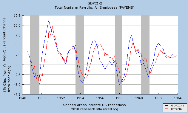
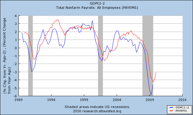
It is well to remember that, regardless of the source of GDP growth, whenever that growth has been in excess of 2.3% a year, it has always led to job growth. Below is the evidence in graphic form. Per prior discussions of "Okun's Law," the blue line represents YoY GDP growth, minus 2% (e.g., 2% YoY GDP growth - 2% = 0% on the graph). The red line is YoY nonfarm payrolls, on the same scale. Here is the immediate post-WW2 period:
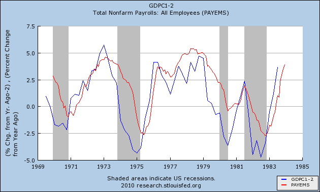
Here are the 1970s and early 1980s recessions:

Here is the era of "jobless recoveries" up until the present:

Notice how well the red line tracks the blue line, and how peaks and troughs are typically ~2% or less apart.

To refresh your memory, here is GDP for the first 3 quarters of 2009:
-6.4% (Q1 2009)
-0.7% (Q2 2009)
+2.2% (Q3 2009)

Even if there is a blowout good number tomorrow (that stands up to subsequent revisions), we're not going to hit +2% YoY GDP growth as of the end of 2009. But beginning this quarter, the goal is much more doable, as 2 quarters of +3.3% growth will be sufficient.

Also, keep in mind that the above graph is for YoY payrolls. A trough is made somewhere in the middle of the year where YoY growth = 0%. Beginning with the 1948 recession, here is the lead time between troughs in jobs and YoY GDP growth in excess of 2%(in descending order, in months):

-9 -8 -6 -5 -4 -4 -3 -2 -2 +7

In case you weren't sure, the +7 outlier is the extremely weak "jobless recovery" of 2002-2003. Even the 1992 "jobless recovery" fit the above pattern.

Notice also that the 1980 "blip" used by Prof. Krugman and others as their exemplar nevertheless generated several quarters of actual job growth.

Assuming the worst case scenario (of 2002-03), if 1Q 2010 is 2.3% or more higher than 1Q 2009 GDP, YoY payrolls will show no losses by August 2010, suggesting a trough in February or March. Under any other scenario, jobs are at their trough now (or revisions will show that we are already past it). Blip or no Blip.

Initial Jobless Claims Drop

From the Department of Labor:

In the week ending Jan. 23, the advance figure for seasonally adjusted initial claims was 470,000, a decrease of 8,000 from the previous week's revised figure of 478,000. The 4-week moving average was 456,250, an increase of 9,500 from the previous week's revised average of 446,750.


Here is the data:


Remember last week we had a big spike of 36,000 that was caused by "administrative" issues -- claims were filed but not processed in the preceding weeks. Therefore, a large backlog was processed in a short period of time. This week we saw a decrease in the one week numbers but an increase in the 4-week moving average. I would expect the 4-week moving average to increase for the next few weeks, largely as the result of the jump of 36,000 last week. However, so long as we continue to see the decrease continue, the jump will amount to a statistical blip.

Thursday Oil Market Round-Up


A.) Oil prices are consolidating in a triangle formation.


A.) Momentum is decreasing and

B.) People are leaving the security.

However, when prices are consolidating, it's important to look at oscillators. To that end


Both the fast stochastic (A) and slow stochastic (B) are showing an oversold condition in the market.

Wednesday, January 27, 2010

Today's Market

There are two important questions with the SPYs right now.

1.) Are they forming a bottom?

2.) Is the bottom strong enough to launch a rally?

Right now the evidence is the SPYs are stabilizing. However, notice that so far the 110.00 - 110.50 area has proved to be difficult to more through.


A Closer Look At Copper

Copper is a key component in many products. Therefore, it is considered to be a leading indicator. Because the markets are currently experiencing some turmoil, now is a good time to look at the chart to see what it says about possible future market direction.


Prices have dropped through several key resistance areas. However, the markets are still open so this could reverse.


A.) The 10 and 20 day EMAs are moving lower and prices are below these EMAs. This is bearish.

B.) Prices are above the 50 day EMA.


A.) The A/D line indicates money is still moving into the market.

Case Shiller Index Mixed

From the WSJ:

The indexes showed prices in 10 major metropolitan areas fell 4.5% in November from a year earlier, while the index for 20 major metropolitan areas dropped 5.3% on the year.

Both indexes declined 0.2% compared with October. Adjusted for season factors, the 10-city index was flat on the month, while the 20-city composite fell 0.1%.

Let's look at the data:


On a year over year basis, the price picture continues to improve -- the rate of decline continues to lessen.


However -- this is where the concern sets in. Notice the 13 cities saw a drop in prices. That is not a good development. While the drop of .2% isn't concerning because of its size, downward movement is not welcome.

Wednesday Commodities Round-Up


A.) Prices have broken two key trend lines, indicating a change in trend is occurring.


A.) The 10 and 20 day EMA are moving lower and the 10 day EMA has crossed below the 20 day EMA. Finally, prices are below all the EMAs.


A.) Momentum has clearly dropped bu

B.) We're not seeing a huge exodus from the shares.

Tuesday, January 26, 2010

Today's Market

Click on all images for a larger image


Prices are just below important technical levels.


Prices are below the EMAs and the shorter EMAs are moving lower. Additionally, the 10 day EMA has moved below the 20 day EMA.


Prices are at technical support. Additionally, the 10, 20 and 50 day EMAs are moving lower and the 10 day EMA has crossed below the 20 day EMA.


The QQQQs are at important technical levels. In addition, the 10 and 20 day EMAs are moving lower and the 10 day EMA has moved through the 20 day EMA.

The point of all these graphs is clear: the markets are hanging in the balance right now.

Tranports Are At Important Support Levels


The transports have moved through several key areas of support and are at important technical levels.