Saturday, September 26, 2009

File Under: Where Have I Heard That Before?

Hmmm...the NY Times sounds vaguely familiar.

The Bonddad Blog, July 6, 2009:

Perhaps the most interesting piece of work Rosie produced recently was an analysis of how many unemployed individuals we currently have for each job opening. Rosie looked at the Job Openings and Labor Turnover Survey (JOLTS) data from the BLS and the number of unemployed (also via the BLS).

Rosie refers to this as “The Truest Picture of Excess Labor Supply,” and it’s hard to argue with that description. The Household Survey reports about 14 million unemployed, and the JOLTS reports about 2.5 million current job openings. Scary stuff.

The Bonddad Blog, Sept. 11, 2009:

The Bureau of Labor Statistics (BLS) puts out several reports. One of them – the Job Openings and Labor Turnover Survey (JOLTS) – doesn’t get wide play. In that report, BLS reports on the number of job openings (among other things). If we combine that report with some information from the Current Population Survey (CPS) – specifically the number of unemployed Americans – we can see the following:


Unfortunately, the JOLTS series only goes back ten years, but the picture this paints of slack in the labor market is not a pretty one, with fully six Americans vying for every job opening.

NY Times, Sept. 27, 2009:

Job seekers now outnumber openings six to one, the worst ratio since the government began tracking open positions in 2000. According to the Labor Department’s latest numbers, from July, only 2.4 million full-time permanent jobs were open, with 14.5 million people officially unemployed.

Friday, September 25, 2009

Weekend Vacation Photos

These are some random photos from our Alaska trip. They're in no particular order. Hope you like them -- and I'll be back on Monday.


The Week in Review: A mixed bag

- by New Deal democrat

Here we are at Friday afternoon again, and before Bonddad posts his much awaited photos and calls it a weekend, let's quickly recap the week.

Unlike last week, which was a full-throated battle cry of bullish data, this week was more of a mixed bag:

- Leading economic indictors for August went up 0.6% and July was revised higher 0.3%, but the underlying data is mainly already known.

- Initial Jobless Claims fell to 530,000, suggesting that the economy is getting closer to the point where it actually starts to create more jobs than it loses.

- Existing Home sales fell slightly in August. The market was apparently expecting Nirvana, and this hiccup (sales are still up YoY for the third month) helped cause a sell-off.

- Durable goods orders (which Bonddad sometimes calls "the Boeing report" because of the heavy influence of aircraft orders) fell -2.4%, taking back about half of the July gain. Ex-aircraft, the series was unchanged. The decline in capital new orders is troubling, but was already factored into the August LEI report so may have no effect.

- U. of Michigan consumer confidence for September rose to 73.5, up from August's 65.7, far above expectations. More importantly, the leading indicator of consumer expectations rose to 73.5, its highest since before the Recession.

- New Home Sales were reported up by the Census Bureau to 429,000 a whopping 3,000 more than the revised July report, i.e., not nearly as much as had been expected.

- the weekly Railcar report showed stabilization after last week's decline. YoY figures generally continue to improve.

- the American Trucking Association reported that its "Truck Tonnage Index increased 2.1 percent in August, matching July’s increase of the same magnitude.... Compared with August 2008, SA tonnage fell 7.5 percent, which was the best year-over-year showing since November 2008."

- Shoppertrak reported that "year-over-year retail sales declined 4.5% for the week ending Sept. 19, ... [but] current sales for the month of September versus last year are only down 1.0%."

The takeaway this week is that the Recovery proceeds but subject to what Bonddad has called "fits and starts." The leading components so far suggest that September's LEI will remain positive, but significantly weaker than the last 5 months.

In the meantime, let's wait on Bonddad's pix and have a nice weekend!

A Look At Getting Better/Getting Worse Numbers


The above chart is from Pollster.com. It is a combination of all the big polls regarding how people feel about the economy. This is one of the first polls that caught my eye back in the late spring. I hadn't looked at it since the election. When I saw the then big swing between March and May I was very surprised. This occurred at the same time we were seeing a dip in the 4-week moving average of initial unemployment claims. These two factors were what first convinced me the economy was bottoming out.

The above chart shows two trends. The first occurs from March to May and shows an increase from 10% to 25% of respondents who said the economy was getting better. The second goes from mid-July to now that shows a more gradual increase from 25% to about 35%. Conversely, the number of people who said things are getting worse decreased from 70% to 50% in the March to May period and the number again decreased another 5% to 45% in the July to current period.

These numbers are not stellar. However, they do track with the rest of the economic numbers that we are seeing which show a clear bottoming in economic activity. It's also important to remember a very important point: the US economy is not going to turn around in one day -- or even a year. We went through the worst economic shock since the Great Depression; something of that magnitude does not lead to quick recovery. But, things are definitely on the right track now.

When will the Economy Start to add Jobs? (VI.) A Conclusion and a Prediction

- by New Deal democrat

This is the Sixth of Seven articles in which I am examining when economic growth (GDP) will translate into job growth (the 7th will deal with the unemployment rate). In the first 4 articles I examined 5 potential leading indicators of job growth. In the 5th article, I showed how the leading indicators fit together temporally. What remained is the issue of whether there was enough "ooomph", enough strength, to push job growth over the top. Certainly I can say that historically when an indicator has reached level X, that has always occurred at the same time as actual job growth, but then it is no longer a leading indicator, just a contemporaneous report.

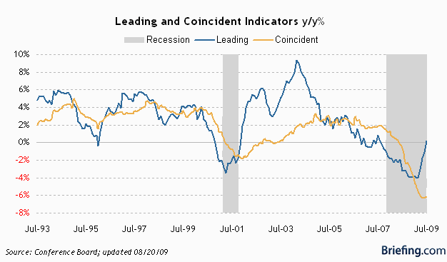
But jobs, or Employment, is one of 4 "Coincident Economic Indicators" (actually, the biggest, accounting for just over 50% of the index) kept by the Conference Board, along with Industrial Production, Real Income (a/k/a Personal income minus transfer payments), and Manufacturing and Trade Sales. Three of those four are also thought to be what the NBER tracks to determine if there is a recession or not. The difference is that the NBER includes our "holy grail", Real retail sales, as opposed to the Conference Board's Manufacturing and Trade Sales. This means, we have an excellent tool to estimate when Employment might turn positive, because it is this Index of Coincident Economic Indicators that is the exact thing that the Leading Indicators are supposed to lead!

Here is where the Leading vs. Coincident Indicators stood before this week's report:


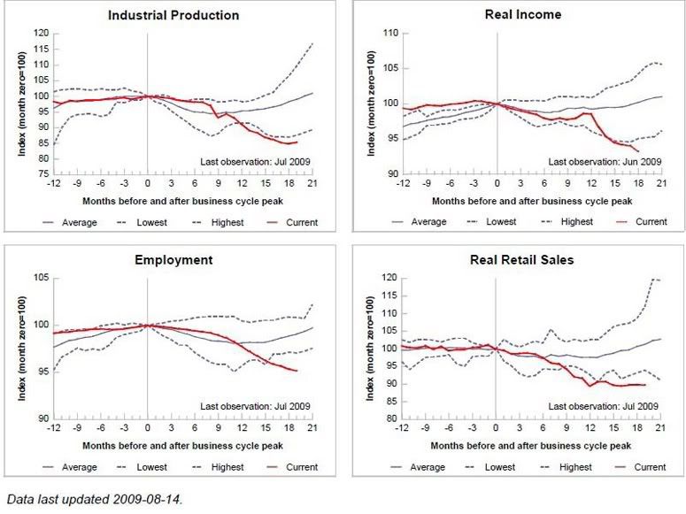
Here is the St. Louis Fred's index of each of the 4 coincident indicators as of last month:


As of this week, while the Coincident index moved sideways, the Leading index is now up ~+2.3% YoY. If it merely meanders sideways for the next 3 months, it will be up over 4% YoY (and barring a sudden stock market meltdown, it looks like it will rise again in September). In comparison, the LEI was ~+5% when jobs started to be added even during the 2002-3 "jobless recovery."

More importantly, the Leading index is designed to lead the Coincident index by about 6 months, give or take 3 months. For our purposes, simply put, the Coincident index should cross zero at some point during that time frame. That means that the average of the 4 series should be at the same reading -- 0% YoY -- at about that time.

So therefore, for purposes of this analysis, I am making the following assertions that I believe are reasonable and probable:

(1) The average of the 4 Coincident Economic Indicators, which include Employment, will cross 0% YoY at some point between October 2009 and April 2010.
(2) Manufacturing and Trade sales (used by the Conference Board as a coincident indicator) will track Real retail sales (used by the NBER to date Recessions) closely, with a several month lag.
(3) the 4 coincident indicators will improve by roughly the same percent (or at least not diverge more than in previous recoveries) in order to arrive at the average of 0.
(4) Jobs will follow a relatively stable trend of improvement - there will be no wild fluctuations.
(5) Per my previous analysis, if both Industrial Production and Real retail sales advance more than 2.5% from their bottoms, Employment must be growing.

I am also varying the weighting given by the Conference Board to calculate the Coincident indicators slightly for ease of calculation.

With those parameters set, let's begin.

I. The above parameters mean, in summary, that in order for Employment not to bottom by the month Coincident Indicators average 0% YoY, both Industrial Production and Real retail sales must not have advanced 2.5% from their bottoms, BUT nevertheless, Industrial Production, Real income and Wholesale and Trade sales must be up sufficiently over zero as a group to compensate for Employment still being negative YoY.

For that set of parameters to be met, one of the two categories already advancing -- Real retail sales (wholesale and trade sales) and/or Industrial Production -- must stall (so that they are not both over 2.5% from their bottoms). But if one of them stalls, then to have a weighted average of zero at the crossover month, then the other of the two, together with the other laggard, Real Income, which only makes up about 15% of the index, must inexplicably surge by at 10%(!) (if we use the January 2010 crossover date), or 2% (if we use the easier 9 month target of April 2010) to make up for both the negative Employment number and the negative Industrial Production or Retail sales number.

The odds of all those conditions being met appear quite small. Even in the 2002 "jobless recovery," Industrial Production rose at most 1.7% and Real income 1.4% before the Coincident Indicators rose above 0% YoY. Thus, if the Leading Index simply works as designed, Employment must either be zero or higher YoY by January (give or take three months), or else Employment can still be negative YoY at that time but Real retail sales and Industrial Production must be at least 2.5% higher from their bottoms. Either way, it appears a extremely likely that by the time the Coincident indicators cross 0% YoY, Employment must have bottomed.

II. There is still one last item to consider, and that is whether there is a reasonable "glide path" or trend line that would be consistent with a bottom in employment as well as the weighted average growth of Coincident indicators being 0% YoY at the crossover month.

Since this past January, Employment is down -2.2%, Industrial Production is down -2.7% , Real income is down -2.3%, and Manufacturing and Trade sales, not shown, is down -6.3%. (940,862 Million in January, vs. 914,303 in June). To arrive at a weighted average of 0%YoY in January 2010, each of the above must improve on average 2.8%. In the case of Employment, that would mean the economy growing an average of 756,000 jobs each month for the next 5 months! That's not going to happen.

If we extend the time at which Coincident Indicators cross 0% YoY to April (9 months after when LEI's turned positive YoY), then since April 2009 Employment is down -0.9%, Industrial Production is up +0.3%, Real Income down -0.1%, and Manufacturing and Trade Sales down -1.3%. To arrive at a weighted average of 0% YoY in April 2010, each of the above must improve on average +0.6% from their present readings (actually, to comply with my +2.5% requirement, Industrial Production must still improve 0.8%, which means that Real income does not need to improve at all). In the case of Employment, that would mean adding a total of 426,000 jobs in 8 months, for an average of 53,250 new jobs a month. This can be done by a positive move of +62,500 a month, giving us the following nonfarm payrolls over the next 8 months:
Sept. 09 -145,000, Oct. 09 -91,000, Nov. 09 -28,000, Dec. 09 +34,000, Jan. 10 +97,000, Feb. 10 +159,000, Mar. 10 +200,000, Apr. 10 +200,000.

The above is just an example, adding +426,000 to total payrolls to meet the "0% YoY change in Coincident Indicators" constraint. Remember, though, that the purpose of this series is to try to estimate when the economy will begin to add jobs -- i.e., net +1 jobs. Using Leading vs. Cooincident indicators is a tool to do so. In other words, there are plenty of other "glide paths" that add jobs - although less than 426,000, if Industrial Production and Real retail sales both improve more. We just don't have the tools to estimate them well, although they must also be consistent with the analysis above.

Extending our crossover point to April gives us a "glide path" for Employment that looks perfectly reasonable and doable, given the strength of the Leading Economic Indicators. A slightly more aggressive "glide path" might possibly give us a positive number in November, if the target crossover date is March instead of April.

Let's review my analysis of when the Economy will begin to add jobs:

(1) ISM manufacturing and Industrial Production both suggest that Employment may well make a bottom as early as October.
(2) Initial Jobless claims suggest 3 months or longer, as does the slow improvement of Real retail sales. This puts us in December or January.
(3) The most likely month to give a reasonable "glide path" of actual job growth as indicated by the Leading Economic Indicators vs. Coincident Indicators is December, or possibly November if there is enough strength in the economy.

A recent graph prepared by Raymond James Investments shows the trends very well:


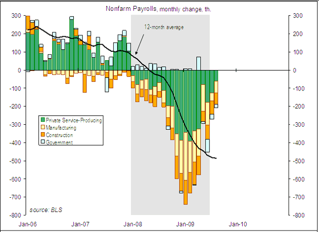
Note the trend since the December trough in payroll losses. Interestingly, this breakdown shows that it was May, not June, that was the outlier in the trend, as service businesses (green) had few layoffs that month. Nevertheless, the overall trend suggests that services could begin to add rather than lose jobs as early as this month, September! Manufacturing, in accord with the ISM index, may follow as early as next month, October. That leaves construction as the ongoing drag on job growth, and the question becomes, when will growth in services and manufacturing be enough to overcome construction losses.

Based on my analysis above, November or December are when I believe that turning point will be reached, plus or minus one month in either direction. Let me be the first to acknowledge that this is not a scientific truth or certainty, but a best estimate based on a logical review of existing data with a long history that accommodates both traditional and "jobless" recoveries. Nevertheless, at least in terms of payroll growth, the analysis in these six installments cause me to predict that this will not be a "jobless recovery" for long.

In my last installment, I will look at Real Retail sales as it relates to Unemployment.

Forex Fridays


1.) Prices formed a double top with the first top at the end of last year and the second top at the beginning of this year. This is a reversal formation.

2 and 3.) These are support levels which prices have moved through.

4.) The MACD is deceasing and has been for the entire year.

5.) The RSI is decreasing and has been for the entire year.

6.) The EMA picture is bearish: all the EMAs are moving lower, the shorter EMAs are below the longer EMAs and prices are below all the EMAs.


1 and 2.) These are technical support levels which prices have moved through.

3.) Prices consolidated in a triangle formation. Triangles are reversal and continuation patterns; that is, they occur during a trend.

4.) The MACD have been decreasing all month but is about to give a buy signal by crossing over its signal line.

5.) The shorter EMAs are below the longer EMAs. The 20 and 50 day EMA are moving lower, but the 10 day EMA is starting to level out.

Bottom line: this is still a very bearish chart.

Thursday, September 24, 2009

Today's Markets


I've included the above picture simply to show where technical support lies on the chart. Simply put, at current levels there are a lot of levels where prices could stop. In addition, prices have fallen about 2.75% from their peak of 108.


Also note the two primary uptrends are still intact.


Notice on the daily chart that we're coming off a double top formation (Number 2). Also note that there was a ton of volume (1) at the end of trading yesterday and the start of trading today.

Will the Real Growth Please Stand-Up?

I've seen a fair amount of commentary around the web that the latest retail sales number is less than legitimate because cash for clunkers obviously played a role in influencing the number. In response to that claim consider the following chart:


Click for a larger image

This is a chart of government consumption expenditures as a percentage of GDP. Both numbers are inflation-adjusted.

Government spending always has an influence on overall GDP. To those who would argue that we shouldn't count cash for clunkers growth I would pose the following question: Where is the line between government spending that we should count and government spending we shouldn't count?

My position is straightforward: cash for clunkers is a classic Keynsean style program that did what it was supposed to do: stimulate demand. The growth that resulted from the program is real -- it increased production in the auto sector added wages to auto employees etc.... In addition, I've never bought into the "you're cannibalizing future sales" with programs like cash for clunkers. I've never seen a valid largely because I don't see how you can actually measure the answer.

More Signs of an Energy Correction

Let's look at the chart of the gas futures ETF:


Like oil, prices have fallen through the long-term trend line.


A closer look at the chart shows that prices have moved through the 200 day EMA and lower support.

Initial Jobless Claims: You're reading the right blog

- by New Deal democrat

On Tuesday I said:


Additionally, as you can see in particular from the last graph, even mid-sized moves within a trend by Real retail sales are usually mimicked by the next month's Initial Jobless Claims -- see for example the late 2005 spike due to Katrina, and a similar, smaller spike in January of this year. Since Real retail sales soared in August due in large part to "cash for clunkers", it should be no surprise that Initial Jobless claims have fallen in each of the last two weeks, and may well continue to do so for several more.

This morning Initial Jobless claims fell to 530,000, the lowest since July 24's 524,000. The 4 week moving average fell to 553,500, the lowest since January of this year:


The number of U.S. workers filing new claims for jobless benefits unexpectedly fell 21,000 last week, government data showed on Thursday, and a less volatile unemployment claims gauge dipped to an eight-month low.

Initial claims for state unemployment insurance declined to a seasonally adjusted 530,000 in the week ending Sept. 19 from a revised 551,000 in the previous week. Analysts polled by Reuters were expecting claims to rise to 550,000 from a previously reported 545,000.

High-paid Wall Street analysts may have been surprised, but you weren't if you were paying attention to this blog.

By the way, this is one week's data, and comes nowhere near to satisfying my condition of the 4 week average dropping to 530,000 on a sustained basis before there will be actual job growth in the economy.

Thursday Oil Market Round-Up


Click for a larger image

Two very important points.

1.) Prices are now below the long-term trend line.

2.) Prices have sold off on high volume.


1.) Notice the 37.5 - 38.5 area has provided a ton of upside resistance.

2.) Prices dropped through three moving averages today on high volume. Notice how much higher today's volume was compared to the previous days.

3.) Notice how the upward sloping trend line has become resistance.

Wednesday, September 23, 2009

Today's Markets


OK -- guess when the Fed released their policy statement. No really, guess.

The markets popped higher at first, but then moved lower in a strong way on strong volume. Let's look at the key points.

1.) Prices move strongly higher on good volume. This is a long bar and it is a bullish sign.

2.) Prices print another long bar, this time moving lower stopping just above an EMA. This is a little more than half an hour after the big move higher and indicates the rally has failed.

3.) Prices rallied higher but ran into upside resistance at the 10 minute EMA. Prices then sold-off with a pretty long bar and closed just below the 50 minute EMA.

4.) Prices move through the 200 minute EMA and close below the EMA. This tells us we're probably going lower in a big way.

Richmond Fed Shows Expansion

From the Richmond Federal Reserve:

In September, the seasonally adjusted manufacturing index — our broadest measure of manufacturing activity — was unchanged from August's reading of 14. Among the index's components, shipments edged up one point to 22, new orders lost five points to finish at 13, and the jobs index picked up five points to end at 5.

Other indicators varied. The capacity utilization measure moved down six points to 16, and the orders backlogs and delivery times indexes turned negative, losing nine and five points, respectively, to end at −5 and −3. Our gauges for inventories grew more slowly in September. The finished goods inventory index trimmed four points to 18, while the raw materials inventory index dropped six points to 12.


Here is a chart of the overall index:


Notice the index is at levels associated with several other high points that occurred during the last expansion.

Let's look a little deeper into the numbers:


Click for a larger image

The volume of new orders has decreased for the last two months. While this isn't enough to call a trend, it does indicate the pace of activity may start to slow in the next several months. However, the employment index has increased over the same time period, which is positive. However, as Invictus pointed out yesterday, the future employment numbers indicate hesitation. The number of expected employees is still hovering around 0 and the expected average workweek is trending lower. My guess is there is little visibility at this point -- that is, no one has a clear idea of whether of not the economy will be producing orders over the next 3-6 months. That is to be expected at this point in the recovery; the economy is just turning around so there are still going to be a lot of questions regarding sustainability.

The 1949 Recession, and why it suggests this recovery won't be like the post 2001 recovery

- by New Deal democrat

Just about everyone seems to think that we live in an era of ever-lengthening "jobless recoveries." If you have followed me long enough, you know that I am usually skeptical of conventional wisdom, and frequently it turns out to be wrong. In that vein, I have become more and more convinced that the incipient Recovery will be unlike the recovery from the 2001 recession. My recent/ongoing examination of leading indicators for job growth as caused me to take a long look at another, similar recession to 2001: the first post-war recession of 1949.

Here is what more typical recessions and recoveries look like graphically:


Notice that both industrial production and real retail sales recover strongly after 3 of the 4 1970s era recessions, and employment follows almost immediately. In the weakest recovery, 1970, industrial production grew just slightly over 2.5% and jobs expanded, but slowly.

Yesterday I noted that in 1949, even though Real Retail Sales grew at a very slight rate throughout the recession, Industrial Production declined. Once both started to grow again, so did Jobs within several months thereafter:


And in 2002, at first Real Retail Sales grew, but Industrial Production did not. Then Industrial Production grew, but Real Retail Sales did not. As soon as both started to grow together, Jobs finally started to increase:


Although not shown on the two graphs above, there is another important series that behaved oddly during both recessions: housing. Housing starts continued to increase throughout the 2001 recession. In 1949, they declined for a few months into the recession, and then began to grow exclusively throughout the rest of the recession and beyond.

It's as if both recessions left ordinary consumers untouched. In fact, that's exactly what happened, both times.

The 1949 recession was discussed extensively in a Federal Reserve paper in 1956 (pdf) by Benjamin Caplan. Here are a few choice excerpts:
The commonly accepted view is that it was an inventory recession. What this means is that the forces which initiated the downturn had their major impact on the accumulation of inventories.
....
The postwar abnormal expansion in consumers' demand began to level off..... [but] Private fixed investment failed to maintain its rate of expansion and, on the contrary, developed a slight declining tendency. The 1948 drop in the rate of growth of demand at the same time that supply capacity continued to expand was only temporary. It was only a brief pause in the postwar boom. It did not take long to complete the relatively small market readjustments called for, such as price and inventory declines. Because of that fact, the recession turned out to be very mild. (p. 29)
....Preceding the decline in total output, there was thus a weakening in the rate of growth of final sales. When the downturn got under way, final sales did not decline but tended to level out for a while before resuming their upward progress. Consequently, the fluctuations in GNP were primarily in that part of output which does not go to final sales, viz, inventory. (p. 31)
....
over-all business sales reached their peak in August 1948, for durable manufacturers in December 1948, for nondurable manufacturers in June 1948, and for both types of retailers in December 1948;... [while] total business inventories (book value) increased steadily through 1948, reaching their peak in February.

On the labor front, unemployment in 1948 averaged slightly less than in 1947, about 2.0 million or 3.4 per cent of the labor force compared with 2.1 million or 3.6 per cent of the labor force. At the same time the civilian labor force expanded by over 1.3 million in 1948 compared with 1947. However, in the fourth quarter of 1948, layoffs began to appear in nondurable industries and in some consumer durable industries. (p. 34)


Just as in 1949 traditional producers built too much, and had to reduce inventories, even though consumer demand remained strong, so in 2001 the drastic overbuilding of fiberoptic and other infrastructure to take advantage of the New Internet Era, i.e., excessive capital expenditure by tech businesses, burst dramatically as such businesses as pets.com and wine.com, among other business "plans", blew up. If you were in one of the affected industries, you suffered terribly. If not, you sailed right through (I am not including in this discussion the exogenous shock of 9/11 which drastically curtailed all business and consumption activity for a brief period thereafter).

In short, consumption remained almost completely unaffected by both downturns. As a result, both were shallow and, in the case of 2001, it was barely a recession at all, as there were only two unconnected quarters of declining economic activity. Real retail sales stagnated (2001) or slowly rose throughout the recession (1949). Unemployment rose only slightly, and almost entirely due to the downturn in the specific productive industries. As the inventory correction ran its course, rising unemployment slowly abated.

Thus it is no surprise that the low point for Real retail sales actually occurred before the recession in 1949, and at the very beginning of the recession in 2001, and rising so slowly during the course of both economic downturns that that it gave rise to the two big outliers of its relationship with payrolls -- a 3 month lag for the onset and 9 month lead over payrolls in the 1949 downturn/recovery, and a 23 month lead over payrolls in the 2002-3 recovery. In essence the point at which employment began to decline and grow was lost within the "noise-to-signal" band of normal monthly variation in Real retail sales.

The contrast with the recent "Great Recession" could not be more stark. This was a consumer retrenchment with a vengeance! Production and employment reacted immediately to the downturn, dropping precipitously. Conversely, the Index of Leading Economic Indicators has similarly rocketed upward in the last few months, with private forecasting group ECRI just reporting that their index hit an all time high -- even higher than the rebound from the 1982 recession that featured 20% interest rates and 10%+ unemployment.

While I have already noted that employers seem to be "hoarding" jobs, waiting to see if the economic growth is sustainable, it is unlikely to go on long if the consumer retrenchment of September 2008 even partly reverses. In short, there is every reason to believe that this recovery will not behave at all like the recovery after the 2001 recession. If it is to approximate a "jobless" recovery, then the model is much more likely to be 1992 in which jobs did start to grow shortly after the recession ended, but not robustly enough to overcome rising unemployment.

About that "Mysterious Trading in Financial Shares"....

From the WSJ:

A year after the government sought to avert a market meltdown by rescuing some of the country's biggest financial firms, speculative traders are feasting on these companies' remains. Shares of two government wards, mortgage giants Fannie Mae and Freddie Mac, bounced between about 60 cents and $2 in August. Shares of Lehman Brothers, left to fail by the government and currently in bankruptcy proceedings, rose from five cents to 20 cents in recent weeks.

AIG, arguably, has been the biggest casino of all. In the past seven weeks, its common shares have careened between $13 and $55, surging past $54 on Tuesday before closing at $45.80.

The extraordinary price action is a dramatic display of an unintended consequence of the U.S. bailout of AIG. Last Sept. 16, the government propped up the faltering company by trading $85 billion in loans for an 80% stake in AIG in the form of preferred shares, which don't trade on the market. It allowed the other 20% of the company's equity -- its millions of common shares -- to continue to trade publicly.

Some analysts declared the deeply indebted company's common shares basically dead money. Many buy-and-hold investors bailed out. That has left AIG's common shares -- $6.2 billion worth, as of Tuesday -- trading most actively between short-term traders, who buy and sell based on market momentum and bet against each other in risky options trades. Often they use borrowed funds, amplifying their gains and losses.

Dominating the recent move in AIG stock were professional day traders like those at T3. But Goldman Sachs Group Inc. and J.P. Morgan Chase & Co. also owned AIG shares during the run-up, according to people familiar with the matter. Fund managers including AllianceBernstein LP and Davis Selected Advisers also held the shares during a portion of the run-up, according to fund documents.


The internet can be a great tool because it allows people to access a large amount of information. I use it regularly for that purpose. In fact, the internet has opened up an entire world of information to many people.

However, this also means that a lot of people who don't know much about certain topics say really stupid and uninformed things which then become common knowledge. Case in point: sometime over the last few months there was an internet "fact" going around that there was mysterious trading in financial stocks. It must be a scheme by the government to manipulate the stock. It's a sign that the market is topping out -- the reasons and conclusions were everywhere.

When I first read this series of posts my trading and economic radar said "bullshit". The reason for the trading for anyone who knows well, anything about the markets, was simple: speculators were moving into the shares. And now we have the above story from the WSJ about that very topic.

Now, I'm sure there are some people who are saying "the WSJ is a propaganda tool of the government and corporate elite..." at which point we should just tune them out. These people are the economic equivalent of the "birther" movement -- people who just aren't that bright who now have a forum to demonstrate they just aren't that bright.

Wednesday Commodities Round-Up

I'm going to start using ETFs for this analysis. The reason is simple: they're publicly traded allowing more people to access the market.


Click for a larger image

DBA is an ETF that is comprised of corn, sugar, soy beans and wheat. Since the end of last year there has been a slight upward bias to the chart with a trend line labeled A above. Prices have moved above this line on several occasions only to return to the trend line. Prices have consolidated in two areas labeled B and C. Note the consolidation is still above the trend line. Finally, note that while it loos as though there is a possible head and shoulders formation, the formation is occurring at the low end of the pattern meaning this is not a reversal formation.


Notice that prices have struggled to get above the 200 day EMA, indicating this ETF is still in a technical bear market. Also note that all the EMAs are currently trending lower and the shorter EMAs are below the longer EMAs. This tells us the overall trend is still negative. However, also note that prices are in a general rising trend that will-- should it continue -- bring prices into a bull market.

Tuesday, September 22, 2009

Tuesday Evening Miscellany

[Note to self: "Miscellany" would sound better in conjunction with Monday.]

On the second Tuesday of every month, the National Federation of Independent Business (NFIB) puts out its Small Business Economic Trends Report (SBET). The NFIB tells me that they've got about 350,000 member small businesses nationwide. The report is always interesting, and often contains some suprises.

Here are some nuggest mined out of this month's report:

Among the questions asked of small business owners, one deals with the "single biggest problem." The choices are:

Inflation
Taxes
Interest Rates
Regulations
Poor Sales
Competition w/ Big Business
Labor Quality
Labor Costs
Insurance

Interestingly, despite President Tax-and-Spend Obama's presence in the White House, fear of higher taxes is not a major current concern for small business owners:


What IS a huge concern for small business owners is the outlook for sales:

The fear of a poor sales outlook is near a record high. This is testimony, in my opinion, to our new era of consumer frugality and the fear it's instilled in businesses both large and small. I would also note that I found it quite interesting that even after Circuit City declared bankruptcy and went belly-up, Best Buy still reported a sub-par quarter last week (with the stock going down the day of the report). What's the message there, my friends?
Also in the NFIB's SBET is a question about hiring intentions. That appears to be a good news/bad news scenario: The good news is that the reading has bounced off an all-time low. The bad news is that it's still pretty much in record low territory:

While on the subject of jobs, let's put some perspective on the current nonfarm payroll (NFP) situation in the context of the previous nine recessions. We've now lost seven million jobs since the December 2007 peak in NFP, more than twice what we lost in the 2001 recession, which led to a "jobless recovery."
To those who would quibble and say different eras should be looked at in percentage terms, well, let's have at it:

I dearly hope that NDD is right that we'll soon begin adding jobs (though I am personally not optimistic). There is so much pain and slack in the labor market that we need to get some job creation asap.

Today's Markets


Although the SPYs were up .64%, it's hard to count this as anything other than a waiting on the Fed day. Notice that prices -- after rising -- remained at or around the same Fibonacci level for most of the trading day. Bottom line, the market is waiting for tomorrow's announcement from the Fed.

FHFA Price Index Increases

From Marketwatch:

The market value of U.S. homes rose by a seasonally adjusted 0.3% in July compared with June, the third monthly increase this year, the Federal Housing Finance Agency reported Tuesday.

Prices for the latest month fell 4.2% compared with July 2008 and were down 10.5% from the peak in April 2007, the FHFA's statistics showed. Prices in July were at the same level as March 2005 and are essentially unchanged since January. Read the full report.

June's price increase was revised to a 0.1% gain, down from 0.5% previously reported.


Let's take a look at the data.


Click for a larger image.

The above chart is of the month over month percentage change in housing prices. Notice that we've had 5 monthly increases this year (the Marketwatch story has 3).


Click for a larger image

The longer term chart shows that prices have stabilized. Here is a chart of the numerical values in the above chart:


Prices have been fluctuating in the 199.1 to 201.6 range since last November.

Bottom line: the month over month numbers tell as that housing prices are starting to stabilize as well.

Leading Economic Indicators Increase Again


Click for a larger image

From the WSJ:


The index of leading indicators rose for the fifth consecutive month in August, offering yet another sign of a recovering U.S. economy.

The leading index increased 0.6% last month, after a revised 0.9% gain in July, the Conference Board reported Monday. July's gain was originally reported as 0.6%.


These numbers are incredibly strong and indicate the recession is over and growth will start soon.

When will the Economy Start to add Jobs? (V.) Putting the Indicators Together

- by New Deal democrat

This is the Fifth of (da**it!) Seven articles exploring leading indicators for job growth in the economy. So far I have examined:

(1) initial jobless claims, which have until now been declining gradually, and which at their trend rate must decline at least 3 more months before they would get to the point where jobs would be created;

(2) the ISM manufacturing employment data, which is very strong and suggests the jobs could be added to the economy next month, and even possibly now;

(3) Industrial Production, which even moreso than ISM manufacturing, is suggesting that job growth could happen imminently - but has a very short lead time;

(4) duration of Unemployment, which appears to be of only limited value, to confirm a payroll reading afterward; and

(5) Real retail sales, describing it as the counter-intuitive "Holy Grail" of reliable leading indicators for job growth.

In this part, I want to put together Real retail sales with the other indicators to begin to form a picture of the most likely month(s) at which the economy will start to add jobs

Of the Leading Indicators above, Real retail sales turns first, 5 months from its low, or 3 1/2 months from its smoothed low, on average. Short of the 23 month 2003 outlier, the longest lead time since World War 2 has been 9 months.

Real Retail Sales and Initial Jobless Claims

Which comes next? The answer is, Initial Jobless Claims. Here are graphs of Real Retail sales (in blue) and Initial jobless claims (in green), first for the 1970s recessions:


and here are the 1991 and 2001 "jobless recoveries":


and finally our own recession/incipient recovery:


As is apparent on the graphs, Initial Jobless Claims turn north on average 1-2 months after Real retail sales. Thus they serve as a reliable confirmation that the turn has been made. Also, because they are reported weekly, they can give first notice of the trend of Real Retail sales.

Additionally, as you can see in particular from the last graph, even mid-sized moves within a trend by Real retail sales are usually mimicked by the next month's Initial Jobless Claims -- see for example the late 2005 spike due to Katrina, and a similar, smaller spike in January of this year. Since Real retail sales soared in August due in large part to "cash for clunkers", it should be no surprise that Initial Jobless claims have fallen in each of the last two weeks, and may well continue to do so for several more.

Real Retail Sales and Industrial Production

In all recoveries except for 1949 and 2002, both Real Retail Sales and Industrial Production were growing together, and Job growth started within 2 months of both moving up.

In 1949, however, even though Real Retail Sales grew at a very slight rate throughout the recession, Industrial Production declined. Once both started to grow again, so did Jobs within several months thereafter:


And in 2002, at first Real Retail Sales grew, but Industrial Production did not. Then Industrial Production grew, but Real Retail Sales did not. As soon as both started to grow together, Jobs finally started to increase:


Now, here is our recession and incipient recovery. Real Retail Sales did not meaningfully grow until August. As per prior recessions, Job losses are converging slightly below 0 during this period of sideways movement. Industrial Production started to grow in July.


Thus, should both Real Retail Sales and Industrial Production continue to advance off the bottom, we should expect jobs to be added quickly, within several months.

Putting together the order of Leading Indicators for job growth, we get:

(1) Real retail sales bottom and turn.
(2) Initial Jobless claims turn.
(3) The ISM manufacturing index turns above 50, i.e., signals actual growth.
(4) Industrial Production turns.
(5) ISM manufacturing index is above 53, ISM employment is at -5 or above, initial jobless claims are at least a sustained 16%-20% off peak, and both Industrial Production and Real retail sales have advanced at a rate of 2.5% or more year-over-year from the bottom.

Items (1) through (4) have already happened. ISM and Real retail are on the cusp of their final signals, meaning job growth could occur as early as October. Industrial production is growing, but not quite at a 2.5% annual rate yet. And initial jobless claims are still only 15% or so off peak, dropping so slowly that it would take at least 3 more months at the current rate for jobless claims to be consistent with job growth.

Recall that I have discussed the strength of past moves, in Real retail sales:


and in Industrial Production:


So, we still have the question, is the upward move strong enough to push the indicators over the final threshold, meaning that job growth has begun?

To add the final parameter, we need to return to Leading vs. Coincident Economic Indicators. That -- and I promise, an actual conclusion -- next in this series. In the meantime, I'm going to post a side note about the 1949 and 2001 recessions, and why I think the recovery won't look like the recovery in 2002-3.

Treasury Tuesday's

Let's look at the Treasury market from several time perspectives.


On the six month chart, notice that prices are consolidating in a triangle formation and have been doing this for almost 4 months. From the larger perspective, treasuries are caught between two trends. The first is a return to risk based assets that means investors are selling Treasuries and moving into higher yielding riskier assets. At the same time, investors are turning more conservative in their orientation to the markets as profiled in this week's Barron's:

Following the series of shocks that started nearly two years ago -- from a 30% decline in the Dow to the collapse of Bear Stearns, Lehman Brothers and AIG to the revelations about Bernard Madoff's $65 billion Ponzi scheme -- individual investors have changed. They've understandably grown cautious, as was evident again last week when new data showed mutual-fund investors put an estimated $43 billion into bonds and withdrew $1.7 billion in stocks in August, even as the Dow was charging from its March low of 6,547 on its way to last week's 9,820. Cash now stands at $3.5 trillion, above where it stood at the height of the financial crisis.


The three month view shows that prices are at the top end of a range within their consolidation pattern. Notice there's a lot of supply in the lower 92 price handle -- meaning when prices get to that level someone (or a group of investors) puts a ton of stock on the market.


The one month chart shows further consolidation in a smaller triangle at the top of the trading range. Also note that prices are using the 50 day EMA for technical support right now.

Monday, September 21, 2009

Today's Markets


Click for a larger image

The markets opened lower, rose and then ran into resistance at the 200 minute EMA.

What I wanted to show was how important Fibonacci numbers are. Notice there are three sets of Fibonacci numbers in the above 10 day chart. The first is from the bottom on the 8th to the top on the 17th. The second is from the bottom on the 14th to the top on the 17th. The third is from the top on the 17th to the bottom on the 18th. I drew a box around areas where certain Fibonacci numbers were important for certain price action. Just look at how much space is taken up with the price action. That's how important Fibonacci numbers are.