Friday, July 31, 2009

Weekend Beagle and Weimar

It's that time of the week. Think about anything except the markets and the economy. We'll be back on Monday.


More on GDP

From CNBC:

Consumer spending, which accounts for over over two-thirds of U.S. economic activity, fell at a 1.2 percent rate in the second quarter after rising 0.6 percent in the previous quarter.

That sliced 0.88 percentage points from second quarter GDP, the department said.

.....

In contrast to the weak consumer reading, business investment improved significantly in the second quarter. The advance report showed business investment decreased at an 8.9 percent rate in the second quarter after diving 39.2 percent in the previous quarter.

.....

Investment in nonresidential structures fell at an 8.9 percent rate compared to a 43.6 percent drop in the first quarter.

Residential investment, which is at the core of the longest recession since the Great Depression, dropped at a 29.3 percent rate in the April-June period after plummeting by 38.2 percent in the first quarter.

"This report has written all over it the continued divergence between consumers and businesses," said Ashraf Laidi, chief market strategist at CMC Markets in London.


The drop in consumer spending raises concerns. It indicates the recent decline in consumer sentiment is seeping through to spending activity.

However, the drop in the decline in investment is good news. It indicates that business -- while cautious -- is feeling a bit better.

GDP Decreases 1%

From the BEA:

Real gross domestic product -- the output of goods and services produced by labor and property located in the United States -- decreased at an annual rate of 1.0 percent in the second quarter of 2009, (that is, from the first quarter to the second), according to the "advance" estimate released by the Bureau of Economic Analysis. In the first quarter, real GDP decreased 6.4 percent.


This is a much better number than the -6.4% of the first quarter. I'm going to spend the rest of the day and probably some of Monday looking in detail at this report because it is very important.

The much smaller decrease in real GDP in the second quarter than in the first primarily reflected much smaller decreases in nonresidential fixed investment, in exports, and in private inventory investment, upturns in federal government spending and in state and local government spending, and a smaller decrease in residential fixed investment that were partly offset by a much smaller decrease in imports and a downturn in PCE.


More concisely, the rate of decline in several economically important areas slowed. In addition, the uptick on government spending helped to slow the decline.


Click on a larger image

Above is a chart of the percent change from the preceding period in the sub-groups of GDP. They show some interesting points.

1.) Government spending really saved the day last quarter -- it was the one positive area of growth.

2.) The rate of decline in several important areas occurred at a slower rate. Gross private domestic investment decreased at a far slower rate as did exports and imports.

3.) The rate of decline is more along the lines that occurred in the 4th quarter of 2008 rather than the 1st quarter of 2009.

Forex Fridays


The weekly chart shows a security that wants to go lower. The MACD and RSI are both declining. All the EMAs are moving lower. The shorter EMAs are below the longer EMAs and the 10 and 20 day EMA have moved through the 50 day EMA.

However, the daily chart shows there is strong support at the (roughly) 78 area. Prices broke through the lower line of the triangle consolidation, fell to the 78 area and have now moved higher.

Thursday, July 30, 2009

Today's Markets


Click for a larger image

Let's break this rally down into three parts.

Part 1: the rally begins. Prices are extremely oversold at this level attracting speculative money. Like most rallies, it does on longer than anticipated. Note that going into this rally we see extremely heavy volume which -- in retrospect -- was probably a selling climax of sorts.

Part 2: prices sell off in an orderly way, using the 200 day EMA as technical support. Prices form a great example of a bull marker pennant pattern.

Part 3: prices break out of the pennant consolidation pattern and then more through previously established prices. Now we see a very bullish orientation -- prices are above all the EMAs, all the EMAs are moving higher and the shorter EMAs are above the longer EMAs.

Unemployment Claims Increase

From the DOL:

In the week ending July 25, the advance figure for seasonally adjusted initial claims was 584,000, an increase of 25,000 from the previous week's revised figure of 559,000. The 4-week moving average was 559,000, a decrease of 8,250 from the previous week's revised average of 567,250.


This ends the period when the auto company issues played with the numbers. Here is the accompanying chart:


The good news here is the 4-week moving average continues to drop. In addition, consider this point from the same report:

The advance number of actual initial claims under state programs, unadjusted, totaled 507,464 in the week ending July 25, a decrease of 78,111 from the previous week. There were 376,123 initial claims in the comparable week in 2008.


Last week the unadjusted numbers dropped 90,000 for a total unadjusted drop of about 160,000 in two weeks. That means we're still in a standard seasonal adjustment phase.

Durable Goods Decrease 2.5%

From the Census:

New orders for manufactured durable goods in June decreased $4.1 billion or 2.5 percent to $158.6 billion, the U.S. Census Bureau announced today. This decrease followed two consecutive monthly increases including a 1.3 percent May increase. Excluding transportation, new orders increased 1.1 percent. Excluding defense, new orders decreased 0.7 percent.


They should really report this number "ex-Boeing".

Let's go to the chart:


Like most statistics, you can break down the last year's activity into two periods. The first is the last half of last year when things fell out of bed. This is the period when the recession gained steam and there was wide-spread talk of a deflationary spiral. The second period started at the beginning of this year when activity returned to a more normal pattern. Notice that the gray bars of the last six months are far more regular than the bars of the last six months of last year.

The point to all of this is we've had six months of numbers that look like normal durable goods activity.

Federal Reserve Sees Stabilization

From the Beige Book:

Reports from the 12 Federal Reserve Districts suggest that economic activity continued to be weak going into the summer, but most Districts indicated that the pace of decline has moderated since the last report or that activity has begun to stabilize, albeit at a low level. Five Districts used the words "slow", "subdued", or "weak" to describe activity levels; Chicago and St. Louis reported that the pace of decline appeared to be moderating; and New York, Cleveland, Kansas City, and San Francisco pointed to signs of stabilization. Minneapolis said the District economy had contracted since the last report.


Here is a link to a post with relevant charts and graphs.

So -- in response to questions such as "will I admit I was wrong in calling a bottom" the answer is no. See information contained in the Beige Book and the link above.


The main issue on this chart is that prices are now below the upward sloping trendline that started earlier this year. Also note that prices are in a "lower highs" situation. Finally, prices and the EMAs are bunched together with no clear direction.


This is a great example of a pennant pattern. Notice how prices starting falling at the end of June followed by a counter-rally in July. But now prices have moved through the lower trend line and have moved through the EMAs.

Let's take a look at the fundamental picture.


Even though inventories have been decreasing, oil inventories are still above historical norms.


Gas demand has picked up leading to

higher prices.

Wednesday, July 29, 2009

Today's Markets


Short version: prices are consolidating at the top of a range right now. For the bulls, this is the best possible scenario as it allows prices to consolidate without destroying the rally.

Case Shiller Shows Improvement

Click on all images for a larger image

Consider the following charts


This is the first month to month gain we've seen in a long time so it's way too early to call a bottom. But it's a very good sign.

Consumer Confidence Drops

From the Conference Board:

The Conference Board Consumer Confidence Index™, which had retreated in June, declined further in July. The Index now stands at 46.6 (1985=100), down from 49.3 in June. The Present Situation Index decreased to 23.4 from 25.0 last month. The Expectations Index declined to 62.0 from 65.5 in June.

Says Lynn Franco, Director of The Conference Board Consumer Research Center: "Consumer confidence, which had rebounded strongly in late spring, has faded in the last two months. The decline in the Present Situation Index was caused primarily by a worsening job market, as the percent of consumers claiming jobs are hard to get rose sharply. The decline in the Expectations Index was more the result of an increase in the proportion of consumers expecting no change in business and labor market conditions, as opposed to an increase in the percent of consumers expecting conditions to deteriorate further. However, more consumers are pessimistic about their income expectations, which does not bode well for spending in the months ahead."


These set of figures was one of the first economic indicators that caught my eye roughly two months ago. The trends then were positive. Now they are negative. Here are the charts from pollster.com:


As the Conference Board indicates, this comes down to the job market. While the initial unemployment claims data is positive, the public needs to see an improvement in the establishment survey now. That means the next employment report is that much more crucial.

Wednesday Commodities Round-Up

Click on all images for a larger image


Industrial metals continue their upward move. The MACD and RSI are rising. Prices are in a clear uptrend and are consolidating gains along the way. The 10 and 20 day EMA are rising and the 10 day EMA is about to cross over the 50 day EMA. The 20 day EMA is approaching the 50 day EMA.


The daily industrial metals chart shows the uptrend in more detail. Prices are moving along the trend line, consolidating gains in triangle patterns. The shorter EMAs are above the longer EMAs, all the EMAs are rising and prices are currently above all the EMAs. This is a bullish chart.


Agricultural prices are now in a downtrend. Notice that prices are consolidating below the upward sloping trend line and that the MACD was given a sell signal. Prices are below all the EMAs and the EMAs are moving into bearish orientation.


The daily agricultural prices chart shows that prices are consolidating in a triangle pattern. The MACD and RSI are both rising (unlike the weekly chart) and prices are entangled with the shorter EMAs.

Tuesday, July 28, 2009

Today's Markets


Click for a larger image

Above is a 10 day chart in 5 minute increments. The point of the chart is to show that prices have broken the upward trend and are now moving sideways.


Click for a larger image

The above chart shows likely technical support levels in case of a correction.

Federal Reserve Sees Stabilization

Bernanke:

At the time of our February report, financial markets at home and abroad were under intense strains, with equity prices at multiyear lows, risk spreads for private borrowers at very elevated levels, and some important financial markets essentially shut. Today, financial conditions remain stressed, and many households and businesses are finding credit difficult to obtain. Nevertheless, on net, the past few months have seen some notable improvements. For example, interest rate spreads in short-term money markets, such as the interbank market and the commercial paper market, have continued to narrow. The extreme risk aversion of last fall has eased somewhat, and investors are returning to private credit markets. Reflecting this greater investor receptivity, corporate bond issuance has been strong. Many markets are functioning more normally, with increased liquidity and lower bid-asked spreads. Equity prices, which hit a low point in March, have recovered to roughly their levels at the end of last year, and banks have raised significant amounts of new capital.


Janet Yellen:

That’s the backdrop to our current situation. And here the picture turns brighter, as we glimpse the first solid signs since the recession started more than a year and a half ago that economic growth may be poised to resume. Indeed, I expect that to happen sometime this year. Financial conditions have improved markedly in recent months. The stock market has rallied and investor appetite for corporate bonds and other assets has rebounded, restoring access to capital at reasonable rates for many healthy companies, including financial institutions. Measures of stress in the markets for short-term funding have also diminished. At the same time, the housing sector finally seems to be stabilizing. Housing starts have leveled off and, in an encouraging sign, sales are beginning to improve. Meanwhile, house price declines may finally be abating. Consumer spending may also be stabilizing. Payrolls are still shrinking at a dreadful pace, but at least the momentum of job losses has slowed a bit in the past two months.


You'd think they were both readers of this blog...

New Home Sales Increase 11%

From the WSJ:

Sales of single-family homes increased by 11.0% to a seasonally adjusted annual rate of 384,000 compared to the prior month, the Commerce Department said Monday. Though, year-over-year, new-home sales were 21.3% lower than the level in June 2008.

The median price for a new home was $206,200 in June, down 12.0% from $234,300 in June 2008. On a monthly basis, the price fell from May 2009's $219,000.


The best best is it is beginning to look as though new home sales have put in a bottom:


Calculated Risk is arguing we'll have a double bottom in housing -- one in sales and one in prices. I think that makes a tremendous amount of sense.

The Real Reason Unemployment has Skyrocketed

- by New Deal democrat

In both the 
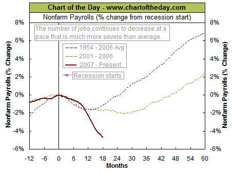
academic and political blogospheres, there are parallel but different discussions going on about the same point: this recession is far more severe in terms of unemployment than the 2.3% loss of GDP from peak would predict. Instead of only an increase of 4.6% in unemployment from its best levels of a few years ago, instead unemployment has increased to near 10%. This violates something academic economist's call "Okun's law":

Here is the gist: if GDP (production and incomes, that is) rises or falls two percent due to the business cycle, the unemployment rate will rise or fall by one percent. The magnitude of swings in unemployment will always be half or nearly half the magnitude of swings in GDP


Thus, in a recession this rule of thumb says thaat the % of jobs lost will approximately equal 1/2 of the GDP loss. In December 2007 when this recession began, the unemployment rate was 4.9%. We have lost ~2.8% of GDP. Thus "Okun's law" says our unemployment rate should now be about 6.3! Instead, at 9.5% and counting, the unempoyment rate during our recession is increasing nearly four times the predicted rate, as almost 8 million jobs have been lost in the last year and 7 months.

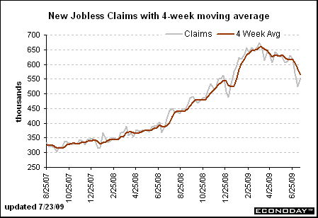
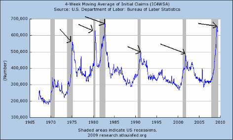
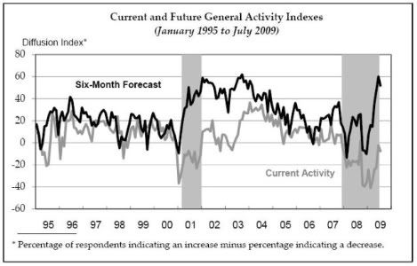
A graph illustrating this point, has appeared frequently in the blogosphere, and is not a stranger to this blog:


In this essay I will posit that it is not the job losses during this recession that are special. Rather, the dramatic increase in unemployment during this recession is an ongoing phenomenon that has been occuring for going on 15 years -- a trend of employment that comes nowhere near its long term average vis a vis GDP growth.

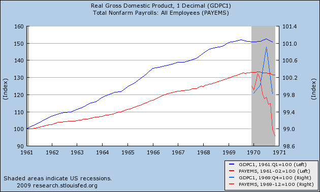
In order to show you how a structurally worse unemployment picture has been built into the structural economy, let me show you a series of graphs of unemployment growth vs. GDP growth covering all of the economic expansions and recessions for the last 50 years. (Note: In all of the graphs below, GDP is in blue, employment gains/losses in red. The longer lines measure the entire cycle from start of expansion to bottom of next recession. The lines at the right measure only the declines during the recession).

The 1960s were truly the halcyon era of American economic dominance. GDP grew on average about 4.75% a year for the entire decade, and employment by a terrific 3.5% a year. When the 1970 recession hit, it caused a mere 1% decline in GDP and a 1.5% decline in employment.


After the 1974 Oil shock, the economy still grew at a "subpar" 3% a year, with 2% annual employment gains. In the severe 1981-82 recession, GDP fell 2.8% in only 6 months before stabilizing, while employment dropped about the same percent, half of it during the initial 6 month burst.


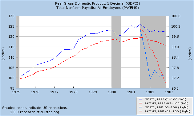
In the 1980s, the economy again grew at a robust 4% a year, while employment grew by 2.75% a year. The mild 1990 recession knocked about 1.5% off GDP and a smaller percent off employment.


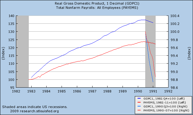
In the 1990s, the economy again grew at a robust 3.5% a year, while employment grew by 2%. Note that this rate, with employment growth only slightly over half of GDP growth, is the weakest so far. But then, things began to really change. The 2001 recession lopped off a paltry 0.4% of GDP, while employment lost 1.2%


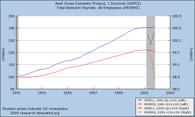
In our own decade, it is clear that something has been different. While the economy as a whole grew by about 2.8% a year during the poor Bush "expansion", employment grew by a paltry 1% a year. When the recession hit, the trend of subpar employment as compared with GDP simply continued. GDP has shrunk some 2.3% from the top, while employment has plummeted by nearly 5%.


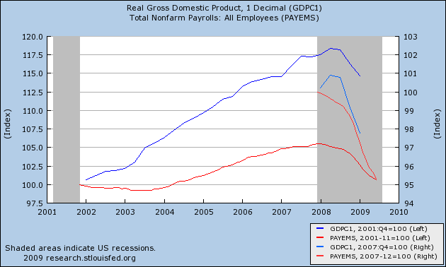
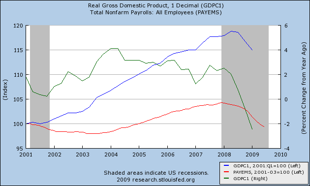
In other words, the steep job losses during this recession should not be looked at in isolation. They are the continuation and intensification of a trend that began in the 1990s, and really took off with the 2001 recession. The trend is that of subpar job growth during economic expansion, and intensified job losses during recessions. Here is a graph starting from January 2001 showing that there has been ZERO job growth in the face of 15% GDP growth even at this point in the "Great Recession". This graph also shows, in green, yearly GDP growth. Note that only in those periods of GDP growth over 2% a year in the last decade, have any jobs been added. It appears that something is happening, something that failed to generate a single American job unless there was at least 2% GDP growth.


So, what started happening during the 1990s expansion, that accelerated dramatically in the 2000s? There is a candidate the graph for which seems to be a near perfect match. This is a graph of the US trade deficit, current through February 2009 (h/t Calculated Risk):


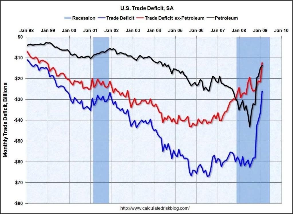
Between 1969 and the mid 1990s, the US ran a consistent trade deficit, but in the mid 1990s, the trade deficit really took off, growing from -$10 billion a year to -$65 billion a year at its height. This is almost a perfect match for our GDP and employment data above. It appears that as corporations offshored more and more factory and back office work to China and the rest of Asia, consumer inflation was held in check, but consumers in the aggregate did not have the jobs to pay for the cheap goods which were supposed to be the payoff. Instead, as we all know, American consumers took advantage of easy credit to go deeper and deeper into debt. This cycle required the generation 2% of GDP growth a year before a single net American job was produced.

In short, the employment losses during this recession are not special. Rather, they are the continuation of a trend caused by the ongoing, chronic trade deficit, most particularly the offshoring of employment.

You may astutely notice, however, that since mid 2008, the trade deficit has plummeted, the most recent reading of -$26 billion being only about 40% of the deficit of several years ago. If I am right, that the culprit is offshoring, then we ought to be moving to a more normal relationship between employment and GDP growth and loss. And indeed, in his most recent installment discussing the issue academically, 
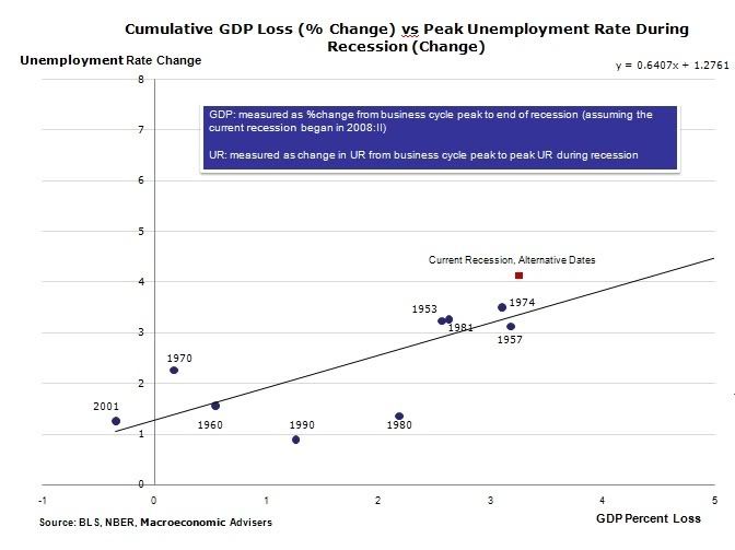
David Altig of the Atlanta Fed notes that if we start the data after the 2nd quarter of 2008, when GDP peaked -- and coincidentally when the trade deficit began to narrow -- the job losses during this recession, while still slightly high, much more closely fit the rule of thumb of "Okun's law":


Should GDP turn positive in the next few months, a test of this hypothesis will be to watch how GDP growth translates into the trade deficit. Has there been an actual change in the structural nature of the trade deficit, so that there will be relatively more robust job growth? Or will the trade deficit increase again, and a "jobless recovery" once again be in store?

Treasury Tuesdays


Click for a larger image

Prices are below the 200 day EMA, indicating we're in a bear market. Also note that prices have broken the upward sloping trending. In addition, prices are now in a downward sloping channel. All of the shorter EMAs are moving lower, the 10 day EMA has moved through the 50 day EMA and prices are below all the EMAs. However, the EMAs are bunched together indicating there's still some confusion about where traders want to send prices.

Monday, July 27, 2009

Today's Markets


Click for a larger image

Let's assume my analysis that the SPYs are in an upside down head and shoulders formation is accurate. The next move is for the market to sell off a bit at least to the neckline or the 10 day EMA (using it for technical support).

Is the Recession Over?

First, here is the key paragraph from the Newsweek article:

The Great Recession, which rolled over our financial lives like one of P.J. Keating's giant pavers, is most likely over. Home sales, while still far below the levels of a year ago, have risen for three straight months—a first since 2004. The stock market has rallied 44 percent since March, thanks to renewed optimism and improving earnings from big companies like Goldman Sachs and Apple. In June, seven of the 10 indicators in the Conference Board Leading Economic Index pointed upward, including manufacturing hours worked and unemployment claims. Macroeconomic Advisers, the St. Louis–based consulting firm, says the economy is expanding at a 2.5 percent annual rate in the current quarter. Economic activity "will increase slightly over the remainder of 2009," Federal Reserve chairman Ben Bernanke told Congress.


From the conference board:

The Conference Board LEI for the U.S. increased for the third consecutive month in June. Most of the components contributed positively to the index this month except real money supply* and manufacturers' new orders for nondefense capital goods*. The six-month change in the index has risen to 2.0 percent (a 4.1 percent annual rate) in the period through June, up substantially from - 3.1 percent (a –6.2 percent annual rate) for the previous six months, and the strengths among the leading indicators have remained balanced with the weaknesses in recent months.


Let's highlight why these numbers are so important. There are three types of economic indicators -- leading, coincident and lagging. Leading indicators happen before anything happens. The amount of advance time can vary, but the important point to remember is they typically happen first. A three month rise in leading indicators is a strong economic development that indicates we have a strong prospects of growth in the next few quarters.

The 4-week moving average of jobless claims continues to drop:


This number has been decreasing for several months and has now moved below the 600,000, currently standing at 566,000. While the seasonally adjusted number increased 30,000 this week, the unadjusted number decreased by 90,298. There has been some debate in economic circles regarding statistical adjustments to the seasonally adjusted numbers that was caused by auto industry lay-offs. However, the drop of 90,298 in the unadjusted numbers gives a strong indication that traditional seasonal factors are in play.

The reason this is important is this indicator typically drops right at or just after the end of a recession.


Existing home sales increased last month by 3.6%. However, the best part of the news is a possible bottoming in the pace of existing home sales. Here's the chart:


Notice there are two relevant time periods. The first is from (roughly) October 2007 to September/October 2008. This period saw a strong level of sales consistency. Then sales dropped again, largely caused by the financial problems of last fall. However, sales appear to have hit a bottoming level from that event and are stabilizing. It's important to note this only deals with the pace of sales. There are still big issues in the housing market that indicates we'll probably have a two bottoms -- a bottom in sales and a bottom in prices -- and Prices are nowhere near bottom right now. But, there are increasing signs of hope.

There is even hope that new home sales have bottomed:


As I originally pointed out on Thursday all the major averages have broken through resistance and are moving higher.


This is important for several reasons.

1.) This is an indication that investors' risk appetite is returning. That bodes will for the future.

2.) Stock indexes are a leading economic indicator, indicating there is growing confidence in future earnings prospects.

Let's add a few more data points:


Although the Philly Fed index dropped a bit last month, its overall trend is moving higher.


The Empire State index is also showing signs of improvement.


The ISM manufacturing index has been increasing for the last 5 months.


Credit spreads have returned to more normal levels


Retail sales appear to have bottomed as have


Real personal consumption expenditures and


Auto sales

Simply put, there is a ton of information indicating the worst is over.

Market Mondays

The conventional wisdom right now is we're in for a slow growth environment. The consumer is going to be de-leveraging for the foreseeable future, business investment is low and will be for some time and overall we'll be in the 1-2% growth range for the next few years. No one is talking about anything other than that.

So, that got me thinking -- When has the conventional wisdom every been right? Or more precisely, what is the contrary view to that concept right now?

Below are three charts of the SPYs, IWMs and DIAs. They are yearly charts. Notice that they are all head and shoulders patterns. The standard way to trade this pattern is to buy when prices cross the neckline. The standard measurement tool is for prices to rise from the neckline to a point that equals the distance from the top of the head to the neckline. Assuming that to be the case, we've got a rally coming.

Now -- we just had a rather historic head and shoulders breakdown a few weeks ago. So -- consider these charts.