Wednesday, November 26, 2008

Happy Thanksgiving

Mr$. Bonddad and I are in Cincinnati for the holidays. Therefore -- being the wonderful blog boss that I am -- I'm giving myself the rest of the week off. I'll be back on Monday, bright and early. In the meantime, here are the kids asking a very important question: "Can we have some turkey, too?"

Photobucket

Everybody, please have a happy and safe holiday.

BD

Wednesday Commodities Round-Up


Click for a larger image

Notice the following on the weekly chart:

-- Prices have dropped by 50% or more over the last few months

-- All the SMAs are moving lower

-- The shorter SMAs are below the longer SMAs

-- Prices are below all the SMAs

-- Prices are at or near their lowest level in over three years

BUT

-- The MACD is oversold, and

-- The RSI is oversold


Click for a larger image

Notice the following on the daily chart:

-- Prices have been dropping for four+ months

-- All the SMAs are moving lower

-- The shorter SMAs are below the longer SMAs

-- Prices are right at the lowest SMAs

BUT

-- The MACD is rising, and

-- The RSI has moved above the oversold level

Bottom line: the technical indicators on both charts tell us a rally is possible. But the fundamental picture is still very dour -- there is continual talk of deflation and recession. This adds to the downward pressure on prices (and with good reason).

Today's Market

As promised, here's a look at yesterday's market.


Click for a larger image

Above is a chart of the SPYs (S&P tracking stock). It also contains the triangle consolidation pattern which prices broke through about a week ago. Note that prices have rebounded and moved through the lower line of the previously established triangle. This line was at approximately 84 (which is 840 on the S&P chart) -- a very key technical trading level right now. Also note the following:

-- All the SMAs are moving lower (for more on this topic, click here)

-- The shorter SMAs are below the longer SMAs

BUT

-- Prices are above the 10 day SMA which is a positive technical development.

Take a close took at the volume for the last three trading days. Note that although prices were increasing volume was decreasing. That led me to draw the following possible new trend lines:


Click for a larger image

It's possible the SPYs are now forming a downward sloping trend channel. This would signal an upcoming orderly price decline.

I should add that frankly the market has me pretty much stumped right now. Usually there is some type of pattern in the chaos that an analyst can latch on to. Right now there is so much going on fundamentally that the technical picture is extremely cloudy. I wish I had a better answer than that right now, but it's what I've got.

Tuesday, November 25, 2008

Today's Market

Right now Mr$. Bonddad and I are flying to see my Dad for Thanksgiving. I'll put this up tomorrow morning.

GDP Shrinks .5%

From CNBC:

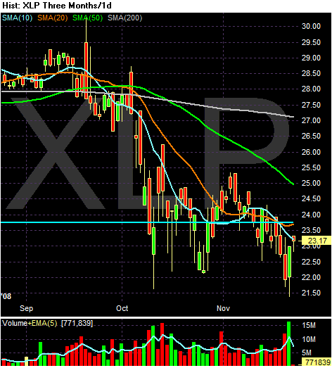
The economy took a tumble in the summer that was worse than first thought as American consumers throttled back their spending by the most in 28 years, further proof the country is almost certainly in the throes of a painful recession.

.....

American consumers -- the lifeblood of the economy -- slashed spending in the third quarter at a 3.7 percent pace. That was deeper than the 3.1 percent cut initially reported and marked the biggest reduction since the second quarter of 1980, when the country was in the grip of recession.

Consumers are hunkering down amid job losses, tanking investment portfolios and sinking home values, which are making them nervous about spending.


The massive drop in consumer spending should raise eyebrows. Lots of them. Here is a graph of the percentage change from the previous quarter in consumer spending. It starts in the first quarter of 1980.


Click for a larger image

I didn't put the dates on the graph because it was too much information. But you will notice there are very few dips. The negative numbers occurred in:

1Q1980 - 2Q1980
2Q1981 - 4Q1981
2Q1990 - 1Q1991

These also correspond to recessions.

Fed Unveils New Lending Facility

From Marketwatch:

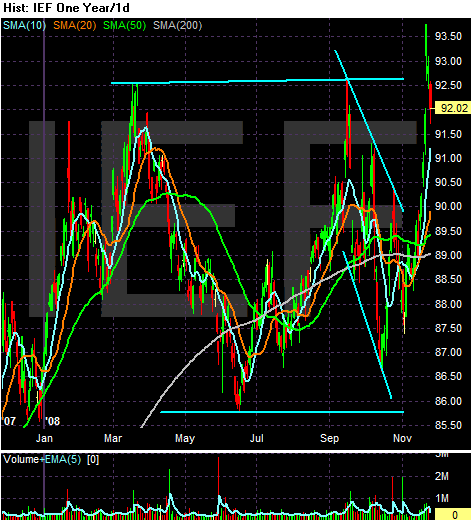
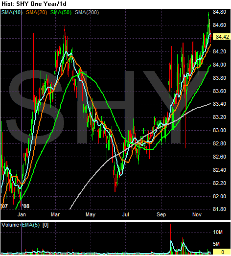
The Federal Reserve on Tuesday unveiled its new Term Asset-Backed Securities Loan Facility (TALF), a plan under which it will lend up to $200 billion to support the issuance of debt backed by consumer and small business debt like credit card loans, student debt, auto loans and loans backed by the Small Business Administration (SBA). The Fed hopes the plan will create liquidity in the market for securities backed by the receivables from such loans, which in turn would encourage originators of consumer loans to restart lending to individuals.


But that's not all:

The central bank will purchase as much as $600 billion in debt issued or backed by government-chartered housing-finance companies. It will also set up a $200 billion program to support consumer and small-business loans, the Fed said in statements today in Washington.


What the Fed is trying to do is jump-start the securitization market for consumer debt. When a credit card company issues a certain amount of cards, it takes the accounts and securitizes them much in the same way mortgages are securitized. However, the entire credit market has seized up, including the consumer market. As a result consumer credit issuance is tight.

But with this new lending facility comes added stress on the Fed. Consider the following points from this week's Barron's:

IF THE FEDERAL RESERVE BANK WERE A COMMERCIAL LENDER, it would be a candidate for receivership, based on its capital ratios. Bank examiners generally view any lender with a ratio below 2% to be dangerously undercapitalized. The Fed's current capital ratio, or capital as a percentage of assets, is 1.9%.

The Fed has provided so many loans and emergency credits -- to banks, brokers, money funds and foreign countries -- that its balance sheet, viewed one way, is as leveraged as any hedge fund's: Its consolidated assets amount to 53 times capital. Only 11 months ago, its leverage on this basis was a more modest 25 times, and its capital ratio 4%. A caveat: Many of the loans are self-liquidating facilities that will disappear in a few months if the financial crisis eases.

Although the Fed's role as a central bank is much different from the role of a private-sector operation, the drastic changes in the size and shape of its balance sheet worry even some long-time Fed officials. Its consolidated assets have swelled to $2.2 trillion from $915 billion in about 11 months, and contain at least a half-dozen items that weren't there before. Some, like a loan to backstop the purchase of a brokerage, Bear Stearns, are unprecedented. (See table for highlights.)

Critics say this action could hinder the Fed in achieving its No. 1 priority: keeping inflation in check. To try to get in front of the crisis, many decisions have had to be made on the fly.

"If the Fed had been [a savings-and-loan] ballooning its balance sheet so fast, the supervisors would have been all over it," says Ed Kane, a Boston College finance professor.


Here is an accompanying graphic:


Click for a larger image

While these are extraordinary times, that does not mean conventional rules of risk management do not apply in one way or the other.

We're Nowhere Near a Bottom in Housing

From Reuters

Sales of previously owned U.S. homes fell in October, with the median home price notching its biggest drop on record as tough economic conditions kept buyers on the sidelines, data showed on Monday.


From Marketwatwch:

Home prices in 20 major U.S. cities dropped 1.8% in September from the prior month, and had fallen a record 17.4% from the previous year, according to the Case-Shiller home price index published Tuesday by Standard & Poor's. Prices have fallen in all 20 cities compared with last month and a year ago.


The price data is all I need to know. When prices fall that much it indicates the balance between supply and demand is horribly out of whack. In addition, prices don't fall that much at the end of a long-term price decline. They fall that much in the middle of a price decline.

The inventory of existing homes for sale slipped 0.9 percent to 4.23 million from 4.27 million in September. The median national home price declined 11.3 percent from a year ago to $183,300, the lowest since March 2004, the NAR said.

However, the percentage drop in prices was the biggest since the NAR started keeping records in 1968. Distressed sales are accounting for about 45 percent of existing home sales.

Analysts said even though housing had become more affordable, sales were likely to remain depressed because of tight access to credit and mounting job losses.


While the drop in inventory is good news, notice that from an absolute numbers perspective the amount of homes available for sale is still sky-high (h/t Calculated Risk):


Click for a larger image

And as the article points out, job losses are really hurting sales figures. The most recent jobs report from the BLS indicates job losses are accelerating. As a result, personal durable goods purchases are decreasing (from the latest GDP report):

Real personal consumption expenditures decreased 3.1 percent in the third quarter, in contrast to an increase of 1.2 percent in the second. Durable goods decreased 14.1 percent, compared with a decrease of 2.8 percent.


And then there are the credit markets which are clearly hurting the real estate market. The Federal Reserve's most recent survey of lenders noted:

Large majorities of domestic respondents reported having tightened their lending standards on prime, nontraditional, and subprime residential mortgages over the previous three months. About 70 percent of domestic respondents—down from about 75 percent in the previous survey—indicated that they had tightened their lending standards on prime mortgages.2 Responses differed somewhat by bank size, with about 80 percent of the largest banks, but only 55 percent of the smaller banks, reporting tighter standards for prime borrowers. About 90 percent—up slightly from July—of the 29 banks that originated nontraditional residential mortgage loans reported having tightened their lending standards on such loans.3 All 4 of the banks that responded to the survey’s question about lending standards on subprime loans indicated that they had tightened their lending standards on such loans over the past three months.4 About 50 percent of domestic respondents—a somewhat higher fraction than the roughly 30 percent in the July survey—experienced weaker demand, on net, for prime residential mortgage loans over the past three months. A higher net fraction of large banks than smaller banks reported a decline in demand. About 70 percent of respondents—up from roughly 45 percent in the July survey—indicated weaker demand for nontraditional mortgage loans over the same period. Each of the 4 domestic banks that originated subprime mortgage loans reported weaker demand for such loans over the survey period, compared with 4 of the 7 banks that reported originating subprime loans in the July survey.


Simply put, demand is down from a weakening job market and tighter lending standards. Supply is still high because of the increasing foreclosure situation. Decreased demand + high supply = lower price. It's that simple.

Treasury Tuesdays

Let's get started, shall we?

Photobucket

Although the yearly chart shows the 7-10 year section of the yield curve has been in a rally since mid-October, also note this section of the market rallied past the upper trend line but quickly retreated. The primary reason for this retreat over the last few days is the stock market rally -- as money flowed into equities it flowed out of the Treasury market. I also think that with the S&P 500 and 10 year Treasury at yield parity something had to give. I think the market sent Treasuries higher as a result.

While the market is clearly in a rally, I am wondering how strong the upside resistance to the Treasury market is. Right now the 10 year is yielding 3.21%. That seems to be a really low rate, especially with the new administration talking about a huge stimulus plan that will balloon Treasury supply.

Photobucket

Above is a 6 month chart of the short end of the yield curve. Simply note it has been in a rally since late May. The bottom line is the credit crunch is still firmly in place according to this market.

Monday, November 24, 2008

Today's Market

Photobucket

Notice the following on the daily chart:

ON THE BULLISH SIDE

-- Prices rebounded from lows established in 2002/2003. In other words, technical support held

-- Prices moved through 84 which was a a point of technical resistance

-- Prices moved through the 10 say SMA

BUT

-- All the SMAs are moving lower

-- The shorter SMAs are below the longer SMAs

Bottom line: this is a bearish chart

In response to the question of the day -- do I think we're consolidating right now, the answer is no. The four market sectors that account for the largest percentage of the market all have incredibly bearish charts right now. That concerns me greatly.

Market Monday's, Pt. II

Thanks to the creation of exchange traded funds (ETFs) it possible for traders to break the market down into different market/industry segments. We'll be looking at the relevant charts momentarily. Before we look at the long-term charts let me make a few observations about the 3-month daily charts.

-- The XLE (energy) XLP (consumer staples) and XLU (utilities) all appear to be bottoming. Here are the charts:

Photobucket

Photobucket

Photobucket

All the other charts have the following characteristics:

-- All the SMAs are moving lower

-- The shorter SMAs are below the longer SMAs

-- Prices are below all the SMAs

In other words, the technical orientation of a majority of the ETFs involved is the most bearish possible.

I'm going to present the multi-year charts in the order to the largest percentage of the S&P 500 to the smallest percentage. That list can be found here.

So let's begin.

Photobucket

The technology sector has obviously never recovered from the tech crash of 2000. However notice that on the multi-year chart prices are near the lows attained in 2002. However, prices bounced off technical levels established in 2002. But most of the gains attained during the 2003-2007 rally are now gone.

Remember on the short term chart the orientation is still very bearish.

So -- we have a long-term technical level that is very important but a short-term bearish chart.

Fundamentally the news has been bad. Several big companies have announced lay-offs. Intel recently issued poor guidance for coming few quarters as well.

Photobucket

The financial sector is at multi-year lows. This sector is fundamentally a basket case. As mentioned above, its daily chart is still incredibly bearish. With the government having to come in and vail-out Citigroup today it should be obvious we're nowhere near a bottom in this sector.

Photobucket

Although health care is supposed to be a safe haven it has been anything but that in the latest sell-off. Like other sectors, health care is trading at multi-year lows. Note the severity of the sell-off -- it was very harsh.

Photobucket

Although consumer staples have taken a hit and are clearly off their highs, they are still 29% above their 2003 lows. That makes this sector a winner for now.

Photobucket

Industrials are about about 20% above their 2003 lows.

The bottom line is pretty clear: the vast majority of sectors are trading ay multi-year lows. Their daily charts predominantly bearish. The multi-yeare charts indicate a majority are at or near multi-year lows. Bottom line: it doesn't like we're at a bottom yet.

Market Monday's

Wow -- what a week. Last week several people asked if I still thought the market was bottoming. Frankly I still don't know. So, I'm going to use this blog today as a way of looking at that question. I'm going to start with what other people are saying, observing and thinking.

From this week's Barron's:

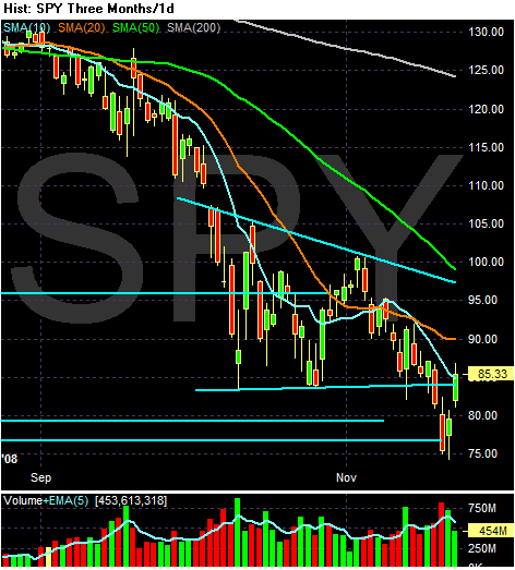
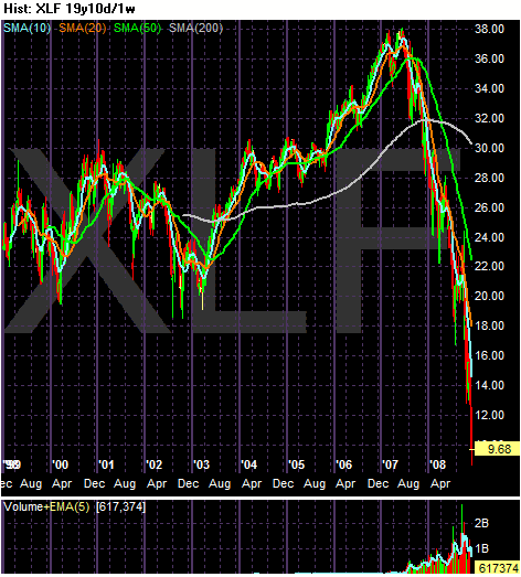
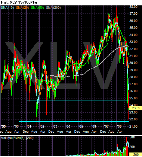
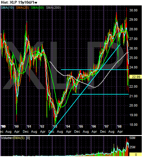
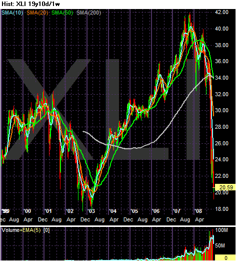
At Thursday's low, both the Dow and S&P had erased more than a decade's worth of gains. If the markets end the year where they finished Friday, both the 39% drop in the Dow and 45% slump in the S&P would mark their worst yearly decline since 1931. The current bear market, which has brought the DJIA down 43% from its October 2007 peak of 14,164, now rivals any decline in the 20th century, save for the loss of 83% from the peak in 1929 to the market depths in 1932 when the index bottomed at just 41.

A philosophical Warren Buffett told Fox Business News Friday morning that slumps worse than this one have happened before, referring to the 1929-1932 crash. Buffett noted that markets and the capitalist system overshoot and that this seems to be one those times. He said the markets are in a "negative feedback loop" as bad news becomes self-reinforcing.

It's tough to say when the markets will bottom, but unless the world is entering an economic depression, history suggests that stocks don't have much further to fall. Save for the 1929-1932 crash, no downturn in the 20th century exceeded 50%. One of the many ironies about this year's setback was that it was largely unanticipated because major averages began 2008 selling for a seemingly modest 16 to 17 times projected earnings, versus a peak of 25 in 2000. It turned out that profit estimates for this year were way too high.


Combine that thought with this fact from last week:

The week's trading was marked by a rare cross: The S&P 500 index dividend yield, about 3.79%, exceeded the 10-year Treasury yield, about 3.20%. For the first time in half a century, the dividend yield is higher than the bond yield. Many dividends will likely be cut next year, sending equity yields back down, and bond yields are at record lows. But the cross suggests stocks are cheaply valued. Bears say it just means there won't be any earnings growth for a while.


Pretty interesting. As the article (and another commenter suggested) there is no guarantee S&P companies will continue paying dividends. In fact, I would expect a wave of dividend cuts from the financial sector over the next 3-6 months. However, we haven't seen that yet which implies management is hanging on to anything that might bolster their stock price.

The blog dshort had this graph up last week (thanks to Calculated Risk for the link):


Click for a larger image

As CR stated:

The current stock market decline is the worst since the Great Depression.


Chris Perruna had this chart up:


Click for a larger image

He titled the post "Support Violated" meaning we have lower to go.

And as usual, Corey over at Afraid to Trade had some great observations. Simply go to his blog and read the last few week's worth of posts.

Also chart out Tim Knight's Slope of Hope blog. I think he's one of the best chart people around.

And finally, read this post over at Barry's blog. Then check out what most of what he's written for the last few weeks as well.

So, that is a sampling of what other people are saying. I'll be back later today with my thoughts.